- Power BI forums
- Updates
- News & Announcements
- Get Help with Power BI
- Desktop
- Service
- Report Server
- Power Query
- Mobile Apps
- Developer
- DAX Commands and Tips
- Custom Visuals Development Discussion
- Health and Life Sciences
- Power BI Spanish forums
- Translated Spanish Desktop
- Power Platform Integration - Better Together!
- Power Platform Integrations (Read-only)
- Power Platform and Dynamics 365 Integrations (Read-only)
- Training and Consulting
- Instructor Led Training
- Dashboard in a Day for Women, by Women
- Galleries
- Community Connections & How-To Videos
- COVID-19 Data Stories Gallery
- Themes Gallery
- Data Stories Gallery
- R Script Showcase
- Webinars and Video Gallery
- Quick Measures Gallery
- 2021 MSBizAppsSummit Gallery
- 2020 MSBizAppsSummit Gallery
- 2019 MSBizAppsSummit Gallery
- Events
- Ideas
- Custom Visuals Ideas
- Issues
- Issues
- Events
- Upcoming Events
- Community Blog
- Power BI Community Blog
- Custom Visuals Community Blog
- Community Support
- Community Accounts & Registration
- Using the Community
- Community Feedback
Register now to learn Fabric in free live sessions led by the best Microsoft experts. From Apr 16 to May 9, in English and Spanish.
- Power BI forums
- Forums
- Get Help with Power BI
- Desktop
- Re: Change transparancy of the filter in a visual
- Subscribe to RSS Feed
- Mark Topic as New
- Mark Topic as Read
- Float this Topic for Current User
- Bookmark
- Subscribe
- Printer Friendly Page
- Mark as New
- Bookmark
- Subscribe
- Mute
- Subscribe to RSS Feed
- Permalink
- Report Inappropriate Content
Change transparancy of the filter in a visual
Is it possible to change the transparancy of the filter in a visual?
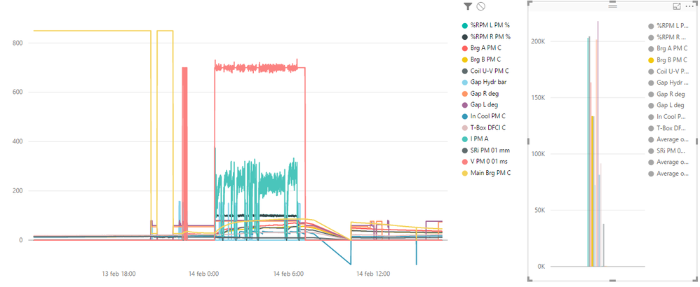
I have a line chart here and it is really unclear what data is highlighted, I'd like to set the transparancy of the things that are not highlighted on 0. If this is not possible out of the box is it easy to make a custom visual out of this?
Curious to hear your opinion.
- Mark as New
- Bookmark
- Subscribe
- Mute
- Subscribe to RSS Feed
- Permalink
- Report Inappropriate Content
Hi @JBeyers,
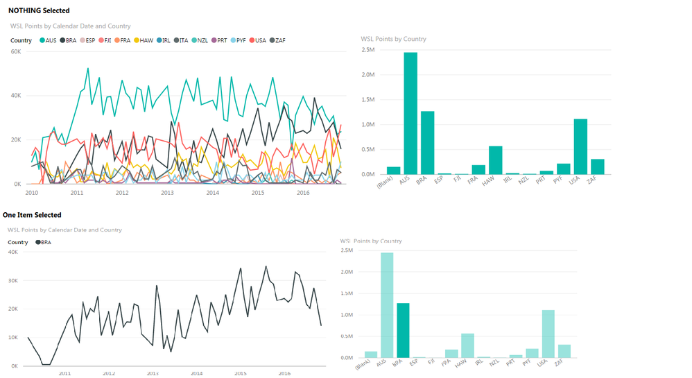
Could you not create another visual which uses the same attributes as you have in your chart with the line colours?
Then when you click on the other visual it will then filter your line chart to ONLY show what you selected?
This is shown below.
- Mark as New
- Bookmark
- Subscribe
- Mute
- Subscribe to RSS Feed
- Permalink
- Report Inappropriate Content
Hey @GilbertQ,
I like your solution however it doesn't seem to work for me.
I think it is because I want to filter on the column header, instead of a value in one column (country in your example).
Do you know if that's right?
Thanks for the help anyway!
- Mark as New
- Bookmark
- Subscribe
- Mute
- Subscribe to RSS Feed
- Permalink
- Report Inappropriate Content
I think your best option may be a Disconnected Slicer - read about it here
https://powerpivotpro.com/2012/07/dynamic-topn-reports-via-slicers-part-2/
It seems you have about 15 Measures
If you've been relying on the built-in calculations (i.e. dragging a Column to the Values area)
you may have to write the equivalent Measures.
Hope this helps! ![]()
- Mark as New
- Bookmark
- Subscribe
- Mute
- Subscribe to RSS Feed
- Permalink
- Report Inappropriate Content
Unfortunately we don't have such setting. ![]()
But what you could do is Hide the Legend in the Chart OR better yet Position it on Top (if you need to make room for the Slicer)
then create a Slicer using the same Legend Field and the Slicer will filter all others in effect setting trasnsparency to zero
not exactly what you asked for but with the slicer you can select multiple items which unfortunately you can't do with the Legend too
Hope this helps! ![]()
- Mark as New
- Bookmark
- Subscribe
- Mute
- Subscribe to RSS Feed
- Permalink
- Report Inappropriate Content
Hey Sean,
Thanks for the suggestion but the big problem here is that I'm not using a legend. The legend that you see here are just all input columns in the value section. I don't think it is possible to create a slicer on column headers, or is it?
Any alternative options?
- Mark as New
- Bookmark
- Subscribe
- Mute
- Subscribe to RSS Feed
- Permalink
- Report Inappropriate Content
Hi @JBeyers,
>>I don't think it is possible to create a slicer on column headers, or is it?
Yes, current power bi visual not support to create a slicer on column headers like a pivot table.
Regards,
Xiaoxin Sheng
If this post helps, please consider accept as solution to help other members find it more quickly.
Helpful resources

Microsoft Fabric Learn Together
Covering the world! 9:00-10:30 AM Sydney, 4:00-5:30 PM CET (Paris/Berlin), 7:00-8:30 PM Mexico City

Power BI Monthly Update - April 2024
Check out the April 2024 Power BI update to learn about new features.

| User | Count |
|---|---|
| 106 | |
| 97 | |
| 80 | |
| 67 | |
| 63 |
| User | Count |
|---|---|
| 147 | |
| 110 | |
| 108 | |
| 85 | |
| 64 |


