FabCon is coming to Atlanta
Join us at FabCon Atlanta from March 16 - 20, 2026, for the ultimate Fabric, Power BI, AI and SQL community-led event. Save $200 with code FABCOMM.
Register now!- Power BI forums
- Get Help with Power BI
- Desktop
- Service
- Report Server
- Power Query
- Mobile Apps
- Developer
- DAX Commands and Tips
- Custom Visuals Development Discussion
- Health and Life Sciences
- Power BI Spanish forums
- Translated Spanish Desktop
- Training and Consulting
- Instructor Led Training
- Dashboard in a Day for Women, by Women
- Galleries
- Data Stories Gallery
- Themes Gallery
- Contests Gallery
- QuickViz Gallery
- Quick Measures Gallery
- Visual Calculations Gallery
- Notebook Gallery
- Translytical Task Flow Gallery
- TMDL Gallery
- R Script Showcase
- Webinars and Video Gallery
- Ideas
- Custom Visuals Ideas (read-only)
- Issues
- Issues
- Events
- Upcoming Events
The Power BI Data Visualization World Championships is back! Get ahead of the game and start preparing now! Learn more
- Power BI forums
- Forums
- Get Help with Power BI
- Desktop
- Change of bar color based on date - before and aft...
- Subscribe to RSS Feed
- Mark Topic as New
- Mark Topic as Read
- Float this Topic for Current User
- Bookmark
- Subscribe
- Printer Friendly Page
- Mark as New
- Bookmark
- Subscribe
- Mute
- Subscribe to RSS Feed
- Permalink
- Report Inappropriate Content
Change of bar color based on date - before and after today
Is it possible to change the color of the bars in a chart, based on date? Values today and after today has another color than before today. I am using this on sales - values to be delivered, and values of backlog
Solved! Go to Solution.
- Mark as New
- Bookmark
- Subscribe
- Mute
- Subscribe to RSS Feed
- Permalink
- Report Inappropriate Content
Hi @Anonymous , you can achieve this by following these steps.
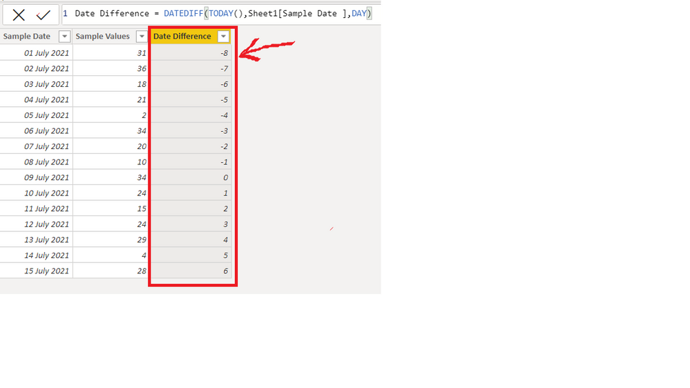
1)Create a column in your table for holding the difference in date with respect to today's date in days. You can use the following DAX for the column.
Date Difference = DATEDIFF(TODAY(),Sheet1[Sample Date ],DAY)You'll get a column like this
2)Create a bar chart and use conditional formatting based on the Date Difference column to get different colours for values having date equal to and greater than today and for values having date less than today. Go to conditional formatting by clicking on fx Button(Shown below)
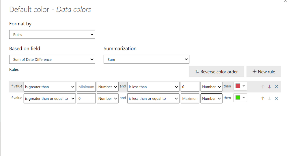
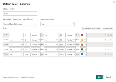
3) Then you can can set the "Format by" field as "Rules" and use the following rules.
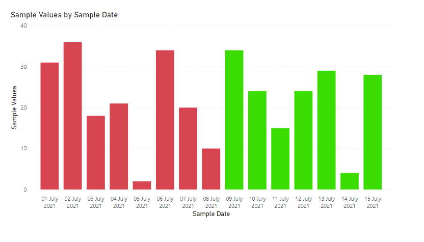
The result will look like this. The values with negative date difference have red colour and the values with zero and positive date difference have green colour.
The date as of writing this answer is 9th July 2021, so the values for 9th July and above have green color and the values having date before 9th July have red colour.
The .pbix file is attached for reference.
Regards,
Aditya
- Mark as New
- Bookmark
- Subscribe
- Mute
- Subscribe to RSS Feed
- Permalink
- Report Inappropriate Content
I don't see the option to get conditional formating am I using the wrong chart type or version?
I'm using clustered columns chart and line and clusteres columns chart.
- Mark as New
- Bookmark
- Subscribe
- Mute
- Subscribe to RSS Feed
- Permalink
- Report Inappropriate Content
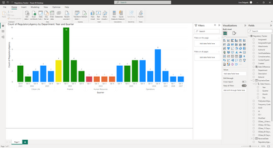
The operations Qtr1 have 3 with -5 days and its not red on the column. I appreciate any help on this matter, thank you 🙁
- Mark as New
- Bookmark
- Subscribe
- Mute
- Subscribe to RSS Feed
- Permalink
- Report Inappropriate Content
Hello! why my graphic doesnt show the red color on the negative values on my graph?
- Mark as New
- Bookmark
- Subscribe
- Mute
- Subscribe to RSS Feed
- Permalink
- Report Inappropriate Content
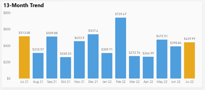
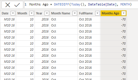
This was also exactly what I was looking for - thank you! I have a 13-month rolling trend chart and wanted to highlight last month vs. last month prior year. Using your formula to create a "Months Ago" column in my date table did the trick.
- Mark as New
- Bookmark
- Subscribe
- Mute
- Subscribe to RSS Feed
- Permalink
- Report Inappropriate Content
Thank you! This is what I'm looking for!
Best regards, Ingrid
- Mark as New
- Bookmark
- Subscribe
- Mute
- Subscribe to RSS Feed
- Permalink
- Report Inappropriate Content
Hi @Anonymous , you can achieve this by following these steps.
1)Create a column in your table for holding the difference in date with respect to today's date in days. You can use the following DAX for the column.
Date Difference = DATEDIFF(TODAY(),Sheet1[Sample Date ],DAY)You'll get a column like this
2)Create a bar chart and use conditional formatting based on the Date Difference column to get different colours for values having date equal to and greater than today and for values having date less than today. Go to conditional formatting by clicking on fx Button(Shown below)
3) Then you can can set the "Format by" field as "Rules" and use the following rules.
The result will look like this. The values with negative date difference have red colour and the values with zero and positive date difference have green colour.
The date as of writing this answer is 9th July 2021, so the values for 9th July and above have green color and the values having date before 9th July have red colour.
The .pbix file is attached for reference.
Regards,
Aditya
Helpful resources

Power BI Dataviz World Championships
The Power BI Data Visualization World Championships is back! Get ahead of the game and start preparing now!

Power BI Monthly Update - November 2025
Check out the November 2025 Power BI update to learn about new features.

| User | Count |
|---|---|
| 59 | |
| 43 | |
| 42 | |
| 23 | |
| 17 |
| User | Count |
|---|---|
| 190 | |
| 122 | |
| 96 | |
| 66 | |
| 47 |
