FabCon is coming to Atlanta
Join us at FabCon Atlanta from March 16 - 20, 2026, for the ultimate Fabric, Power BI, AI and SQL community-led event. Save $200 with code FABCOMM.
Register now!- Power BI forums
- Get Help with Power BI
- Desktop
- Service
- Report Server
- Power Query
- Mobile Apps
- Developer
- DAX Commands and Tips
- Custom Visuals Development Discussion
- Health and Life Sciences
- Power BI Spanish forums
- Translated Spanish Desktop
- Training and Consulting
- Instructor Led Training
- Dashboard in a Day for Women, by Women
- Galleries
- Data Stories Gallery
- Themes Gallery
- Contests Gallery
- Quick Measures Gallery
- Notebook Gallery
- Translytical Task Flow Gallery
- TMDL Gallery
- R Script Showcase
- Webinars and Video Gallery
- Ideas
- Custom Visuals Ideas (read-only)
- Issues
- Issues
- Events
- Upcoming Events
To celebrate FabCon Vienna, we are offering 50% off select exams. Ends October 3rd. Request your discount now.
- Power BI forums
- Forums
- Get Help with Power BI
- Desktop
- Re: Card not pulling data from SharePoint Excel ta...
- Subscribe to RSS Feed
- Mark Topic as New
- Mark Topic as Read
- Float this Topic for Current User
- Bookmark
- Subscribe
- Printer Friendly Page
- Mark as New
- Bookmark
- Subscribe
- Mute
- Subscribe to RSS Feed
- Permalink
- Report Inappropriate Content
Card not pulling data from SharePoint Excel tab
Good Day,
I have 4 excel documents that are saved in SharePoint. In each excel document it has a tab called Availability that allows the user to enter if they took a business, sick or vacation day during the a specific month. At the end of the each month it has 3 additional columns named Business, Sick and Vacation which deducts the total amount of days taken each (business, sick and vacation) and it shows the employee's balance days remaining for the year.
I created a card in Powerbi to show the balance days for each but it is pull a high figure (e.g. if the balance vacation days for user X is 40 it is pulling 591)
Is there a way just to pull the correct number from the columns suggested?
- Mark as New
- Bookmark
- Subscribe
- Mute
- Subscribe to RSS Feed
- Permalink
- Report Inappropriate Content
Any solutions how to resolve this. Thanks much.
- Mark as New
- Bookmark
- Subscribe
- Mute
- Subscribe to RSS Feed
- Permalink
- Report Inappropriate Content
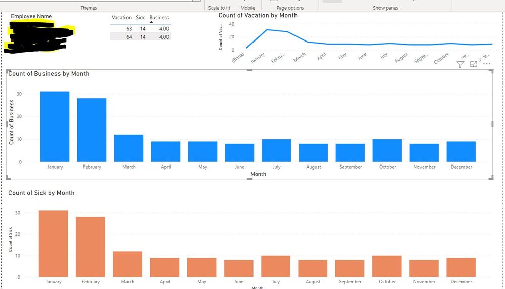
Thanks for the feedback. I created the visual table but it is pulling duplicate data as seen. I only want to reflect the balance of each which is one row. Also, the bar charts and line chart is not reflecting accurate data. January suppose to be 63 days for vcation and its show 32 days for business and even sick which should be 4 and 14 respectively.
- Mark as New
- Bookmark
- Subscribe
- Mute
- Subscribe to RSS Feed
- Permalink
- Report Inappropriate Content


- Mark as New
- Bookmark
- Subscribe
- Mute
- Subscribe to RSS Feed
- Permalink
- Report Inappropriate Content

 1 row of vac, sick, business should be seen in visual table, charts not displaying accurate data
- Mark as New
- Bookmark
- Subscribe
- Mute
- Subscribe to RSS Feed
- Permalink
- Report Inappropriate Content
Hi @KPro17
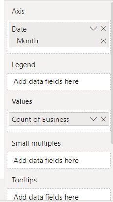
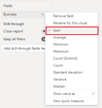
From your screenshot, you are using Count to aggregate Business column. I recommend that you use Sum instead. You can right click on Business column in the Fields or Values box and select Sum. Just as below.
In addition, the Card visual is only able to display an aggregated value, so it will display the total of the whole Business column. If you want to show the value for every user, you can use Table visual. Put both user name and Business columns into a table visual, then you will see the total for every user. Or if you want to show the total in a Card visual for a user at a time, you can add a slicer to the report page and put User name column into it. Then use the slicer to filter users.
Table visualizations in Power BI reports and dashboards - Power BI | Microsoft Docs
Slicers in Power BI - Power BI | Microsoft Docs
Best Regards,
Community Support Team _ Jing
If this post helps, please Accept it as Solution to help other members find it.


