Become a Certified Power BI Data Analyst!
Join us for an expert-led overview of the tools and concepts you'll need to pass exam PL-300. The first session starts on June 11th. See you there!
Get registered- Power BI forums
- Get Help with Power BI
- Desktop
- Service
- Report Server
- Power Query
- Mobile Apps
- Developer
- DAX Commands and Tips
- Custom Visuals Development Discussion
- Health and Life Sciences
- Power BI Spanish forums
- Translated Spanish Desktop
- Training and Consulting
- Instructor Led Training
- Dashboard in a Day for Women, by Women
- Galleries
- Webinars and Video Gallery
- Data Stories Gallery
- Themes Gallery
- Contests Gallery
- Quick Measures Gallery
- Notebook Gallery
- Translytical Task Flow Gallery
- R Script Showcase
- Ideas
- Custom Visuals Ideas (read-only)
- Issues
- Issues
- Events
- Upcoming Events
Power BI is turning 10! Let’s celebrate together with dataviz contests, interactive sessions, and giveaways. Register now.
- Power BI forums
- Forums
- Get Help with Power BI
- Desktop
- Re: Can't stack two series column chart... need so...
- Subscribe to RSS Feed
- Mark Topic as New
- Mark Topic as Read
- Float this Topic for Current User
- Bookmark
- Subscribe
- Printer Friendly Page
- Mark as New
- Bookmark
- Subscribe
- Mute
- Subscribe to RSS Feed
- Permalink
- Report Inappropriate Content
Can't stack two series column chart... need some help
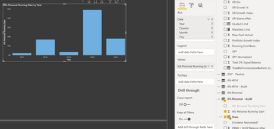
Here's what I start with:
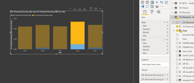
I have a nice stacked column visual, and I've selected my first data set for the columns. One of the columns is "Date". It works great. But now, I want to stack another series on top of it:
But, that's not right... all I did was drag the column I wanted into the "Values" section. But every year's value is the same. Hmmm... is it somehow just showing the sum total for every time slice? Even when I drill down, the number for the new series is the same. It looks like it just stuck the entire sum of the column on top of the chart. That's pretty lame... Maybe I need to drag the date column from this data set onto the chart?
Nope, that doesn't do anything...
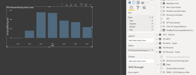
I can delete the first time series:
And now the remaining data set acts correctly. Okay, I'm now resorting to printing off the powerBI charts, cutting them out and taping the columns together. Is there a better way?
- Mark as New
- Bookmark
- Subscribe
- Mute
- Subscribe to RSS Feed
- Permalink
- Report Inappropriate Content
I figured it out. I need to Append Queries to combine the two different tables. From the combined table, PowerBI is able to plot the stacked column chart just fine.
- Mark as New
- Bookmark
- Subscribe
- Mute
- Subscribe to RSS Feed
- Permalink
- Report Inappropriate Content
@utnapishtem , there two measures are from the same table? if not are those tables using a common date table?
In this case, both measures should finally refer to a common date table
To get the best of the time intelligence function. Make sure you have a date calendar and it has been marked as the date in model view. Also, join it with the date column of your fact/s. Refer :radacad sqlbi My Video Series Appreciate your Kudos.
- Mark as New
- Bookmark
- Subscribe
- Mute
- Subscribe to RSS Feed
- Permalink
- Report Inappropriate Content
Hmm; I thought I replied, but looks like my reply got lost...
Anyway, I spent some time reading the articles you posted about creating a date calendar. I don't see why that is necessary here. I'm not trying to create different date slices or anything. I'm just trying to plot two different time series as stacked columns. Maybe I'm not understanding what PowerBI is doing with my data here. How would it know the relation between the data I'm plotting and the date it is on? I mean, it's not like the row numbers line up 1:1 with some arbitrary date. You're telling me both 'measures' (they're columns) need to 'use' a common date table. What does that even mean? The data is coming from Excel. Each column comes from a different table in Excel. Each table has it's own date column. Is that not possible to combine in PowerBI? I created a repro project that illustrates my problem, but can't find any place to upload it here, so it's on my OneDrive shared here: https://1drv.ms/u/s!BA7jl24SA2VzhbF00Rer7BXH3eGyvg?e=E1lqln
Helpful resources

Join our Fabric User Panel
This is your chance to engage directly with the engineering team behind Fabric and Power BI. Share your experiences and shape the future.

Power BI Monthly Update - June 2025
Check out the June 2025 Power BI update to learn about new features.

| User | Count |
|---|---|
| 76 | |
| 76 | |
| 57 | |
| 37 | |
| 34 |
| User | Count |
|---|---|
| 99 | |
| 56 | |
| 54 | |
| 45 | |
| 40 |


