FabCon is coming to Atlanta
Join us at FabCon Atlanta from March 16 - 20, 2026, for the ultimate Fabric, Power BI, AI and SQL community-led event. Save $200 with code FABCOMM.
Register now!- Power BI forums
- Get Help with Power BI
- Desktop
- Service
- Report Server
- Power Query
- Mobile Apps
- Developer
- DAX Commands and Tips
- Custom Visuals Development Discussion
- Health and Life Sciences
- Power BI Spanish forums
- Translated Spanish Desktop
- Training and Consulting
- Instructor Led Training
- Dashboard in a Day for Women, by Women
- Galleries
- Data Stories Gallery
- Themes Gallery
- Contests Gallery
- Quick Measures Gallery
- Notebook Gallery
- Translytical Task Flow Gallery
- TMDL Gallery
- R Script Showcase
- Webinars and Video Gallery
- Ideas
- Custom Visuals Ideas (read-only)
- Issues
- Issues
- Events
- Upcoming Events
Calling all Data Engineers! Fabric Data Engineer (Exam DP-700) live sessions are back! Starting October 16th. Sign up.
- Power BI forums
- Forums
- Get Help with Power BI
- Desktop
- Re: Calculating proportions with DAX
- Subscribe to RSS Feed
- Mark Topic as New
- Mark Topic as Read
- Float this Topic for Current User
- Bookmark
- Subscribe
- Printer Friendly Page
- Mark as New
- Bookmark
- Subscribe
- Mute
- Subscribe to RSS Feed
- Permalink
- Report Inappropriate Content
Calculating proportions with DAX
I’m having trouble “thinking in DAX” WRT describing proportions.
I have two tables.
- A table that defines a taxonomy of categories (Dictionary)[Category] and unique issues (Dictionary)[All Issues].
- A table of questionnaire responses. Each response can be parsed across multiple issues.
- Among many other columns, the table includes one named (Verbatims)[Unpivoted Issues].
- It also includes a unique respondent ID (Verbatims)[UUID].
Dictionary
Category | Issue |
GENERAL | General - OTHER Issues |
GENERAL | General – Vague issues |
Startup | Startup - Other Issues |
Ports | USB Port - Physical damage |
Internet/Connectivity | Wi-Fi - Vague Issue |
Verbatims
UUID | Unpivoted_Issues |
5a6b5a614e593f722a24736c39 | General - OTHER Issues |
3e2b46627b51763b556b5b2d2e | General – Vague issues |
654e434370456f4c2d6455496c | General - OTHER Issues |
654e434370456f4c2d6455496c | USB Port - Physical damage |
654e434370456f4c2d6455496c | Startup - Other Issues |
2d3e5e557c4e4373592754275f | Wi-Fi - Vague Issue |
6a7b3255424430656a6e7a5329 | USB Port - Physical damage |
6a7b3255424430656a6e7a5329 | General - OTHER Issues |
4b394832746520534c2165794f | USB Port - Physical damage |
I need to produce visualizations that show the proportions of issues within categories by unique respondents.
I didn’t have trouble coming up with a visualization for % of issues by unique respondents or count of issues within their categories but I can’t seem to get my arms around this one.
Solved! Go to Solution.
- Mark as New
- Bookmark
- Subscribe
- Mute
- Subscribe to RSS Feed
- Permalink
- Report Inappropriate Content
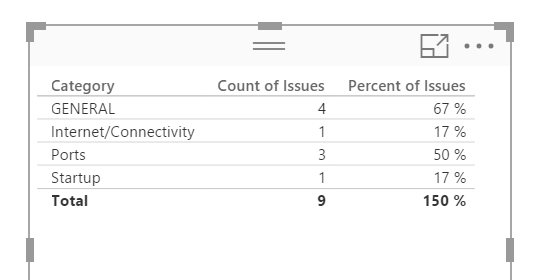
@russm - With the data you posted, I created 2 new columns in Dictionary:
Count of Issues = CALCULATE(COUNTROWS(DISTINCT(Verbatims[UUID])),RELATEDTABLE(Verbatims))
Percent of Issues = [Count of Issues] / COUNTROWS(DISTINCT(Verbatims[UUID]))
I get the visualization:
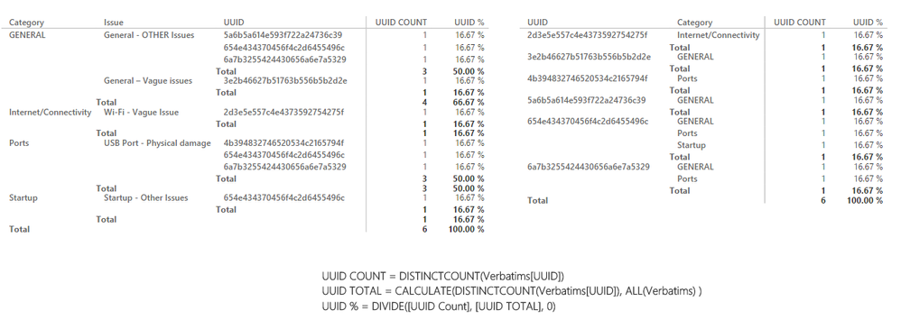
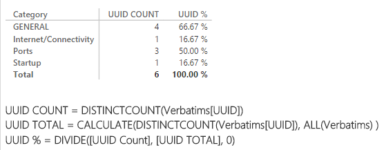
I think I like @Sean's better as it shows the total unique (6) and the percentage comes out to 100%. I guess it is just what makes more sense to your users, not all of the issues adding up to 9 or having 150%. Or, just turn off the totals row and don't tell them.
Follow on LinkedIn
@ me in replies or I'll lose your thread!!!
Instead of a Kudo, please vote for this idea
Become an expert!: Enterprise DNA
External Tools: MSHGQM
YouTube Channel!: Microsoft Hates Greg
Latest book!: DAX For Humans
DAX is easy, CALCULATE makes DAX hard...
- Mark as New
- Bookmark
- Subscribe
- Mute
- Subscribe to RSS Feed
- Permalink
- Report Inappropriate Content
@Sean - Assuming that your formulas are for measures, correct?
Follow on LinkedIn
@ me in replies or I'll lose your thread!!!
Instead of a Kudo, please vote for this idea
Become an expert!: Enterprise DNA
External Tools: MSHGQM
YouTube Channel!: Microsoft Hates Greg
Latest book!: DAX For Humans
DAX is easy, CALCULATE makes DAX hard...
- Mark as New
- Bookmark
- Subscribe
- Mute
- Subscribe to RSS Feed
- Permalink
- Report Inappropriate Content
- Mark as New
- Bookmark
- Subscribe
- Mute
- Subscribe to RSS Feed
- Permalink
- Report Inappropriate Content
So in this example - is this the result you are looking for?
GENERAL => General - OTHER Issues => 50%
=> General - Vague Issues => 50%
GENERAL => => 100%
and so on....
- Mark as New
- Bookmark
- Subscribe
- Mute
- Subscribe to RSS Feed
- Permalink
- Report Inappropriate Content
Thanks for the quick response!
Sort of. What I'm after is more like this (count of issues included for clarity):
| Category | Count of Issues | % of issues by Distinct UUID |
| GENERAL | 4 | 67% |
| Ports | 3 | 50% |
| Startup | 1 | 17% |
| Internet/Connectivity | 1 | 17% |
Where: Distinctcount(Verbatims)[UUID] = 6
(Apologies for the hex code in the original post. I should've just used names)
- Mark as New
- Bookmark
- Subscribe
- Mute
- Subscribe to RSS Feed
- Permalink
- Report Inappropriate Content
@russm - With the data you posted, I created 2 new columns in Dictionary:
Count of Issues = CALCULATE(COUNTROWS(DISTINCT(Verbatims[UUID])),RELATEDTABLE(Verbatims))
Percent of Issues = [Count of Issues] / COUNTROWS(DISTINCT(Verbatims[UUID]))
I get the visualization:
I think I like @Sean's better as it shows the total unique (6) and the percentage comes out to 100%. I guess it is just what makes more sense to your users, not all of the issues adding up to 9 or having 150%. Or, just turn off the totals row and don't tell them.
Follow on LinkedIn
@ me in replies or I'll lose your thread!!!
Instead of a Kudo, please vote for this idea
Become an expert!: Enterprise DNA
External Tools: MSHGQM
YouTube Channel!: Microsoft Hates Greg
Latest book!: DAX For Humans
DAX is easy, CALCULATE makes DAX hard...
- Mark as New
- Bookmark
- Subscribe
- Mute
- Subscribe to RSS Feed
- Permalink
- Report Inappropriate Content
@russm You changed the original data? => I had 9 distinct count and all of a sudden I see 6
- Mark as New
- Bookmark
- Subscribe
- Mute
- Subscribe to RSS Feed
- Permalink
- Report Inappropriate Content
Guilty. I realized right after I posted that the original was not illustrating my concern the way I wanted, I'd thought I caught it before I had any views.
- Mark as New
- Bookmark
- Subscribe
- Mute
- Subscribe to RSS Feed
- Permalink
- Report Inappropriate Content
- Mark as New
- Bookmark
- Subscribe
- Mute
- Subscribe to RSS Feed
- Permalink
- Report Inappropriate Content
@Sean - Assuming that your formulas are for measures, correct?
Follow on LinkedIn
@ me in replies or I'll lose your thread!!!
Instead of a Kudo, please vote for this idea
Become an expert!: Enterprise DNA
External Tools: MSHGQM
YouTube Channel!: Microsoft Hates Greg
Latest book!: DAX For Humans
DAX is easy, CALCULATE makes DAX hard...
- Mark as New
- Bookmark
- Subscribe
- Mute
- Subscribe to RSS Feed
- Permalink
- Report Inappropriate Content
Thank you. This does work against my example. The ratios are a little off when applied to my actual data model. I think I have some ALLEXCEPT work to do which goes beyond the scope of the original ask.
- Mark as New
- Bookmark
- Subscribe
- Mute
- Subscribe to RSS Feed
- Permalink
- Report Inappropriate Content
Yes all Measures.
- Mark as New
- Bookmark
- Subscribe
- Mute
- Subscribe to RSS Feed
- Permalink
- Report Inappropriate Content
Thank you for clarifying this.
Helpful resources

FabCon Global Hackathon
Join the Fabric FabCon Global Hackathon—running virtually through Nov 3. Open to all skill levels. $10,000 in prizes!

Power BI Monthly Update - September 2025
Check out the September 2025 Power BI update to learn about new features.


