FabCon is coming to Atlanta
Join us at FabCon Atlanta from March 16 - 20, 2026, for the ultimate Fabric, Power BI, AI and SQL community-led event. Save $200 with code FABCOMM.
Register now!- Power BI forums
- Get Help with Power BI
- Desktop
- Service
- Report Server
- Power Query
- Mobile Apps
- Developer
- DAX Commands and Tips
- Custom Visuals Development Discussion
- Health and Life Sciences
- Power BI Spanish forums
- Translated Spanish Desktop
- Training and Consulting
- Instructor Led Training
- Dashboard in a Day for Women, by Women
- Galleries
- Data Stories Gallery
- Themes Gallery
- Contests Gallery
- Quick Measures Gallery
- Notebook Gallery
- Translytical Task Flow Gallery
- TMDL Gallery
- R Script Showcase
- Webinars and Video Gallery
- Ideas
- Custom Visuals Ideas (read-only)
- Issues
- Issues
- Events
- Upcoming Events
Calling all Data Engineers! Fabric Data Engineer (Exam DP-700) live sessions are back! Starting October 16th. Sign up.
- Power BI forums
- Forums
- Get Help with Power BI
- Desktop
- Calculating Percentages of a Binary column
- Subscribe to RSS Feed
- Mark Topic as New
- Mark Topic as Read
- Float this Topic for Current User
- Bookmark
- Subscribe
- Printer Friendly Page
- Mark as New
- Bookmark
- Subscribe
- Mute
- Subscribe to RSS Feed
- Permalink
- Report Inappropriate Content
Calculating Percentages of a Binary column
Hi,
I am trying to 1) calculate the percentages of attendance (binary column 1 =attended 0 =not attended) for 10 different modules. The format of the columns is below:
| Module 1 | Module 2 | Module 3 | Module 4 etc. |
| 1 | 0 | 1 | 1 |
| 1 | 1 | 0 | 1 |
| 0 | 1 | 0 | 0 |
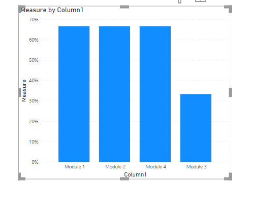
Once I have the percentages of attendance for each of the 10 modules, I would then like to display that in a bar graph showing each of the 10 modules on the x axis and then the percentages on the y.
I created the following measure for one of the modules but am having issues when creating the bar chart.
is this possible to achieve with how the data is formatted?
- Mark as New
- Bookmark
- Subscribe
- Mute
- Subscribe to RSS Feed
- Permalink
- Report Inappropriate Content
is the table your sample data?
What's the expected output?
module 1 66.6%
module 2 33.3%
module 3 66.6%
Did I answer your question? Mark my post as a solution!
Proud to be a Super User!
- Mark as New
- Bookmark
- Subscribe
- Mute
- Subscribe to RSS Feed
- Permalink
- Report Inappropriate Content
yes the sample data is the table above and expected output is ultimately a bar chart with the modules on the x x axis and the percentages for each on the y axis
- Mark as New
- Bookmark
- Subscribe
- Mute
- Subscribe to RSS Feed
- Permalink
- Report Inappropriate Content
you can try this
in PQ
1, use header as first row
2. transpose
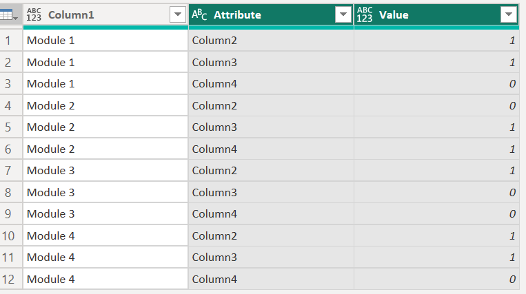
3. select first column and unpivot other columns
then you can create measure (make sure the data type of value column is whole number)
Measure = sum('Table'[Value])/COUNTROWS('Table')
pls see the attachment below
Did I answer your question? Mark my post as a solution!
Proud to be a Super User!
Helpful resources

FabCon Global Hackathon
Join the Fabric FabCon Global Hackathon—running virtually through Nov 3. Open to all skill levels. $10,000 in prizes!

Power BI Monthly Update - September 2025
Check out the September 2025 Power BI update to learn about new features.


