A new Data Days event is coming soon!
This time we’re going bigger than ever. Fabric, Power BI, SQL, AI and more. We're covering it all. You won't want to miss it.
Learn more- Power BI forums
- Get Help with Power BI
- Desktop
- Service
- Report Server
- Power Query
- Mobile Apps
- Developer
- DAX Commands and Tips
- Custom Visuals Development Discussion
- Health and Life Sciences
- Power BI Spanish forums
- Translated Spanish Desktop
- Training and Consulting
- Instructor Led Training
- Dashboard in a Day for Women, by Women
- Galleries
- Data Stories Gallery
- Themes Gallery
- Contests Gallery
- QuickViz Gallery
- Quick Measures Gallery
- Visual Calculations Gallery
- Notebook Gallery
- Translytical Task Flow Gallery
- TMDL Gallery
- R Script Showcase
- Webinars and Video Gallery
- Ideas
- Custom Visuals Ideas (read-only)
- Issues
- Issues
- Events
- Upcoming Events
Did you hear? There's a new SQL AI Developer certification (DP-800). Start preparing now and be one of the first to get certified. Register now
- Power BI forums
- Forums
- Get Help with Power BI
- Desktop
- Re: Calculate Defect Rate
- Subscribe to RSS Feed
- Mark Topic as New
- Mark Topic as Read
- Float this Topic for Current User
- Bookmark
- Subscribe
- Printer Friendly Page
- Mark as New
- Bookmark
- Subscribe
- Mute
- Subscribe to RSS Feed
- Permalink
- Report Inappropriate Content
Calculate Defect Rate
Hello,
I've 2 tables.
- TABLE 1: Defect Data Table
| ITEM | Qty |
| 1A | 8 |
| 2A | 4 |
| 3A | |
| 4A | 5 |
| 5A | |
| 6A | 6 |
| 7A | 6 |
- TABLE 2: Item Receive Data Table
Item | Qty |
| 1A | 15 |
2A | |
| 3A | |
| 4A | 14 |
| 5A | 51 |
| 6A | |
| 7A | 9 |
Expected Result: Consider only items, which has QTY data from both table. (like consider 1A, 4A and 7A only here).
Defect rate = SUM(Defect table (QTY))/ Sum(Item Receive table (QTY))
I need to project defect rate on the line and clustered coulmn chart. Please advise!
- Mark as New
- Bookmark
- Subscribe
- Mute
- Subscribe to RSS Feed
- Permalink
- Report Inappropriate Content
hi, @Anonymous
Create the relationship between Defect Data Table with Item Receive Data Table by Item field.
Then use DIVIDE Function to add a measure:
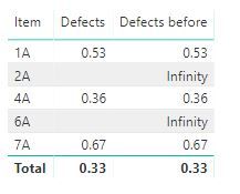
Defects = DIVIDE(SUM(Table16[Qty]),SUM(Table17[Qty]))
If not your case, please share your expected output.
Best Regards,
Lin
If this post helps, then please consider Accept it as the solution to help the other members find it more quickly.
- Mark as New
- Bookmark
- Subscribe
- Mute
- Subscribe to RSS Feed
- Permalink
- Report Inappropriate Content
Hi @v-lili6-msft,
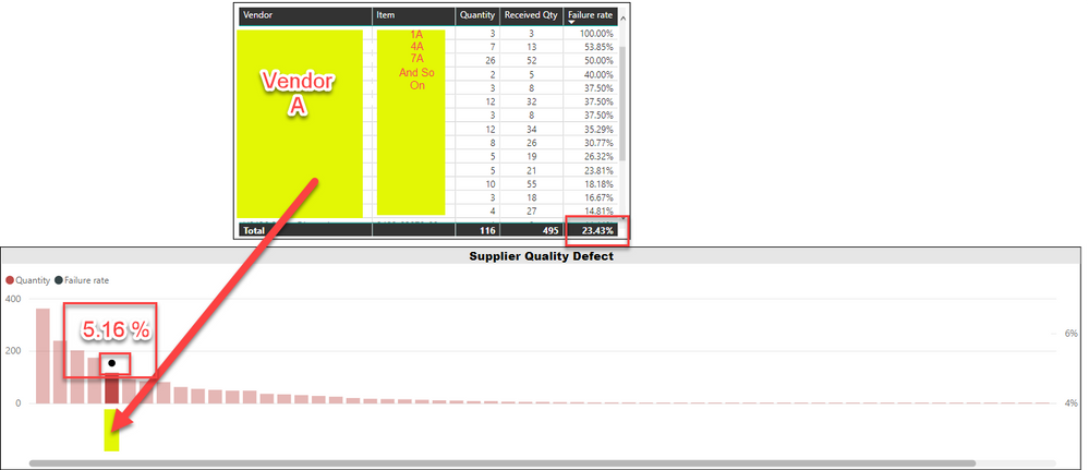
I already had an answer in table (by having filter: Qty (defect table) and Qty (Receive Table) is NOT BLANK) but to have it this defect rate by Vendor on line and bar chart, it's calculating total sum of QTY on both the table and showing a wrong result.
As shown in below image, I got the result in table (23.43 % is expected outcome) but not on the chart (05.16 % not the correct one).
Hope this help. Can you please advise?
- Mark as New
- Bookmark
- Subscribe
- Mute
- Subscribe to RSS Feed
- Permalink
- Report Inappropriate Content
hi, @Anonymous
Could you share your sample pbix file for us to have a test, It is difficult to find out the reason from the screenshot.
You can upload it to Dropbox and post the link here. Do mask sensitive data before uploading
Best Regards,
Lin
If this post helps, then please consider Accept it as the solution to help the other members find it more quickly.
- Mark as New
- Bookmark
- Subscribe
- Mute
- Subscribe to RSS Feed
- Permalink
- Report Inappropriate Content
You should be able to do something like:
Measure =
VAR __table2 = FILTER('Table17',NOT(ISBLANK([Qty])))
VAR __table3 = ADDCOLUMNS(__table2,"__defects",SUMX(RELATEDTABLE('Table16'),[Defects]))
VAR __table4 = FILTER(__table3,NOT(ISBLANK([__defects])))
RETURN
DIVIDE(SUMX(__table4,[__defects]),SUMX(__table4,[Qty]),0)
Follow on LinkedIn
@ me in replies or I'll lose your thread!!!
Instead of a Kudo, please vote for this idea
Become an expert!: Enterprise DNA
External Tools: MSHGQM
YouTube Channel!: Microsoft Hates Greg
Latest book!: DAX For Humans
DAX is easy, CALCULATE makes DAX hard...
Helpful resources

Power BI Monthly Update - April 2026
Check out the April 2026 Power BI update to learn about new features.

Data Days 2026 coming soon!
Sign up to receive a private message when registration opens and key events begin.

New to Fabric Survey
If you have recently started exploring Fabric, we'd love to hear how it's going. Your feedback can help with product improvements.

| User | Count |
|---|---|
| 37 | |
| 32 | |
| 27 | |
| 24 | |
| 17 |
| User | Count |
|---|---|
| 70 | |
| 50 | |
| 31 | |
| 25 | |
| 24 |


