Join us at FabCon Vienna from September 15-18, 2025
The ultimate Fabric, Power BI, SQL, and AI community-led learning event. Save €200 with code FABCOMM.
Get registered- Power BI forums
- Get Help with Power BI
- Desktop
- Service
- Report Server
- Power Query
- Mobile Apps
- Developer
- DAX Commands and Tips
- Custom Visuals Development Discussion
- Health and Life Sciences
- Power BI Spanish forums
- Translated Spanish Desktop
- Training and Consulting
- Instructor Led Training
- Dashboard in a Day for Women, by Women
- Galleries
- Data Stories Gallery
- Themes Gallery
- Contests Gallery
- Quick Measures Gallery
- Notebook Gallery
- Translytical Task Flow Gallery
- TMDL Gallery
- R Script Showcase
- Webinars and Video Gallery
- Ideas
- Custom Visuals Ideas (read-only)
- Issues
- Issues
- Events
- Upcoming Events
Compete to become Power BI Data Viz World Champion! First round ends August 18th. Get started.
- Power BI forums
- Forums
- Get Help with Power BI
- Desktop
- Re: Bubble Chart
- Subscribe to RSS Feed
- Mark Topic as New
- Mark Topic as Read
- Float this Topic for Current User
- Bookmark
- Subscribe
- Printer Friendly Page
- Mark as New
- Bookmark
- Subscribe
- Mute
- Subscribe to RSS Feed
- Permalink
- Report Inappropriate Content
Bubble Chart
Hi,
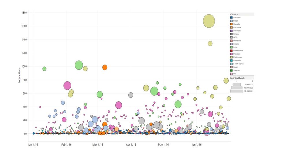
I am developing Power BI reports and I am trying to recreate the attached graph. The scatter chart doesn't work in my case as it doesn't allow to put in the x-axis a timeserie. Till now I manage to make something similar by using either the pulsechart or the spline chart but unfortunetely the first doesn't allow me to colour the bubbles according to the attribute "country" while the second doesn't allow me to give different sizes according to my measurement "post total reach".
Please advice!
- Mark as New
- Bookmark
- Subscribe
- Mute
- Subscribe to RSS Feed
- Permalink
- Report Inappropriate Content
Does putting Country field into the "Legend" section of the scatter graph not colour by Country automatically?
- Mark as New
- Bookmark
- Subscribe
- Mute
- Subscribe to RSS Feed
- Permalink
- Report Inappropriate Content
Yes it does but the problem with the scatter plot is that it doesn't allow to put dates on the x-axis
- Mark as New
- Bookmark
- Subscribe
- Mute
- Subscribe to RSS Feed
- Permalink
- Report Inappropriate Content
I see. This should help: http://community.powerbi.com/t5/Desktop/Scatter-with-date-on-X-and-time-on-Y/m-p/19030
- Mark as New
- Bookmark
- Subscribe
- Mute
- Subscribe to RSS Feed
- Permalink
- Report Inappropriate Content
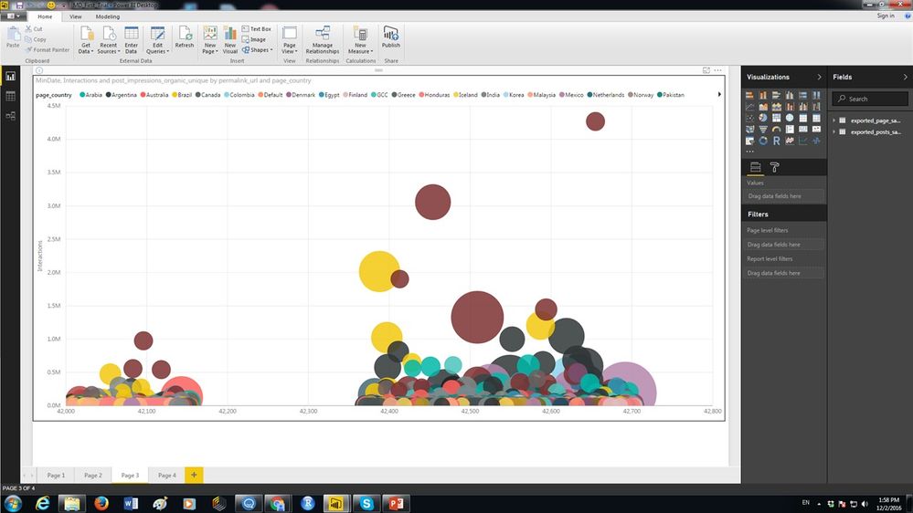
Thank you very much!! That was really helpfull! I manage to make this by creating a new measure with the value of minimum date:
my only problem now is that I wish I could have date format instead of number format which unfortunately I cannot fix it from the Modelling tab.
Any ideas??
- Mark as New
- Bookmark
- Subscribe
- Mute
- Subscribe to RSS Feed
- Permalink
- Report Inappropriate Content
Hi @elenirapti8,
As only aggregated data(value is usually a number) is supported for Axis in Scatter Charts, it is not possible to format the X Axis to date currently. You can vote the similar idea here.![]()
Regards


