FabCon is coming to Atlanta
Join us at FabCon Atlanta from March 16 - 20, 2026, for the ultimate Fabric, Power BI, AI and SQL community-led event. Save $200 with code FABCOMM.
Register now!- Power BI forums
- Get Help with Power BI
- Desktop
- Service
- Report Server
- Power Query
- Mobile Apps
- Developer
- DAX Commands and Tips
- Custom Visuals Development Discussion
- Health and Life Sciences
- Power BI Spanish forums
- Translated Spanish Desktop
- Training and Consulting
- Instructor Led Training
- Dashboard in a Day for Women, by Women
- Galleries
- Data Stories Gallery
- Themes Gallery
- Contests Gallery
- Quick Measures Gallery
- Notebook Gallery
- Translytical Task Flow Gallery
- TMDL Gallery
- R Script Showcase
- Webinars and Video Gallery
- Ideas
- Custom Visuals Ideas (read-only)
- Issues
- Issues
- Events
- Upcoming Events
Join the Fabric FabCon Global Hackathon—running virtually through Nov 3. Open to all skill levels. $10,000 in prizes! Register now.
- Power BI forums
- Forums
- Get Help with Power BI
- Desktop
- Breakdowns responsive to varius data cut choices i...
- Subscribe to RSS Feed
- Mark Topic as New
- Mark Topic as Read
- Float this Topic for Current User
- Bookmark
- Subscribe
- Printer Friendly Page
- Mark as New
- Bookmark
- Subscribe
- Mute
- Subscribe to RSS Feed
- Permalink
- Report Inappropriate Content
Breakdowns responsive to varius data cut choices in waterfall PBI charts
Hi All,
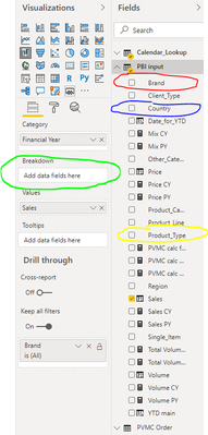
I am looking for a solution, to prepare a changable waterfall chart, which will be showing the sales development by year, but depending on a slicer selection, the YoY change will be either broken down by products, or by countries, or by brands, etc.
To be more precise, I need to prepare a measure, to be used in the green field on the picture below, which depending on the slicer selection, will either put red, blue or yellow data field there:
Can you help me prepare such measure or point me towards different solution?
Solved! Go to Solution.
- Mark as New
- Bookmark
- Subscribe
- Mute
- Subscribe to RSS Feed
- Permalink
- Report Inappropriate Content
Hi @Anonymous
I think what you are looking to achieve is possible with a combination of Buttons and Bookmarks as demonstrated in the article below.
https://radacad.com/bookmarks-and-buttons-making-power-bi-charts-even-more-interactive
Slicers can not switch visuals and Measures return a scalar value.
Mariusz
If this post helps, then please consider Accepting it as the solution.
Please feel free to connect with me.
- Mark as New
- Bookmark
- Subscribe
- Mute
- Subscribe to RSS Feed
- Permalink
- Report Inappropriate Content
Thank you Mariusz, I believe this should work fine!


