FabCon is coming to Atlanta
Join us at FabCon Atlanta from March 16 - 20, 2026, for the ultimate Fabric, Power BI, AI and SQL community-led event. Save $200 with code FABCOMM.
Register now!- Power BI forums
- Get Help with Power BI
- Desktop
- Service
- Report Server
- Power Query
- Mobile Apps
- Developer
- DAX Commands and Tips
- Custom Visuals Development Discussion
- Health and Life Sciences
- Power BI Spanish forums
- Translated Spanish Desktop
- Training and Consulting
- Instructor Led Training
- Dashboard in a Day for Women, by Women
- Galleries
- Data Stories Gallery
- Themes Gallery
- Contests Gallery
- QuickViz Gallery
- Quick Measures Gallery
- Visual Calculations Gallery
- Notebook Gallery
- Translytical Task Flow Gallery
- TMDL Gallery
- R Script Showcase
- Webinars and Video Gallery
- Ideas
- Custom Visuals Ideas (read-only)
- Issues
- Issues
- Events
- Upcoming Events
The Power BI Data Visualization World Championships is back! Get ahead of the game and start preparing now! Learn more
- Power BI forums
- Forums
- Get Help with Power BI
- Desktop
- Breakdowns responsive to varius data cut choices i...
- Subscribe to RSS Feed
- Mark Topic as New
- Mark Topic as Read
- Float this Topic for Current User
- Bookmark
- Subscribe
- Printer Friendly Page
- Mark as New
- Bookmark
- Subscribe
- Mute
- Subscribe to RSS Feed
- Permalink
- Report Inappropriate Content
Breakdowns responsive to varius data cut choices in waterfall PBI charts
Hi All,
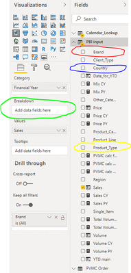
I am looking for a solution, to prepare a changable waterfall chart, which will be showing the sales development by year, but depending on a slicer selection, the YoY change will be either broken down by products, or by countries, or by brands, etc.
To be more precise, I need to prepare a measure, to be used in the green field on the picture below, which depending on the slicer selection, will either put red, blue or yellow data field there:
Can you help me prepare such measure or point me towards different solution?
Solved! Go to Solution.
- Mark as New
- Bookmark
- Subscribe
- Mute
- Subscribe to RSS Feed
- Permalink
- Report Inappropriate Content
Hi @Anonymous
I think what you are looking to achieve is possible with a combination of Buttons and Bookmarks as demonstrated in the article below.
https://radacad.com/bookmarks-and-buttons-making-power-bi-charts-even-more-interactive
Slicers can not switch visuals and Measures return a scalar value.
Mariusz
If this post helps, then please consider Accepting it as the solution.
Please feel free to connect with me.
- Mark as New
- Bookmark
- Subscribe
- Mute
- Subscribe to RSS Feed
- Permalink
- Report Inappropriate Content
Thank you Mariusz, I believe this should work fine!
Helpful resources

Power BI Dataviz World Championships
The Power BI Data Visualization World Championships is back! Get ahead of the game and start preparing now!

Power BI Monthly Update - November 2025
Check out the November 2025 Power BI update to learn about new features.

| User | Count |
|---|---|
| 59 | |
| 46 | |
| 42 | |
| 23 | |
| 18 |
| User | Count |
|---|---|
| 193 | |
| 124 | |
| 101 | |
| 67 | |
| 49 |

