FabCon is coming to Atlanta
Join us at FabCon Atlanta from March 16 - 20, 2026, for the ultimate Fabric, Power BI, AI and SQL community-led event. Save $200 with code FABCOMM.
Register now!- Power BI forums
- Get Help with Power BI
- Desktop
- Service
- Report Server
- Power Query
- Mobile Apps
- Developer
- DAX Commands and Tips
- Custom Visuals Development Discussion
- Health and Life Sciences
- Power BI Spanish forums
- Translated Spanish Desktop
- Training and Consulting
- Instructor Led Training
- Dashboard in a Day for Women, by Women
- Galleries
- Data Stories Gallery
- Themes Gallery
- Contests Gallery
- QuickViz Gallery
- Quick Measures Gallery
- Visual Calculations Gallery
- Notebook Gallery
- Translytical Task Flow Gallery
- TMDL Gallery
- R Script Showcase
- Webinars and Video Gallery
- Ideas
- Custom Visuals Ideas (read-only)
- Issues
- Issues
- Events
- Upcoming Events
Learn from the best! Meet the four finalists headed to the FINALS of the Power BI Dataviz World Championships! Register now
- Power BI forums
- Forums
- Get Help with Power BI
- Desktop
- Basic But so Frustrating - Help!!!
- Subscribe to RSS Feed
- Mark Topic as New
- Mark Topic as Read
- Float this Topic for Current User
- Bookmark
- Subscribe
- Printer Friendly Page
- Mark as New
- Bookmark
- Subscribe
- Mute
- Subscribe to RSS Feed
- Permalink
- Report Inappropriate Content
Basic But so Frustrating - Help!!!
Hi Everyone, this is doing my head in, and I cannot figure out how to resolve so any guidance would be appreciated.
I have a table with 2 columns, Date and Duration as shown below:
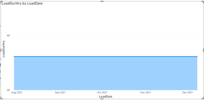
the 'LoadDate' is shown by day, eg 08/12/2021, however, when i drop these values into a graph to plot load duration by day, PowerBi is displaying the dates grouped as month, as shown below:
There is no date hierachy built into this field, and it is formated as a date field, I have also turned off all the date/time grouping for this workbook in settings, but I still cannot for the life of me change the graph to show by actual day date as shown in the table screenshot.
Any ideas?
thanks
Paul
Solved! Go to Solution.
- Mark as New
- Bookmark
- Subscribe
- Mute
- Subscribe to RSS Feed
- Permalink
- Report Inappropriate Content
Hi @xPJRx
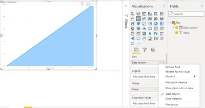
Try this.
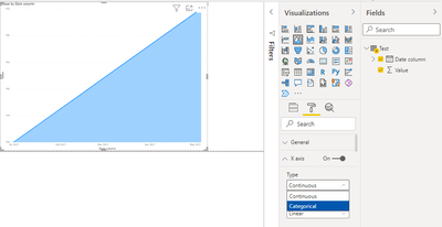
All you have to do is go to Format->X Axis->Type->Categorical.
Third image has solution.
Thanks,
Thingsclump team
- Mark as New
- Bookmark
- Subscribe
- Mute
- Subscribe to RSS Feed
- Permalink
- Report Inappropriate Content
Hi @xPJRx
Try this.
All you have to do is go to Format->X Axis->Type->Categorical.
Third image has solution.
Thanks,
Thingsclump team
- Mark as New
- Bookmark
- Subscribe
- Mute
- Subscribe to RSS Feed
- Permalink
- Report Inappropriate Content
Knew it would be something so simple.
Thanks for your reply, most appreciated, tested and works just fine 🙂
- Mark as New
- Bookmark
- Subscribe
- Mute
- Subscribe to RSS Feed
- Permalink
- Report Inappropriate Content
@xPJRx , Make sure you are taking the sum of load duration , not the count
Can you share sample data and sample output in table format? Or a sample pbix after removing sensitive data.
Helpful resources

Join our Fabric User Panel
Share feedback directly with Fabric product managers, participate in targeted research studies and influence the Fabric roadmap.

Power BI Monthly Update - February 2026
Check out the February 2026 Power BI update to learn about new features.

| User | Count |
|---|---|
| 50 | |
| 49 | |
| 35 | |
| 15 | |
| 14 |
| User | Count |
|---|---|
| 91 | |
| 75 | |
| 41 | |
| 26 | |
| 25 |


