A new Data Days event is coming soon!
This time we’re going bigger than ever. Fabric, Power BI, SQL, AI and more. We're covering it all. You won't want to miss it.
Learn more- Power BI forums
- Get Help with Power BI
- Desktop
- Service
- Report Server
- Power Query
- Mobile Apps
- Developer
- DAX Commands and Tips
- Custom Visuals Development Discussion
- Health and Life Sciences
- Power BI Spanish forums
- Translated Spanish Desktop
- Training and Consulting
- Instructor Led Training
- Dashboard in a Day for Women, by Women
- Galleries
- Data Stories Gallery
- Themes Gallery
- Contests Gallery
- QuickViz Gallery
- Quick Measures Gallery
- Visual Calculations Gallery
- Notebook Gallery
- Translytical Task Flow Gallery
- TMDL Gallery
- R Script Showcase
- Webinars and Video Gallery
- Ideas
- Custom Visuals Ideas (read-only)
- Issues
- Issues
- Events
- Upcoming Events
Level up your Power BI skills this month - build one visual each week and tell better stories with data! Get started
- Power BI forums
- Forums
- Get Help with Power BI
- Desktop
- Bar-chart conditional formatting
- Subscribe to RSS Feed
- Mark Topic as New
- Mark Topic as Read
- Float this Topic for Current User
- Bookmark
- Subscribe
- Printer Friendly Page
- Mark as New
- Bookmark
- Subscribe
- Mute
- Subscribe to RSS Feed
- Permalink
- Report Inappropriate Content
Bar-chart conditional formatting
In the new format pane of the new version I can no longer find the Conditional formatting option for bar chart.
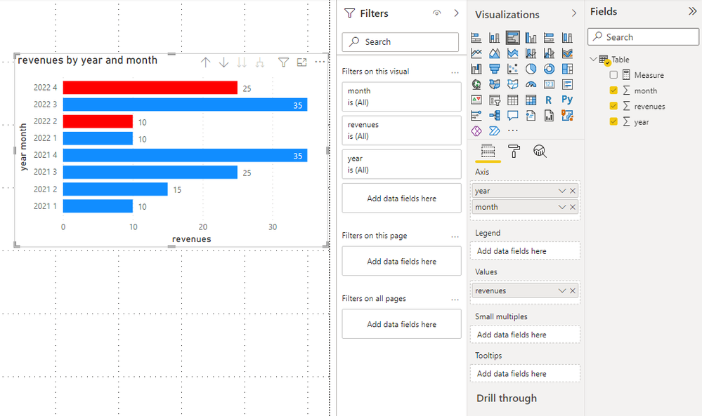
Is there a way to format the bar color in some way (dax maybe)? I've got x-axis=month, legenda=year, y-axis=revenues: I'd like to simply filter only last two years and show current year bar in red if the revenue is lower than previous year.
Thanks for support!
Solved! Go to Solution.
- Mark as New
- Bookmark
- Subscribe
- Mute
- Subscribe to RSS Feed
- Permalink
- Report Inappropriate Content
Hi @AGo ,
If you have something in the legend field, you cannot use formatting.
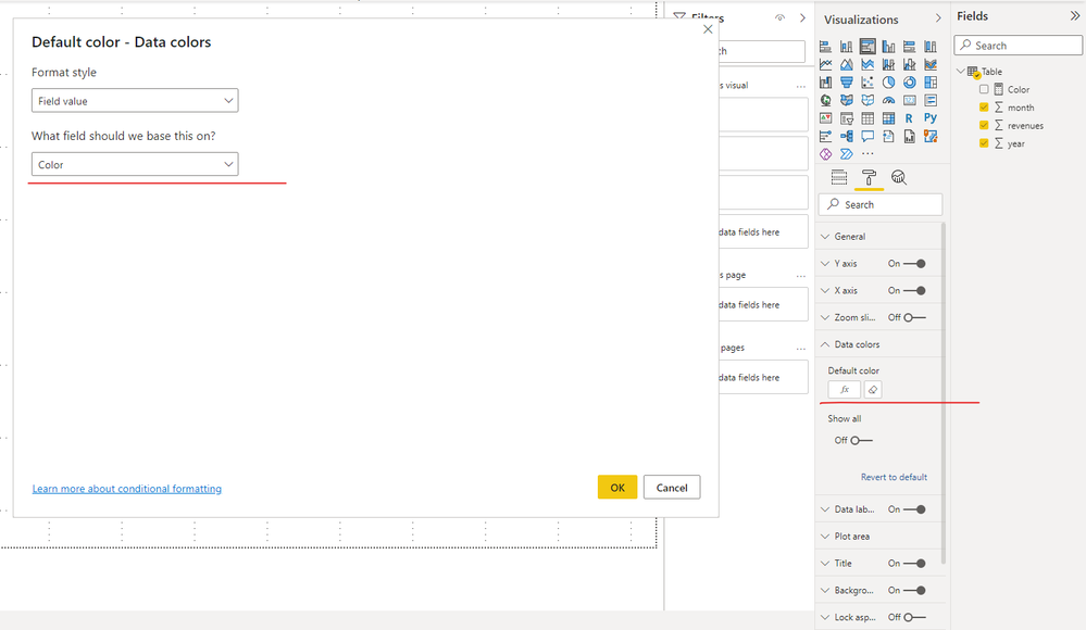
It is suggested to put year and month into x-axis and set color.
You could create a measure like
Color =
VAR _currentyear =
    CALCULATE (
        SUM ( 'Table'[revenues] ),
        FILTER (
            ALLSELECTED ( 'Table' ),
            [month] = MAX ( 'Table'[month] )
                && [year] = MAX ( 'Table'[year] )
        )
    )
VAR _lastyear =
    CALCULATE (
        SUM ( 'Table'[revenues] ),
        FILTER (
            ALLSELECTED ( 'Table' ),
            [month] = MAX ( 'Table'[month] )
                && [year]
                    = MAX ( 'Table'[year] ) - 1
        )
    )
RETURN
    IF ( _currentyear < _lastyear, "red" )
Then add the measure into data colors.
You could check more details from my attachment.
Best Regards,
Stephen Tao
If this post helps, then please consider Accept it as the solution to help the other members find it more quickly.
- Mark as New
- Bookmark
- Subscribe
- Mute
- Subscribe to RSS Feed
- Permalink
- Report Inappropriate Content
- Hello,
- What if I will be having continous 12 months. Just need to apply conditional formatting to all months in same bar chart.
- Because the previous answer is not working
Helpful resources

Power BI Monthly Update - April 2026
Check out the April 2026 Power BI update to learn about new features.

Data Days 2026 coming soon!
Sign up to receive a private message when registration opens and key events begin.

New to Fabric Survey
If you have recently started exploring Fabric, we'd love to hear how it's going. Your feedback can help with product improvements.

| User | Count |
|---|---|
| 38 | |
| 29 | |
| 28 | |
| 20 | |
| 18 |
| User | Count |
|---|---|
| 66 | |
| 34 | |
| 31 | |
| 25 | |
| 23 |


