FabCon is coming to Atlanta
Join us at FabCon Atlanta from March 16 - 20, 2026, for the ultimate Fabric, Power BI, AI and SQL community-led event. Save $200 with code FABCOMM.
Register now!- Power BI forums
- Get Help with Power BI
- Desktop
- Service
- Report Server
- Power Query
- Mobile Apps
- Developer
- DAX Commands and Tips
- Custom Visuals Development Discussion
- Health and Life Sciences
- Power BI Spanish forums
- Translated Spanish Desktop
- Training and Consulting
- Instructor Led Training
- Dashboard in a Day for Women, by Women
- Galleries
- Data Stories Gallery
- Themes Gallery
- Contests Gallery
- Quick Measures Gallery
- Notebook Gallery
- Translytical Task Flow Gallery
- TMDL Gallery
- R Script Showcase
- Webinars and Video Gallery
- Ideas
- Custom Visuals Ideas (read-only)
- Issues
- Issues
- Events
- Upcoming Events
Calling all Data Engineers! Fabric Data Engineer (Exam DP-700) live sessions are back! Starting October 16th. Sign up.
- Power BI forums
- Forums
- Get Help with Power BI
- Desktop
- Bar chart - cluster x-axis and show bars for each ...
- Subscribe to RSS Feed
- Mark Topic as New
- Mark Topic as Read
- Float this Topic for Current User
- Bookmark
- Subscribe
- Printer Friendly Page
- Mark as New
- Bookmark
- Subscribe
- Mute
- Subscribe to RSS Feed
- Permalink
- Report Inappropriate Content
Bar chart - cluster x-axis and show bars for each cluster
Hi,
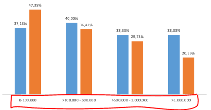
I am looking for a way to cluster x-axis like below and add to bars to each. Below is the table with the data imported to BI from Excel.
Year | 0-100.000 | 100.000-500.000 | 500.000-1.000.000 | >1.000.000 |
| 2020 | 37,13% | 40,0% | 33,33% | 33,33 |
| 2021 | 47,45% | 36,41% | 29,27% | 20,59 |
Thanks
Thomas
Solved! Go to Solution.
- Mark as New
- Bookmark
- Subscribe
- Mute
- Subscribe to RSS Feed
- Permalink
- Report Inappropriate Content
@Anonymous ,
DO the following steps:
Step 1: Go to Transform Query Editor
Step 2: Select all the columns except Year and click on "Unpivot Columns" under Transform tab.
Step 3: Save and close the Query Editor.
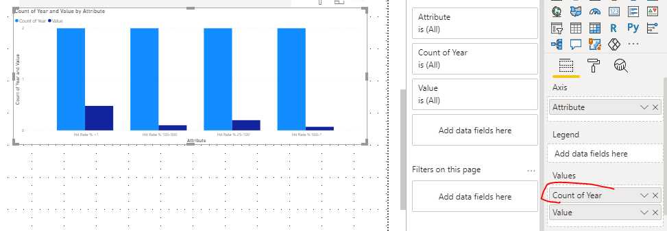
Step 4: Take the Cluster column chart from visualzation pane and enter needed values on axis and value property.
Attaching screen shot for your reference:
Please take a quick glance at newly created dashboards : Restaurant Management Dashboard , HR Analytics Report , Hotel Management Report, Sales Analysis Report , Fortune 500 Companies Analysis , Revenue Tracking Dashboard
- Mark as New
- Bookmark
- Subscribe
- Mute
- Subscribe to RSS Feed
- Permalink
- Report Inappropriate Content
@Tahreem24
Great job! thx.
One thing I can't get to work is the year. Somehow mine is counting. Any trick for that?
Best
Thomas
- Mark as New
- Bookmark
- Subscribe
- Mute
- Subscribe to RSS Feed
- Permalink
- Report Inappropriate Content
@Anonymous Good to know that my solution is working for you.
Just try to use SUM instaed of Count like below:
Please take a quick glance at newly created dashboards : Restaurant Management Dashboard , HR Analytics Report , Hotel Management Report, Sales Analysis Report , Fortune 500 Companies Analysis , Revenue Tracking Dashboard
- Mark as New
- Bookmark
- Subscribe
- Mute
- Subscribe to RSS Feed
- Permalink
- Report Inappropriate Content
Hi @Tahreem24 ,
Thanks for your effort.
I noticed this method is summing "year", which makes the bar chart look wrong.
The sum is 4041 (2020+2021) for below chart. Instead it should return two bars with each value from below table.
Hope it makes sense 🙂
- Mark as New
- Bookmark
- Subscribe
- Mute
- Subscribe to RSS Feed
- Permalink
- Report Inappropriate Content
HI @Anonymous,
Have you tried to move your year field to the legend fields of your chart? It should display and summary the value of your records based on attribute and year groups.
Regards,
Xiaoxin Sheng
- Mark as New
- Bookmark
- Subscribe
- Mute
- Subscribe to RSS Feed
- Permalink
- Report Inappropriate Content
@Anonymous ,
Make the year column to Text data type.
Please take a quick glance at newly created dashboards : Restaurant Management Dashboard , HR Analytics Report , Hotel Management Report, Sales Analysis Report , Fortune 500 Companies Analysis , Revenue Tracking Dashboard
Helpful resources

FabCon Global Hackathon
Join the Fabric FabCon Global Hackathon—running virtually through Nov 3. Open to all skill levels. $10,000 in prizes!

Power BI Monthly Update - September 2025
Check out the September 2025 Power BI update to learn about new features.


