FabCon is coming to Atlanta
Join us at FabCon Atlanta from March 16 - 20, 2026, for the ultimate Fabric, Power BI, AI and SQL community-led event. Save $200 with code FABCOMM.
Register now!- Power BI forums
- Get Help with Power BI
- Desktop
- Service
- Report Server
- Power Query
- Mobile Apps
- Developer
- DAX Commands and Tips
- Custom Visuals Development Discussion
- Health and Life Sciences
- Power BI Spanish forums
- Translated Spanish Desktop
- Training and Consulting
- Instructor Led Training
- Dashboard in a Day for Women, by Women
- Galleries
- Data Stories Gallery
- Themes Gallery
- Contests Gallery
- QuickViz Gallery
- Quick Measures Gallery
- Visual Calculations Gallery
- Notebook Gallery
- Translytical Task Flow Gallery
- TMDL Gallery
- R Script Showcase
- Webinars and Video Gallery
- Ideas
- Custom Visuals Ideas (read-only)
- Issues
- Issues
- Events
- Upcoming Events
The Power BI Data Visualization World Championships is back! Get ahead of the game and start preparing now! Learn more
- Power BI forums
- Forums
- Get Help with Power BI
- Desktop
- Re: Average of average for a calculated measure
- Subscribe to RSS Feed
- Mark Topic as New
- Mark Topic as Read
- Float this Topic for Current User
- Bookmark
- Subscribe
- Printer Friendly Page
- Mark as New
- Bookmark
- Subscribe
- Mute
- Subscribe to RSS Feed
- Permalink
- Report Inappropriate Content
Average of average for a calculated measure
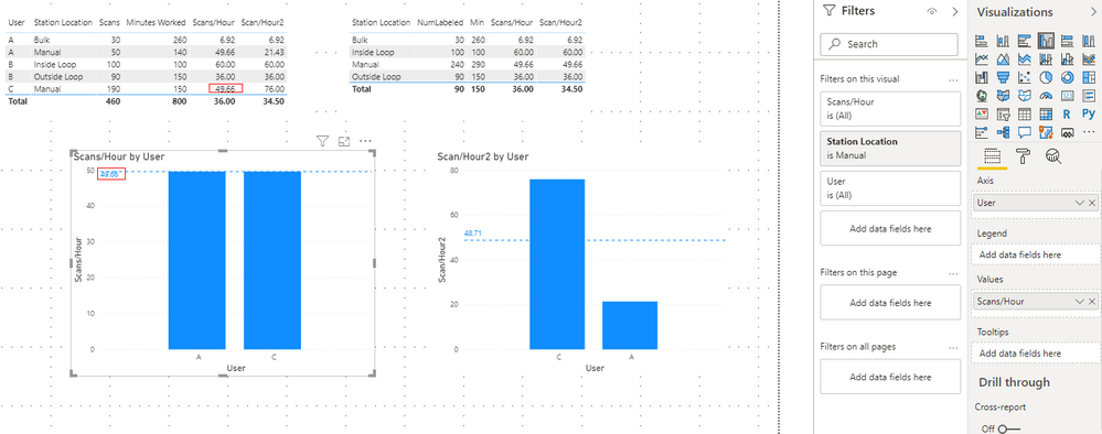
I'm trying to get show a category average line on a calcualted measure however PowerBI is calulating an average of the averages. I want to use the underlying average for each area. In the figure attached I want the dotted line on the graph (49.83) to match the value in the table (manual 53.58). Tried playing around with caluculate Allexcept without luck. Thanks.
- Mark as New
- Bookmark
- Subscribe
- Mute
- Subscribe to RSS Feed
- Permalink
- Report Inappropriate Content
I know this is an old thread, but in case anyone comes across this like I did...
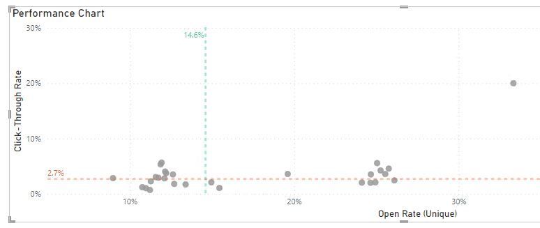
I was trying to show the measure lines in a scatter plot -- in my case, a total open rate and click-through rate for the month. But using the graph's average line feature was not calculating this in the way I wanted -- it averaged the percentages, when I was looking for the sum of all clicks / sum of all opens, matching my KPI above.
So instead, I used the X and Y Constant Lines options, and selected my measure to use as the value (vs. a static value). Remove other average lines, if you have them on. This worked, and also is responsive to my date slider and filters.


- Mark as New
- Bookmark
- Subscribe
- Mute
- Subscribe to RSS Feed
- Permalink
- Report Inappropriate Content
It is somewhat helpful to show the dotted line average for the chart on the left (scans/hour by user) matches the location average. However what I want is the dotted line avarage from the first graph on the left to replace the dotted line average on the second graph on the left (scan/hour2 by User). So I can have just one column graph that shows the users individual average versus the location average. So I would like the graph on the right to have a dotted line average with a value of the dotted line average of the graph on the left (change 48.71 to 49.66).
Thanks,
Brian
- Mark as New
- Bookmark
- Subscribe
- Mute
- Subscribe to RSS Feed
- Permalink
- Report Inappropriate Content
Hi @brianfase
Could you tell me if your problem has been solved? If it is, kindly Accept it as the solution. More people will benefit from it. Or you are still confused about it, please provide me with more details about your data model and your problem or share me with your pbix file from your onedrive business.
Best Regards,
Rico Zhou
- Mark as New
- Bookmark
- Subscribe
- Mute
- Subscribe to RSS Feed
- Permalink
- Report Inappropriate Content
Hi @brianfase
I build a table as your sample.
I build two kind of measure to calculate Scan/Hours:
First one:
Min = CALCULATE(SUM('Table'[Minutes Worked]),FILTER(ALL('Table'),'Table'[Station Location]=MAX('Table'[Station Location])))NumLabeled = CALCULATE(SUM('Table'[Scans]),FILTER(ALL('Table'),'Table'[Station Location]=MAX('Table'[Station Location])))Scans/Hour = [NumLabeled]/[Min]*60Second one:
Scan/Hour2 = SUM('Table'[Scans])/SUM('Table'[Minutes Worked])*60And I use two measure to build Cluster Column chart.
Result:
Select Manual in Filters:
You may have a try First one, I hope this could help you.
If this reply still couldn’t help you to solve this problem, please provide me your more details about the calculate logic of NumLabeled and Mins in this measure: Scans/Hour = SUM(LabelerNumbers[NumLabeled])/SUM(LabelerNumbers[Mins])*60.
And ID NUMBER is not contained in your example , please show me more values or you can share me with your pbix file from your Onedrive for Business.
You can download the pbix file from this link: Average of average for a calculated measure
Best Regards,
Rico Zhou
If this post helps, then please consider Accept it as the solution to help the other members find it more quickly.
- Mark as New
- Bookmark
- Subscribe
- Mute
- Subscribe to RSS Feed
- Permalink
- Report Inappropriate Content
@brianfase , you are using Sum(A)/Sum(B). That seems right.
seems like you are looking for
average(summarize(all(Table),Table[station location],"_avg",[Avg Measure]),[_1])
- Mark as New
- Bookmark
- Subscribe
- Mute
- Subscribe to RSS Feed
- Permalink
- Report Inappropriate Content
@brianfase are you using a measure for Avg. What is that measure? seems like it is ignoring the filter.
I would ❤ Kudos if my solution helped. 👉 If you can spend time posting the question, you can also make efforts to give Kudos whoever helped to solve your problem. It is a token of appreciation!
⚡Visit us at https://perytus.com, your one-stop-shop for Power BI-related projects/training/consultancy.⚡
Subscribe to the @PowerBIHowTo YT channel for an upcoming video on List and Record functions in Power Query!!
Learn Power BI and Fabric - subscribe to our YT channel - Click here: @PowerBIHowTo
If my solution proved useful, I'd be delighted to receive Kudos. When you put effort into asking a question, it's equally thoughtful to acknowledge and give Kudos to the individual who helped you solve the problem. It's a small gesture that shows appreciation and encouragement! ❤
Did I answer your question? Mark my post as a solution. Proud to be a Super User! Appreciate your Kudos 🙂
Feel free to email me with any of your BI needs.
- Mark as New
- Bookmark
- Subscribe
- Mute
- Subscribe to RSS Feed
- Permalink
- Report Inappropriate Content
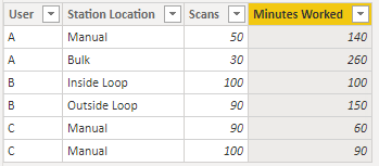
The underlying data is basically like this:
| User | Station Location | Scans | Minutes Worked |
| A | Manual | 50 | 140 |
| A | Bulk | 30 | 260 |
| B | Inside Loop | 100 | 100 |
| B | Outside Loop | 90 | 150 |
| C | Manual | 90 | 60 |
| C | Manual | 100 | 90 |
I have a calculated measure to get the average scans per hour using:
- Mark as New
- Bookmark
- Subscribe
- Mute
- Subscribe to RSS Feed
- Permalink
- Report Inappropriate Content
@brianfase oh so you are adding an average line from the analytical pane, not your own measure, not sure how this avg on analytical pane works, try your own measure (i guess) but I expect analytical pane to work with filters.
Subscribe to the @PowerBIHowTo YT channel for an upcoming video on List and Record functions in Power Query!!
Learn Power BI and Fabric - subscribe to our YT channel - Click here: @PowerBIHowTo
If my solution proved useful, I'd be delighted to receive Kudos. When you put effort into asking a question, it's equally thoughtful to acknowledge and give Kudos to the individual who helped you solve the problem. It's a small gesture that shows appreciation and encouragement! ❤
Did I answer your question? Mark my post as a solution. Proud to be a Super User! Appreciate your Kudos 🙂
Feel free to email me with any of your BI needs.
- Mark as New
- Bookmark
- Subscribe
- Mute
- Subscribe to RSS Feed
- Permalink
- Report Inappropriate Content
@brianfase I just checked the docs for analytics pane and seems like it should work with filter, I have to reproduce/test at my end and see how it works? Interesting thing to look at.
Subscribe to the @PowerBIHowTo YT channel for an upcoming video on List and Record functions in Power Query!!
Learn Power BI and Fabric - subscribe to our YT channel - Click here: @PowerBIHowTo
If my solution proved useful, I'd be delighted to receive Kudos. When you put effort into asking a question, it's equally thoughtful to acknowledge and give Kudos to the individual who helped you solve the problem. It's a small gesture that shows appreciation and encouragement! ❤
Did I answer your question? Mark my post as a solution. Proud to be a Super User! Appreciate your Kudos 🙂
Feel free to email me with any of your BI needs.
- Mark as New
- Bookmark
- Subscribe
- Mute
- Subscribe to RSS Feed
- Permalink
- Report Inappropriate Content
No it is my own calculated measure applied to both the table and the graph. I just have the table on the side to check my numbers on the graph to see when I try something different if I can get the correct number to display. I tried the formula you provided however I am not sure if I am implementing it correctly because it gives me an error:
Too many arguments were passed to the AVERAGE function. The maximum argument count for the function is 1
here is what I have:
- Mark as New
- Bookmark
- Subscribe
- Mute
- Subscribe to RSS Feed
- Permalink
- Report Inappropriate Content
Sorry yes I was trying to add an average from the anylitical pane. However the average that it uses is an average of the averages unless there is some kind of settings to change that. So when I compare it to the tabel average for the area sum A/Sum B the numbers don't match.
- Mark as New
- Bookmark
- Subscribe
- Mute
- Subscribe to RSS Feed
- Permalink
- Report Inappropriate Content
@brianfase super confusing, not sure how to help
Subscribe to the @PowerBIHowTo YT channel for an upcoming video on List and Record functions in Power Query!!
Learn Power BI and Fabric - subscribe to our YT channel - Click here: @PowerBIHowTo
If my solution proved useful, I'd be delighted to receive Kudos. When you put effort into asking a question, it's equally thoughtful to acknowledge and give Kudos to the individual who helped you solve the problem. It's a small gesture that shows appreciation and encouragement! ❤
Did I answer your question? Mark my post as a solution. Proud to be a Super User! Appreciate your Kudos 🙂
Feel free to email me with any of your BI needs.
Helpful resources

Power BI Dataviz World Championships
The Power BI Data Visualization World Championships is back! Get ahead of the game and start preparing now!

Power BI Monthly Update - November 2025
Check out the November 2025 Power BI update to learn about new features.

| User | Count |
|---|---|
| 59 | |
| 43 | |
| 42 | |
| 23 | |
| 17 |
| User | Count |
|---|---|
| 190 | |
| 122 | |
| 96 | |
| 66 | |
| 47 |


