Join the #PBI10 DataViz contest
Power BI is turning 10, and we’re marking the occasion with a special community challenge. Use your creativity to tell a story, uncover trends, or highlight something unexpected.
Get started- Power BI forums
- Get Help with Power BI
- Desktop
- Service
- Report Server
- Power Query
- Mobile Apps
- Developer
- DAX Commands and Tips
- Custom Visuals Development Discussion
- Health and Life Sciences
- Power BI Spanish forums
- Translated Spanish Desktop
- Training and Consulting
- Instructor Led Training
- Dashboard in a Day for Women, by Women
- Galleries
- Webinars and Video Gallery
- Data Stories Gallery
- Themes Gallery
- Contests Gallery
- Quick Measures Gallery
- Notebook Gallery
- Translytical Task Flow Gallery
- R Script Showcase
- Ideas
- Custom Visuals Ideas (read-only)
- Issues
- Issues
- Events
- Upcoming Events
Join us for an expert-led overview of the tools and concepts you'll need to become a Certified Power BI Data Analyst and pass exam PL-300. Register now.
- Power BI forums
- Forums
- Get Help with Power BI
- Desktop
- Re: Aggregate sum not available for numeric slicer...
- Subscribe to RSS Feed
- Mark Topic as New
- Mark Topic as Read
- Float this Topic for Current User
- Bookmark
- Subscribe
- Printer Friendly Page
- Mark as New
- Bookmark
- Subscribe
- Mute
- Subscribe to RSS Feed
- Permalink
- Report Inappropriate Content
Aggregate sum not available for numeric slicer/slider
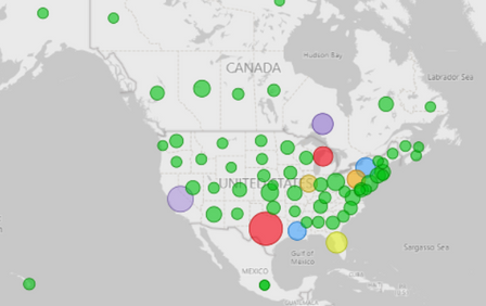
I have created a map that sums membership counts by state.
Fine. Nice bubbles sized by aggregate summary count.
Task: I have created a numeric 'between' slicer/slider to filter results down to only those states with a membership count between x and y.
Problem: The slicer/slider is being created at the detail row level (0 or 1 count for each row) rather than the aggregate summary count per state level as shown in its related bubble map visual.
Question: Can I create a slider control based upon the aggregate summary state count (ex. 1,234 for Texas) rather than the detail row count (1)?
- Mark as New
- Bookmark
- Subscribe
- Mute
- Subscribe to RSS Feed
- Permalink
- Report Inappropriate Content
Thanks for the interest.
Simply put, the below table shows some example source data. Each row has a 0 or 1 for Membership_Count.
The visual above's bubble amounts show the summation of Membership_Count (e.g. 2 for CT, 5 for CA, 7 for TX, 4 for FL, 5 for MI, 0 for LA and NC). This is correct.
The slider shows only 0 to 1, representing Membership_Count on each detail record. This is incorrect.
I'd like the slider to represent State_Province totals from the smallest (e.g. 0 for LA and NC) to largest (e.g. 7 for TX).
Outside of pre-populating the source data with the totals on each row is there a way for PowerBI to do with the slider what it did for the bubbles - sum the total by State_Province.
| Member_Number | Membership_Count | State_Province |
| 123456 | 1 | CT |
| 123457 | 1 | CT |
| 123458 | 1 | CA |
| 123459 | 1 | CA |
| 123460 | 1 | CA |
| 123461 | 1 | CA |
| 123462 | 1 | CA |
| 123463 | 0 | NC |
| 123464 | 1 | TX |
| 123465 | 1 | TX |
| 123466 | 1 | TX |
| 123467 | 1 | TX |
| 123468 | 1 | TX |
| 123469 | 1 | TX |
| 123470 | 1 | TX |
| 123471 | 1 | FL |
| 123472 | 1 | FL |
| 123473 | 1 | FL |
| 123474 | 1 | FL |
| 123475 | 0 | LA |
| 123476 | 1 | MI |
| 123477 | 1 | MI |
| 123478 | 1 | MI |
| 123479 | 1 | MI |
| 123480 | 1 | MI |
- Mark as New
- Bookmark
- Subscribe
- Mute
- Subscribe to RSS Feed
- Permalink
- Report Inappropriate Content
Hi @Anonymous ,
Could you please provide some sample data and your desired output? I cannot understand your meaning correctly. you can create simple data with excel, then show me the screenshots about the data and the desired output your want.
Best regards.
Helpful resources
| User | Count |
|---|---|
| 62 | |
| 59 | |
| 56 | |
| 38 | |
| 29 |
| User | Count |
|---|---|
| 82 | |
| 62 | |
| 45 | |
| 41 | |
| 40 |


