Join us at FabCon Vienna from September 15-18, 2025
The ultimate Fabric, Power BI, SQL, and AI community-led learning event. Save €200 with code FABCOMM.
Get registered- Power BI forums
- Get Help with Power BI
- Desktop
- Service
- Report Server
- Power Query
- Mobile Apps
- Developer
- DAX Commands and Tips
- Custom Visuals Development Discussion
- Health and Life Sciences
- Power BI Spanish forums
- Translated Spanish Desktop
- Training and Consulting
- Instructor Led Training
- Dashboard in a Day for Women, by Women
- Galleries
- Data Stories Gallery
- Themes Gallery
- Contests Gallery
- Quick Measures Gallery
- Notebook Gallery
- Translytical Task Flow Gallery
- TMDL Gallery
- R Script Showcase
- Webinars and Video Gallery
- Ideas
- Custom Visuals Ideas (read-only)
- Issues
- Issues
- Events
- Upcoming Events
Enhance your career with this limited time 50% discount on Fabric and Power BI exams. Ends September 15. Request your voucher.
- Power BI forums
- Forums
- Get Help with Power BI
- Desktop
- Re: Adding data label of other attribute from the ...
- Subscribe to RSS Feed
- Mark Topic as New
- Mark Topic as Read
- Float this Topic for Current User
- Bookmark
- Subscribe
- Printer Friendly Page
- Mark as New
- Bookmark
- Subscribe
- Mute
- Subscribe to RSS Feed
- Permalink
- Report Inappropriate Content
Adding data label of other attribute from the chart
Hi all,
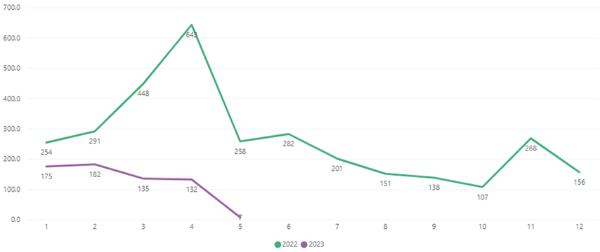
I am using line chart to compare performance from 2022 to 2023 latest month.
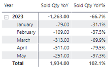
Is it possible to add YoY% just below 2023 data label (175, 182, 135 …) on the chart?
If yes, how can I do that? I searched from the internet but no result yet...
Thank you so much for all your help.
- Mark as New
- Bookmark
- Subscribe
- Mute
- Subscribe to RSS Feed
- Permalink
- Report Inappropriate Content
Hi @chloe914 ,
I believe adding the Delta to the label alone, without including the line in the graph is not possible (hopefully I understand correctly what you would like to achieve). I suggest using the imported visual "Growth Rate Chart by DJEENI v1.2" from DJEENI BV to show the YoY%. Let me know if I can help further.
- Mark as New
- Bookmark
- Subscribe
- Mute
- Subscribe to RSS Feed
- Permalink
- Report Inappropriate Content
Hello, I tried to use the mentioned visual, but not exactly what I want. Anyway, thanks for your advice!
Helpful resources
| User | Count |
|---|---|
| 69 | |
| 67 | |
| 62 | |
| 48 | |
| 28 |
| User | Count |
|---|---|
| 113 | |
| 77 | |
| 65 | |
| 55 | |
| 43 |


