Get certified for free when you join Fabric Data Days 2026 and dive into Fabric, Power BI, SQL, AI, and other essential data skills.
Join nowJuly 7 - July 17 | Round 2 of the Power BI Dataviz World Championships. Don't miss your chance! Learn more
Hiya, maybe I'm just being thick but I can't work out why this is happening.
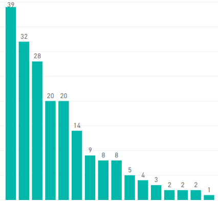
I have a simple bar chart, sorted descending by value. The value is 'Count of ID' and axis is 'Department'.
When I add another field as legend I seem to lose half the data. I've tried converting to a table, after which I can see all the data (exported the table to Excel too to manually count rows). The sorting remains so obbviously the data is there but it's not showing on the chart!
I've checked and all rows/fields have data.
First image is with no legend, second image is the same chart with the legend added:
This is super strange! Can you by any chance share the pbix?
There appears to be a limitation to the number of different values that there can be in the legend. I did not know this myself but from what i can tell it appears to be around 50 values.
Join us in Barcelona for FabCon and SQLCon, the Fabric, Power BI, SQL, and AI community event. Save €200 with code FABCMTY200.
Check out the July 2026 Power BI update to learn about new features.
Join Data Days 2026: 60 days of free live/on-demand sessions, challenges, study groups, and certification opportunities.
| User | Count |
|---|---|
| 30 | |
| 25 | |
| 25 | |
| 24 | |
| 16 |
| User | Count |
|---|---|
| 54 | |
| 34 | |
| 27 | |
| 24 | |
| 20 |