Join us at the 2025 Microsoft Fabric Community Conference
Microsoft Fabric Community Conference 2025, March 31 - April 2, Las Vegas, Nevada. Use code FABINSIDER for a $400 discount.
Register now- Power BI forums
- Get Help with Power BI
- Desktop
- Service
- Report Server
- Power Query
- Mobile Apps
- Developer
- DAX Commands and Tips
- Custom Visuals Development Discussion
- Health and Life Sciences
- Power BI Spanish forums
- Translated Spanish Desktop
- Training and Consulting
- Instructor Led Training
- Dashboard in a Day for Women, by Women
- Galleries
- Webinars and Video Gallery
- Data Stories Gallery
- Themes Gallery
- Power BI DataViz World Championships Gallery
- Quick Measures Gallery
- R Script Showcase
- COVID-19 Data Stories Gallery
- Community Connections & How-To Videos
- 2021 MSBizAppsSummit Gallery
- 2020 MSBizAppsSummit Gallery
- 2019 MSBizAppsSummit Gallery
- Events
- Ideas
- Custom Visuals Ideas (read-only)
- Issues
- Issues
- Events
- Upcoming Events
The Power BI DataViz World Championships are on! With four chances to enter, you could win a spot in the LIVE Grand Finale in Las Vegas. Show off your skills.
- Power BI forums
- Galleries
- Data Stories Gallery
- Re: Team Performance vs. Target - with BOOKMARKS a...

Re: Team Performance vs. Target - with BOOKMARKS and TOGGLE
05-17-2019 23:28 PM
- Mark as New
- Bookmark
- Subscribe
- Mute
- Subscribe to RSS Feed
- Permalink
- Report Inappropriate Content
Team Performance vs. Target - with BOOKMARKS and TOGGLE
Are we going to reach the TARGET and receive our bonuses for 2017?
With the year-end approaching, I want to share with my team on a daily basis, how we are scoring against the target, where we can still push, which customer? which product? The target (and bonuses) are within reach!
This Power BI report uses bookmarks and drillthrough to better organize the content, to move fluently between pages, to switch between visuals (toggle) and to drill down Sales Reps, Customers and Products.
Analysis steps:
- Click on a team member photo to open his/her Sales Rep Bookmark. 
- Switch between Map and Bar visuals using the Toggle image
- Drillthrough customer (right click on the bar chart) to open Customer Bookmark
- Identify Product opportunities within customer, switch between Scatter and Matrix visuals using Toggle
- On slicer, select UNITS or PROFIT, select PERIOD to understand long and short term trends.
Refreshed daily.
eyJrIjoiMjRkYjM1NjEtMTc0Zi00MzcyLTliZjgtYjU0YWJiMjQ3OTg5IiwidCI6ImI3M2IxZDZlLTIxZDUtNGUzOC1iMjM5LTgxMzRkOWQyYmY3OCIsImMiOjh9
- Mark as New
- Bookmark
- Subscribe
- Mute
- Subscribe to RSS Feed
- Permalink
- Report Inappropriate Content
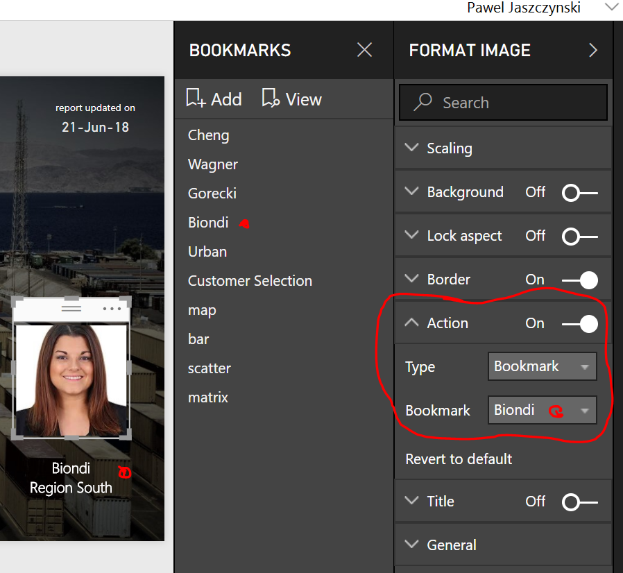
you mean Link option? You will find the Link option under FORMAT IMAGE - ACTION.
In the below example:
1. click 'Biondi' picture
2. select Format Image - Action - Bookmark / Biondi to link 'Biondi' picture to 'Biondi' bookmark
hope it helps. or is your questions really about Title option?
- Mark as New
- Bookmark
- Subscribe
- Mute
- Subscribe to RSS Feed
- Permalink
- Report Inappropriate Content
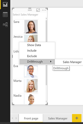
Alternatively to Bookmark you can use DRILLTHROUGH. similar result but faster, you only need to remember to rightclick instead of click. the way I do it:
1. import a table with Names + URL Image link
2. Create Front Page (with names + URL) and Detail Page
3. Setup Drillthrough option on Detail Page
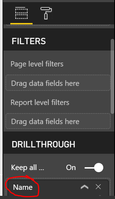
4. rightclick Name to Drillthrough...
Filtered Detail Page opens
hope it helps
- Mark as New
- Bookmark
- Subscribe
- Mute
- Subscribe to RSS Feed
- Permalink
- Report Inappropriate Content
- Mark as New
- Bookmark
- Subscribe
- Mute
- Subscribe to RSS Feed
- Permalink
- Report Inappropriate Content
Can you send the pbix file?
- Mark as New
- Bookmark
- Subscribe
- Mute
- Subscribe to RSS Feed
- Permalink
- Report Inappropriate Content
hola puedes compartirlo al correo de lobar28@hotmail.com gracias
- Mark as New
- Bookmark
- Subscribe
- Mute
- Subscribe to RSS Feed
- Permalink
- Report Inappropriate Content
Great Job, this is an amazing report
- Mark as New
- Bookmark
- Subscribe
- Mute
- Subscribe to RSS Feed
- Permalink
- Report Inappropriate Content
In what order did you update your bookmarks? When i update the bookmarks for the toggle function it automaticaly picks up the page level filters (which are for the bookmarks per salesperson)
- Mark as New
- Bookmark
- Subscribe
- Mute
- Subscribe to RSS Feed
- Permalink
- Report Inappropriate Content
On top are bookmarks for the pages (individual sales reps), below bookmarks for the toggle (map/bar).
But I think order is not important here. Important is that you correctly set up the 'Data' filters for the two bookmark groups:
- Sales Reps - 'Data' filter is hacked
- Toggle (map/bar) - 'Data' filter is unhacked
hope it helps.
Pawel
excellab.at
- Mark as New
- Bookmark
- Subscribe
- Mute
- Subscribe to RSS Feed
- Permalink
- Report Inappropriate Content
Thanks a lot!
- Mark as New
- Bookmark
- Subscribe
- Mute
- Subscribe to RSS Feed
- Permalink
- Report Inappropriate Content
Would you like to share the .pbix files?
- Mark as New
- Bookmark
- Subscribe
- Mute
- Subscribe to RSS Feed
- Permalink
- Report Inappropriate Content
- Mark as New
- Bookmark
- Subscribe
- Mute
- Subscribe to RSS Feed
- Permalink
- Report Inappropriate Content
Thanks for sharing this excellent example!
How did you create the KPI? Which visual(s) are you using to compose the KPI (Title, Value, Indicator Symbol)?
Thanks for any insight you can share.
--Michael--
- Mark as New
- Bookmark
- Subscribe
- Mute
- Subscribe to RSS Feed
- Permalink
- Report Inappropriate Content
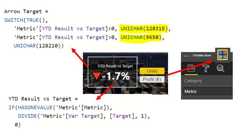
I used the standard Card visual for both KPI and Arrow, and a Chicklet Slicer for the Unit/Profit Selection.
To get the arrow-up (green) / arrow down (red) symbols I used UNICHAR and colored Data Labels green (128315 is by default red).
here are the measures:
hope it helps
- Mark as New
- Bookmark
- Subscribe
- Mute
- Subscribe to RSS Feed
- Permalink
- Report Inappropriate Content
This was of great help as i was struggling get this right. ![]()
![]()
- Mark as New
- Bookmark
- Subscribe
- Mute
- Subscribe to RSS Feed
- Permalink
- Report Inappropriate Content
Fantastic! Thanks so much!
This really is an excellent report!
--Michael--
- Mark as New
- Bookmark
- Subscribe
- Mute
- Subscribe to RSS Feed
- Permalink
- Report Inappropriate Content
This is a great report, how did you create the legend for above and below target for the map visual?
- Mark as New
- Bookmark
- Subscribe
- Mute
- Subscribe to RSS Feed
- Permalink
- Report Inappropriate Content
no rocket science here. the legend is simply a picture that I created in Power Point, saved as .png and imported into PBI
- Mark as New
- Bookmark
- Subscribe
- Mute
- Subscribe to RSS Feed
- Permalink
- Report Inappropriate Content
Fantastic report! I have a question if I may. How do you get to display the selective labels in the cumulative chart? Do you create separate measures for each (MAX or whatever) and add them as values?
Thanks for your help,
Regards,
Paul.
Did I answer your question? Mark my post as a solution!
In doing so, you are also helping me. Thank you!
Proud to be a Super User!
Paul on Linkedin.
- Mark as New
- Bookmark
- Subscribe
- Mute
- Subscribe to RSS Feed
- Permalink
- Report Inappropriate Content
Hi Paul,
glad you like the report.
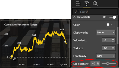
you can control density of labels in a line chart by adjusting the 'Label density' (Format - Data Labels - Label density)
no need to create separate measures unless you need to highlight specific dates.
hope it helps,
Pawel
- Mark as New
- Bookmark
- Subscribe
- Mute
- Subscribe to RSS Feed
- Permalink
- Report Inappropriate Content
Is the Line graph the Power KPI custom visual by any chance? The default Line Chart Visual in Power BI Desktop (April 2018 version) is lacking the "label density" option.
Did I answer your question? Mark my post as a solution!
In doing so, you are also helping me. Thank you!
Proud to be a Super User!
Paul on Linkedin.
- Mark as New
- Bookmark
- Subscribe
- Mute
- Subscribe to RSS Feed
- Permalink
- Report Inappropriate Content
yes, the 'label density' is a feature of the standard Line Chart.
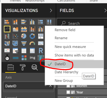
if you don't see it, try this: adjust your Axis to 'DateID' (day) instead of 'Date Hierarchy'.
- Mark as New
- Bookmark
- Subscribe
- Mute
- Subscribe to RSS Feed
- Permalink
- Report Inappropriate Content
Thanks for that. Therein lies my "problem": I'm using a non-standard date table (Month granularity) so I assume that's why the option isn't available. The funny thing is the Power KPI visual does have it as an option for this particular graph, so I may just change it to that visual.
Thanks again for your help!
Regards,
Paul.
Did I answer your question? Mark my post as a solution!
In doing so, you are also helping me. Thank you!
Proud to be a Super User!
Paul on Linkedin.
- Mark as New
- Bookmark
- Subscribe
- Mute
- Subscribe to RSS Feed
- Permalink
- Report Inappropriate Content
Well! learn a new thing everyday!! Never "saw" that option!! Thank you!
Did I answer your question? Mark my post as a solution!
In doing so, you are also helping me. Thank you!
Proud to be a Super User!
Paul on Linkedin.


