Join us at FabCon Vienna from September 15-18, 2025
The ultimate Fabric, Power BI, SQL, and AI community-led learning event. Save €200 with code FABCOMM.
Get registeredGo To
- Power BI forums
- Get Help with Power BI
- Desktop
- Service
- Report Server
- Power Query
- Mobile Apps
- Developer
- DAX Commands and Tips
- Custom Visuals Development Discussion
- Health and Life Sciences
- Power BI Spanish forums
- Translated Spanish Desktop
- Training and Consulting
- Instructor Led Training
- Dashboard in a Day for Women, by Women
- Galleries
- Data Stories Gallery
- Themes Gallery
- Contests Gallery
- Quick Measures Gallery
- Notebook Gallery
- Translytical Task Flow Gallery
- TMDL Gallery
- R Script Showcase
- Webinars and Video Gallery
- Ideas
- Custom Visuals Ideas (read-only)
- Issues
- Issues
- Events
- Upcoming Events
Turn on suggestions
Auto-suggest helps you quickly narrow down your search results by suggesting possible matches as you type.
Showing results for
Compete to become Power BI Data Viz World Champion! First round ends August 18th. Get started.
- Power BI forums
- Forums
- Get Help with Power BI
- DAX Commands and Tips
- create area chart with green and red colors to ind...
Reply
Topic Options
- Subscribe to RSS Feed
- Mark Topic as New
- Mark Topic as Read
- Float this Topic for Current User
- Bookmark
- Subscribe
- Printer Friendly Page
- Mark as New
- Bookmark
- Subscribe
- Mute
- Subscribe to RSS Feed
- Permalink
- Report Inappropriate Content
create area chart with green and red colors to indicate profit and loss
12-15-2022
05:38 AM
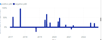
I have created area chart that that shows profit and loss % over time. I would like to show the loss (negative part) in red color and the profit ( positive part) in geen color.
i created 2 measures one for profit % and one for loss %
positive p&l =
var pl=[p&l %]
var result= IF(pl>0 , pl,0)
return result
negative p&l =
var pl=[p&l %]
var result= IF(pl<0 , pl,0)
return result
when i added the measures in the chart it looked like:
any idea on how to create the area chart with green/red colors instead of 1 color
2 REPLIES 2
- Mark as New
- Bookmark
- Subscribe
- Mute
- Subscribe to RSS Feed
- Permalink
- Report Inappropriate Content
09-06-2024
08:29 AM
Could you solve this?
Anonymous
Not applicable
- Mark as New
- Bookmark
- Subscribe
- Mute
- Subscribe to RSS Feed
- Permalink
- Report Inappropriate Content
Helpful resources
Top Solution Authors
| User | Count |
|---|---|
| 15 | |
| 8 | |
| 6 | |
| 6 | |
| 6 |
Top Kudoed Authors
| User | Count |
|---|---|
| 23 | |
| 13 | |
| 13 | |
| 8 | |
| 8 |


