Join us at FabCon Vienna from September 15-18, 2025
The ultimate Fabric, Power BI, SQL, and AI community-led learning event. Save €200 with code FABCOMM.
Get registered- Power BI forums
- Get Help with Power BI
- Desktop
- Service
- Report Server
- Power Query
- Mobile Apps
- Developer
- DAX Commands and Tips
- Custom Visuals Development Discussion
- Health and Life Sciences
- Power BI Spanish forums
- Translated Spanish Desktop
- Training and Consulting
- Instructor Led Training
- Dashboard in a Day for Women, by Women
- Galleries
- Data Stories Gallery
- Themes Gallery
- Contests Gallery
- Quick Measures Gallery
- Notebook Gallery
- Translytical Task Flow Gallery
- TMDL Gallery
- R Script Showcase
- Webinars and Video Gallery
- Ideas
- Custom Visuals Ideas (read-only)
- Issues
- Issues
- Events
- Upcoming Events
Compete to become Power BI Data Viz World Champion! First round ends August 18th. Get started.
- Power BI forums
- Forums
- Get Help with Power BI
- DAX Commands and Tips
- Re: combining three measures into a single measure...
- Subscribe to RSS Feed
- Mark Topic as New
- Mark Topic as Read
- Float this Topic for Current User
- Bookmark
- Subscribe
- Printer Friendly Page
- Mark as New
- Bookmark
- Subscribe
- Mute
- Subscribe to RSS Feed
- Permalink
- Report Inappropriate Content
combining three measures into a single measure for matrix visual
Hi,
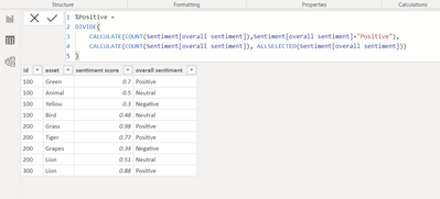
I have created 3 measures for calculating percentage for 3 different sentiments as below.
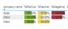
This seems to be working fine and in matrix I can show them as below
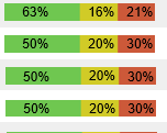
However this appears as 3 different columns, however I want to show it in a single column like below:
In a single bar I want to show positive,negative,neutral
Any help or guidance would be really appreciated
Solved! Go to Solution.
- Mark as New
- Bookmark
- Subscribe
- Mute
- Subscribe to RSS Feed
- Permalink
- Report Inappropriate Content
@Saswa_D just create this measure:
% of all selected =
DIVIDE(COUNT(Sentiment[overall sentiment]), CALCUALTE(COUNT(Sentiment[overall sentiment]), ALLSELECTED(Sentiment[overall sentiment]))
Put it in a stacked bar chart and the [overall sentiment] column in the lengend.
- Mark as New
- Bookmark
- Subscribe
- Mute
- Subscribe to RSS Feed
- Permalink
- Report Inappropriate Content
Thank You, this works as a separate visual but do we have any trick to make it work in matrix visual like for each row I can show a single bar in matrix or if in table visual.
Right now it shows up in 3 different columns in matrix visual
- Mark as New
- Bookmark
- Subscribe
- Mute
- Subscribe to RSS Feed
- Permalink
- Report Inappropriate Content
@Saswa_D the regular matrix / table can't do that. They have the sparkline feature but it's not that rich to be able to do a stacked bar chart with legend. Maybe there is a custom visual that does that, but not something I'm aware of.
- Mark as New
- Bookmark
- Subscribe
- Mute
- Subscribe to RSS Feed
- Permalink
- Report Inappropriate Content
That helps, Thank You very much. I would still accept the above stacked bar solution since it does our work though in separate visual
- Mark as New
- Bookmark
- Subscribe
- Mute
- Subscribe to RSS Feed
- Permalink
- Report Inappropriate Content
Helpful resources
| User | Count |
|---|---|
| 26 | |
| 10 | |
| 8 | |
| 6 | |
| 6 |
| User | Count |
|---|---|
| 32 | |
| 14 | |
| 10 | |
| 10 | |
| 9 |


