Party with Power BI’s own Guy in a Cube
Power BI is turning 10! Tune in for a special live episode on July 24 with behind-the-scenes stories, product evolution highlights, and a sneak peek at what’s in store for the future.
Save the date- Power BI forums
- Get Help with Power BI
- Desktop
- Service
- Report Server
- Power Query
- Mobile Apps
- Developer
- DAX Commands and Tips
- Custom Visuals Development Discussion
- Health and Life Sciences
- Power BI Spanish forums
- Translated Spanish Desktop
- Training and Consulting
- Instructor Led Training
- Dashboard in a Day for Women, by Women
- Galleries
- Webinars and Video Gallery
- Data Stories Gallery
- Themes Gallery
- Contests Gallery
- Quick Measures Gallery
- Notebook Gallery
- Translytical Task Flow Gallery
- R Script Showcase
- Ideas
- Custom Visuals Ideas (read-only)
- Issues
- Issues
- Events
- Upcoming Events
Enhance your career with this limited time 50% discount on Fabric and Power BI exams. Ends August 31st. Request your voucher.
- Power BI forums
- Forums
- Get Help with Power BI
- DAX Commands and Tips
- Re: Why cant I add Outlier label to a scatter plot
- Subscribe to RSS Feed
- Mark Topic as New
- Mark Topic as Read
- Float this Topic for Current User
- Bookmark
- Subscribe
- Printer Friendly Page
- Mark as New
- Bookmark
- Subscribe
- Mute
- Subscribe to RSS Feed
- Permalink
- Report Inappropriate Content
Why cant I add Outlier label to a scatter plot
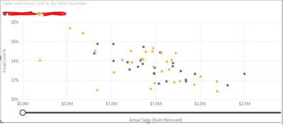
Hello again! So, I think I am coming to a close with highlighting outliers in my data visualizations. I have the following DAX expression:
Here are the measure used in the above formula for more context:
- Cost % = IF(sum(All_Actual_Sales[Actual Sales])>0,
sum(All_Actual_Expenses[Amount])/sum(All_Actual_Sales[Actual Sales])) - Cost % STDEV = STDEVX.P(All_Actual_Expenses, [Cost %])
- Outlier STDEV = CALCULATE(2.5* [Cost % STDEV])
What I am doing is + and - the [Outlier STDEV] measure from the [Cost %] mesaure to give parameters to the "Outliers" label I am trying to create. Please help me solve why I cant add this to my current scatter plot. I cleared out the names of the Directors for privacy, the colors reflect the directors names

Solved! Go to Solution.
- Mark as New
- Bookmark
- Subscribe
- Mute
- Subscribe to RSS Feed
- Permalink
- Report Inappropriate Content
You want to put the text "Outlier" next to each point that is an outlier according to the formula? If so, then I know only one YT vid that talks about something similar. Here it is: 100% Control of Data Labels in Power BI - YouTube
But... you have to be prepared for some advanced features, like using Tabular Editor and calculation groups. You've been warned! 🙂
- Mark as New
- Bookmark
- Subscribe
- Mute
- Subscribe to RSS Feed
- Permalink
- Report Inappropriate Content
Thank you! Its always these type of things that require the most complicated formulas haha! I will check this video out and get back to you.
Helpful resources

Power BI Monthly Update - July 2025
Check out the July 2025 Power BI update to learn about new features.

Join our Fabric User Panel
This is your chance to engage directly with the engineering team behind Fabric and Power BI. Share your experiences and shape the future.

| User | Count |
|---|---|
| 22 | |
| 10 | |
| 10 | |
| 9 | |
| 7 |
