Huge last-minute discounts for FabCon Vienna from September 15-18, 2025
Supplies are limited. Contact info@espc.tech right away to save your spot before the conference sells out.
Get your discount- Power BI forums
- Get Help with Power BI
- Desktop
- Service
- Report Server
- Power Query
- Mobile Apps
- Developer
- DAX Commands and Tips
- Custom Visuals Development Discussion
- Health and Life Sciences
- Power BI Spanish forums
- Translated Spanish Desktop
- Training and Consulting
- Instructor Led Training
- Dashboard in a Day for Women, by Women
- Galleries
- Data Stories Gallery
- Themes Gallery
- Contests Gallery
- Quick Measures Gallery
- Notebook Gallery
- Translytical Task Flow Gallery
- TMDL Gallery
- R Script Showcase
- Webinars and Video Gallery
- Ideas
- Custom Visuals Ideas (read-only)
- Issues
- Issues
- Events
- Upcoming Events
Score big with last-minute savings on the final tickets to FabCon Vienna. Secure your discount
- Power BI forums
- Forums
- Get Help with Power BI
- DAX Commands and Tips
- Re: Using KPI Visualisation to visualize trends of...
- Subscribe to RSS Feed
- Mark Topic as New
- Mark Topic as Read
- Float this Topic for Current User
- Bookmark
- Subscribe
- Printer Friendly Page
- Mark as New
- Bookmark
- Subscribe
- Mute
- Subscribe to RSS Feed
- Permalink
- Report Inappropriate Content
Using KPI Visualisation to visualize trends of change across consecutive indexes
I want to calculate the % change (usually across consecutive weeks) based on selected filter values and visualize them. The idx column represents the week number, the highest number being the most recent week (57 is the highest idx value).
Under the hood, I want to group by index values, look at the sums of 'Job Count' for these groups, calculate the percentage change across the sums corresponding to consecutive indexes, and visualize this trend in the background of the KPI visualization. This weekly (usually) % change would be calculated on-the-fly based on custom values of filters etc. Can you please help me out with this? I have attached a snapshot of the data. Please let me know what other info you'd like me to provide.
- Mark as New
- Bookmark
- Subscribe
- Mute
- Subscribe to RSS Feed
- Permalink
- Report Inappropriate Content
Hi @Anonymous ,
I create sample based on my understanding according to you describe, please check if it meets your needs.
My table:
Create a measure:
Percent Change =
VAR cur_index =
    SELECTEDVALUE ( 'Table 2'[Index] )
VAR pre_index = cur_index - 1
VAR cur_jc =
    CALCULATE ( SUM ( 'Table 2'[Job Count] ), 'Table 2'[Index] = cur_index )
VAR pre_jc =
    CALCULATE ( SUM ( 'Table 2'[Job Count] ), 'Table 2'[Index] = pre_index )
VAR diff_jc = cur_jc - pre_jc
RETURN
    DIVIDE ( diff_jc, pre_jc )
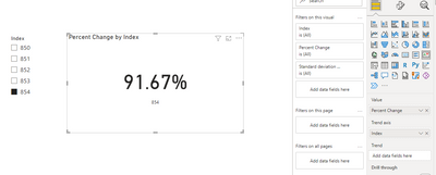
Create a KPI and Slicer visual, then add the fields and measure:
If this post helps, then please consider Accept it as the solution to help the other members find it more quickly.
- Mark as New
- Bookmark
- Subscribe
- Mute
- Subscribe to RSS Feed
- Permalink
- Report Inappropriate Content
Hey Luca, thanks for your reply. I have already implemented something like this. I am able to create measures for the two most recent values and calculate the % change between them as you have in your comment. However, I am trying to group by the 'idx' column (which takes values 1-57 representing the week number), calculate the % change of sums of Job Counts between two consecutive indexes/weeks, and map the 56 values for these % changes as a plot in the background of the KPI visualization.
So, in the KPI viz, I'd like the 'Trend' plot in the background to be a plot of the % change (y-axis) by week number (idx, x-axis). So, in your example, it's % change between 2 weeks just. I'd like it to be a plot for 57 weeks (56 data points) for % change between consecutive indexes. Please let me know how you would do that, or if you have any questions. Thanks.
Helpful resources
| User | Count |
|---|---|
| 13 | |
| 8 | |
| 8 | |
| 7 | |
| 5 |
| User | Count |
|---|---|
| 21 | |
| 15 | |
| 15 | |
| 10 | |
| 7 |


