Get Fabric certified for FREE!
Don't miss your chance to take the Fabric Data Engineer (DP-700) exam on us!
Learn more- Power BI forums
- Get Help with Power BI
- Desktop
- Service
- Report Server
- Power Query
- Mobile Apps
- Developer
- DAX Commands and Tips
- Custom Visuals Development Discussion
- Health and Life Sciences
- Power BI Spanish forums
- Translated Spanish Desktop
- Training and Consulting
- Instructor Led Training
- Dashboard in a Day for Women, by Women
- Galleries
- Data Stories Gallery
- Themes Gallery
- Contests Gallery
- QuickViz Gallery
- Quick Measures Gallery
- Visual Calculations Gallery
- Notebook Gallery
- Translytical Task Flow Gallery
- TMDL Gallery
- R Script Showcase
- Webinars and Video Gallery
- Ideas
- Custom Visuals Ideas (read-only)
- Issues
- Issues
- Events
- Upcoming Events
We've captured the moments from FabCon & SQLCon that everyone is talking about, and we are bringing them to the community, live and on-demand. Starts on April 14th. Register now
- Power BI forums
- Forums
- Get Help with Power BI
- DAX Commands and Tips
- Re: User defined scatterplot axes for regression
- Subscribe to RSS Feed
- Mark Topic as New
- Mark Topic as Read
- Float this Topic for Current User
- Bookmark
- Subscribe
- Printer Friendly Page
- Mark as New
- Bookmark
- Subscribe
- Mute
- Subscribe to RSS Feed
- Permalink
- Report Inappropriate Content
User defined scatterplot axes for regression
Long time viewer, first time poster.
I have a table of facts. There are ~60 columns with ~30,000 rows. The table tracks process parameters. Each row in the table represents a single event.
I would like to be able to have the report consumer select which column is used on the y-axis and the which is used on the x-axis.
There are about 3 columns that act as identifiers (event ID key, facility, date). The remainder are the data that is collected about the event.
The goal is a user-defined linear regression between any two non-identifier columns that exist in the table.
Ive tried using field parameters, unpivoting the table and cross joining to get all possible combinations (this was unworkable), using a copy of the fact table to get the x and y, calculated tables and using a slicer as the way to add columns, etc.
All the usual patterns that work for measures do not work for calculated tables when I tried.
Any ideas?
- Mark as New
- Bookmark
- Subscribe
- Mute
- Subscribe to RSS Feed
- Permalink
- Report Inappropriate Content
- Mark as New
- Bookmark
- Subscribe
- Mute
- Subscribe to RSS Feed
- Permalink
- Report Inappropriate Content
Thanks for the reply Amit. I partially solved the problem. Field parameters were the solution.
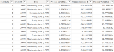
Sample Data:
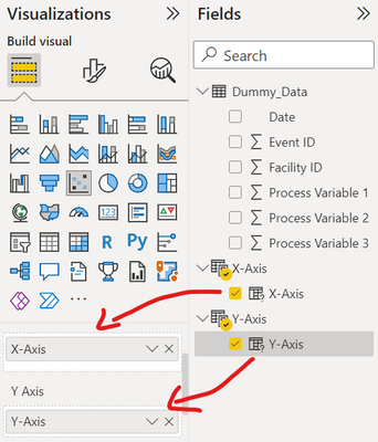
Set up two identical Field Parameter tables, one for the x-axis and one for the y-axis:
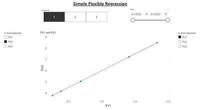
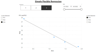
Created Scatterplot visual and put the "columns" in the x and y-axis fields of the visual.

| 
|
Only thing left is to set up the regression. But I cannot refer to the data that underlies the field parameter columns. I need to create measures for the regression calculations {e.g. SUMX(X-Axis, X-Axis[X-Axis]), SUMX(X-Axis, X-Axis[X-Axis] ^ 2), etc.} but the relevant columns of the field parameter tables are strings. Is there any to access the data that the field parameter is referring to? I tried adding these parameter fields to an add-in visual that performs regression calculations and it works so there is a way to access the underlying data set to perform the calculations. I can't use the add-in because I don't have a license and the dataset is limited to 1000 points in the free version.
Any suggestions?
Helpful resources

New to Fabric Survey
If you have recently started exploring Fabric, we'd love to hear how it's going. Your feedback can help with product improvements.

Power BI DataViz World Championships - June 2026
A new Power BI DataViz World Championship is coming this June! Don't miss out on submitting your entry.

Join our Fabric User Panel
Share feedback directly with Fabric product managers, participate in targeted research studies and influence the Fabric roadmap.

| User | Count |
|---|---|
| 8 | |
| 8 | |
| 3 | |
| 3 | |
| 2 |
| User | Count |
|---|---|
| 22 | |
| 13 | |
| 10 | |
| 6 | |
| 5 |


