FabCon is coming to Atlanta
Join us at FabCon Atlanta from March 16 - 20, 2026, for the ultimate Fabric, Power BI, AI and SQL community-led event. Save $200 with code FABCOMM.
Register now!- Power BI forums
- Get Help with Power BI
- Desktop
- Service
- Report Server
- Power Query
- Mobile Apps
- Developer
- DAX Commands and Tips
- Custom Visuals Development Discussion
- Health and Life Sciences
- Power BI Spanish forums
- Translated Spanish Desktop
- Training and Consulting
- Instructor Led Training
- Dashboard in a Day for Women, by Women
- Galleries
- Data Stories Gallery
- Themes Gallery
- Contests Gallery
- QuickViz Gallery
- Quick Measures Gallery
- Visual Calculations Gallery
- Notebook Gallery
- Translytical Task Flow Gallery
- TMDL Gallery
- R Script Showcase
- Webinars and Video Gallery
- Ideas
- Custom Visuals Ideas (read-only)
- Issues
- Issues
- Events
- Upcoming Events
Get Fabric Certified for FREE during Fabric Data Days. Don't miss your chance! Request now
- Power BI forums
- Forums
- Get Help with Power BI
- DAX Commands and Tips
- Re: Top Ranked in various metrics
- Subscribe to RSS Feed
- Mark Topic as New
- Mark Topic as Read
- Float this Topic for Current User
- Bookmark
- Subscribe
- Printer Friendly Page
- Mark as New
- Bookmark
- Subscribe
- Mute
- Subscribe to RSS Feed
- Permalink
- Report Inappropriate Content
Top Ranked in various metrics
I have a number of current ranking measures which detail top salesperson, top selling region etc which are working well within a clustered column visual.
What I would like to do with each metric is display some additional information. So in best selling region, I'd like to display the region name (this is as a tooltip), but probably through concantenation, also display the best selling salesperson in that region and the total sales for that person. I have all these currently as measures along the lines of this...
- Mark as New
- Bookmark
- Subscribe
- Mute
- Subscribe to RSS Feed
- Permalink
- Report Inappropriate Content
Hi,
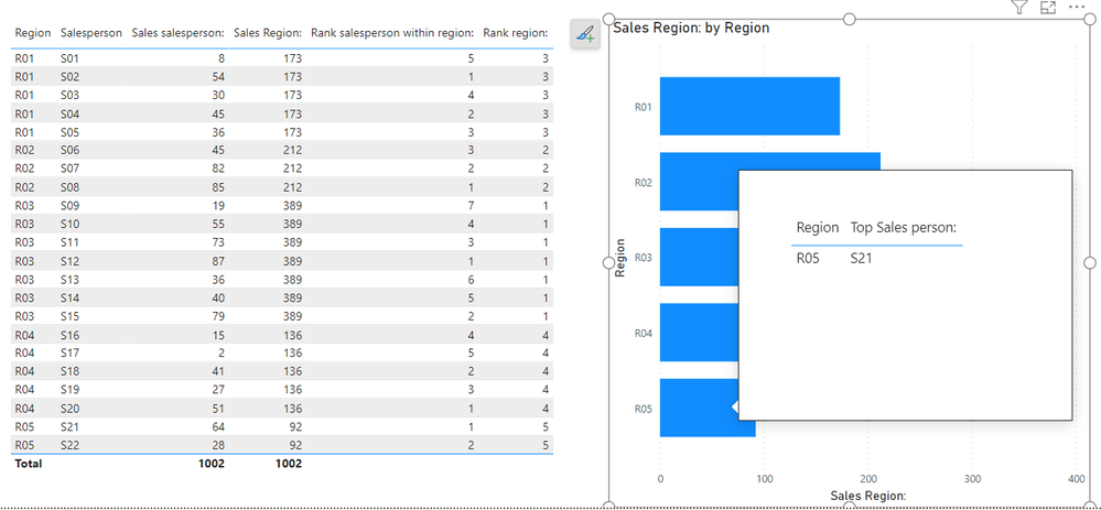
I am not sure how your semantic model looks like, but I tried to create a sample pbix file like below.
Please check the below picture and the attached pbix file.
I hope the below can provide some ideas on how to create a solution for your semantic model.
RANK function (DAX) - DAX | Microsoft Learn
TOPN function (DAX) - DAX | Microsoft Learn
CONCATENATEX function (DAX) - DAX | Microsoft Learn
If this post helps, then please consider accepting it as the solution to help other members find it faster, and give a big thumbs up.
Click here to visit my LinkedIn page
Click here to schedule a short Teams meeting to discuss your question.
- Mark as New
- Bookmark
- Subscribe
- Mute
- Subscribe to RSS Feed
- Permalink
- Report Inappropriate Content
Thank you for replying and I can see that I could probably achieve an element of what I need with your solution, so thank you for that.
Here is a link to stripped back sample file
https://drive.google.com/file/d/1rCl91ci3u80OuT62kUsQgOt6lCOuxyiL/view?usp=sharing
What I would like to see if possible to achieve is utilising some of the measures I have (adpating them of course), to have the tooltip style in the first chart, blending together the best selling salesperson & team by daily sales. Unfortunately I need to keep the existing format of the tooltip as there are a number of other metrics I need to display, that cannot be superceded by the tooltip suggestion you have offered.
Helpful resources

Power BI Monthly Update - November 2025
Check out the November 2025 Power BI update to learn about new features.

Fabric Data Days
Advance your Data & AI career with 50 days of live learning, contests, hands-on challenges, study groups & certifications and more!

| User | Count |
|---|---|
| 11 | |
| 9 | |
| 9 | |
| 6 | |
| 5 |
| User | Count |
|---|---|
| 27 | |
| 22 | |
| 19 | |
| 17 | |
| 11 |


