FabCon is coming to Atlanta
Join us at FabCon Atlanta from March 16 - 20, 2026, for the ultimate Fabric, Power BI, AI and SQL community-led event. Save $200 with code FABCOMM.
Register now!- Power BI forums
- Get Help with Power BI
- Desktop
- Service
- Report Server
- Power Query
- Mobile Apps
- Developer
- DAX Commands and Tips
- Custom Visuals Development Discussion
- Health and Life Sciences
- Power BI Spanish forums
- Translated Spanish Desktop
- Training and Consulting
- Instructor Led Training
- Dashboard in a Day for Women, by Women
- Galleries
- Data Stories Gallery
- Themes Gallery
- Contests Gallery
- Quick Measures Gallery
- Notebook Gallery
- Translytical Task Flow Gallery
- TMDL Gallery
- R Script Showcase
- Webinars and Video Gallery
- Ideas
- Custom Visuals Ideas (read-only)
- Issues
- Issues
- Events
- Upcoming Events
Join the Fabric FabCon Global Hackathon—running virtually through Nov 3. Open to all skill levels. $10,000 in prizes! Register now.
- Power BI forums
- Forums
- Get Help with Power BI
- DAX Commands and Tips
- Show Last 24 Hours in a clustered column chart
- Subscribe to RSS Feed
- Mark Topic as New
- Mark Topic as Read
- Float this Topic for Current User
- Bookmark
- Subscribe
- Printer Friendly Page
- Mark as New
- Bookmark
- Subscribe
- Mute
- Subscribe to RSS Feed
- Permalink
- Report Inappropriate Content
Show Last 24 Hours in a clustered column chart
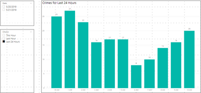
I was trying to create a measurement that will show the total crimes in the last 24 hours on a chart.
This Hour and Last Hour works fine. But the Last 24 is not. Seems like it will no go through the entire Last 24 hours from Now()
Not sure if I need to use another visual to show it or probably just have it on a table/matrix and drag the dates in just to show
those affected dates/data
I have this calc column in my time table
Any help would be greatly appreciated.
- Mark as New
- Bookmark
- Subscribe
- Mute
- Subscribe to RSS Feed
- Permalink
- Report Inappropriate Content
I wonder if this is the reason, it seems like you made a minor mistake in your measure. If change this place to
"Last 24 Hours", the chart worked
- Mark as New
- Bookmark
- Subscribe
- Mute
- Subscribe to RSS Feed
- Permalink
- Report Inappropriate Content
i might be completely off base but would this work.
=  var HrsDelta = 24 *( NOW() - Table1[dateTime] )
   return if( HrsDelta <= 24 && HrsDelta >= 0, TRUE(), FALSE())
Helpful resources
| User | Count |
|---|---|
| 10 | |
| 8 | |
| 5 | |
| 5 | |
| 4 |


