FabCon is coming to Atlanta
Join us at FabCon Atlanta from March 16 - 20, 2026, for the ultimate Fabric, Power BI, AI and SQL community-led event. Save $200 with code FABCOMM.
Register now!- Power BI forums
- Get Help with Power BI
- Desktop
- Service
- Report Server
- Power Query
- Mobile Apps
- Developer
- DAX Commands and Tips
- Custom Visuals Development Discussion
- Health and Life Sciences
- Power BI Spanish forums
- Translated Spanish Desktop
- Training and Consulting
- Instructor Led Training
- Dashboard in a Day for Women, by Women
- Galleries
- Data Stories Gallery
- Themes Gallery
- Contests Gallery
- QuickViz Gallery
- Quick Measures Gallery
- Visual Calculations Gallery
- Notebook Gallery
- Translytical Task Flow Gallery
- TMDL Gallery
- R Script Showcase
- Webinars and Video Gallery
- Ideas
- Custom Visuals Ideas (read-only)
- Issues
- Issues
- Events
- Upcoming Events
The Power BI Data Visualization World Championships is back! Get ahead of the game and start preparing now! Learn more
- Power BI forums
- Forums
- Get Help with Power BI
- DAX Commands and Tips
- Return/generate value based on date range
- Subscribe to RSS Feed
- Mark Topic as New
- Mark Topic as Read
- Float this Topic for Current User
- Bookmark
- Subscribe
- Printer Friendly Page
- Mark as New
- Bookmark
- Subscribe
- Mute
- Subscribe to RSS Feed
- Permalink
- Report Inappropriate Content
Return/generate value based on date range
Hello Community,
I need to right a measure that generate value based on date range. So basically i've calendar table and data input table.
Data Input
| Start Date | End Date | Amount |
| 1/1/2020 | 12/31/2021 | 100 |
So the requirement is to put this on line chart that has periods from calendar table on x axes and we want a line shows the amount the Amount on every month within that period.
Any ideas other that building a table to spread the amounts of rows?
Solved! Go to Solution.
- Mark as New
- Bookmark
- Subscribe
- Mute
- Subscribe to RSS Feed
- Permalink
- Report Inappropriate Content
Hi @MoCPA ,
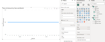
I suggest you to inactive or remove the relationship between the input table and calendar table. Then create a measure to filter your visual.
Filter =
VAR _START =
    SELECTEDVALUE ( 'Data Input'[Start Date] )
VAR _END =
    SELECTEDVALUE ( 'Data Input'[End Date] )
RETURN
    IF (
        MIN ( 'Calendar'[Date] ) >= _START
            && MAX ( 'Calendar'[Date] ) <= _END,
        1,
        0
    )
Add this measure into visual level filter and set it to show items when value = 1. Result is a below.
Best Regards,
Rico Zhou
If this post helps, then please consider Accept it as the solution to help the other members find it more quickly.
- Mark as New
- Bookmark
- Subscribe
- Mute
- Subscribe to RSS Feed
- Permalink
- Report Inappropriate Content
@MoCPA , Refer if these approches can help
Measure way
Power BI Dax Measure- Allocate data between Range: https://youtu.be/O653vwLTUzM
https://community.powerbi.com/t5/Community-Blog/How-to-divide-distribute-values-between-start-date-o...
Tables way
https://amitchandak.mediumcom/dax-get-all-dates-between-the-start-and-end-date-8f3dac4ff90b
https://amitchandak.medium.com/power-query-get-all-dates-between-the-start-and-end-date-9ad6a84cf5f2
Helpful resources

Power BI Monthly Update - November 2025
Check out the November 2025 Power BI update to learn about new features.

Fabric Data Days
Advance your Data & AI career with 50 days of live learning, contests, hands-on challenges, study groups & certifications and more!

| User | Count |
|---|---|
| 20 | |
| 10 | |
| 9 | |
| 4 | |
| 4 |
| User | Count |
|---|---|
| 33 | |
| 31 | |
| 19 | |
| 12 | |
| 11 |

