Join us at FabCon Vienna from September 15-18, 2025
The ultimate Fabric, Power BI, SQL, and AI community-led learning event. Save €200 with code FABCOMM.
Get registered- Power BI forums
- Get Help with Power BI
- Desktop
- Service
- Report Server
- Power Query
- Mobile Apps
- Developer
- DAX Commands and Tips
- Custom Visuals Development Discussion
- Health and Life Sciences
- Power BI Spanish forums
- Translated Spanish Desktop
- Training and Consulting
- Instructor Led Training
- Dashboard in a Day for Women, by Women
- Galleries
- Data Stories Gallery
- Themes Gallery
- Contests Gallery
- Quick Measures Gallery
- Notebook Gallery
- Translytical Task Flow Gallery
- TMDL Gallery
- R Script Showcase
- Webinars and Video Gallery
- Ideas
- Custom Visuals Ideas (read-only)
- Issues
- Issues
- Events
- Upcoming Events
Compete to become Power BI Data Viz World Champion! First round ends August 18th. Get started.
- Power BI forums
- Forums
- Get Help with Power BI
- DAX Commands and Tips
- Re: How to show value instead of aggregate in scat...
- Subscribe to RSS Feed
- Mark Topic as New
- Mark Topic as Read
- Float this Topic for Current User
- Bookmark
- Subscribe
- Printer Friendly Page
- Mark as New
- Bookmark
- Subscribe
- Mute
- Subscribe to RSS Feed
- Permalink
- Report Inappropriate Content
How to show value instead of aggregate in scatter plot
How to show value instead of aggregate in scatter plot?
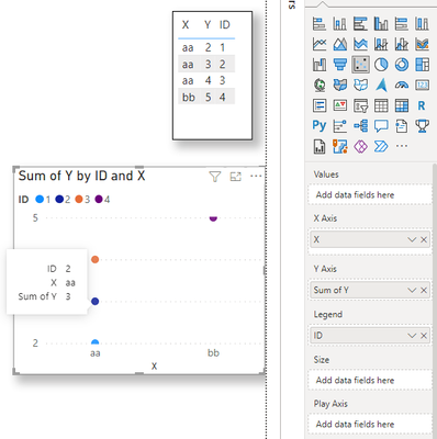
I just have table like this
X. Y
aa. 2
aa. 3
aa. 4
bb 5
I should show aa as 4 data points(without summarising to 9) and bb as 1 data point using scatter plot. Kindly help
- Mark as New
- Bookmark
- Subscribe
- Mute
- Subscribe to RSS Feed
- Permalink
- Report Inappropriate Content
Thanks for responding.
I don't want to sumamarize y columns. I want to see it as separate data points and X column should be in x axis and used as legend. Is there any suggestion for this to achieve?
- Mark as New
- Bookmark
- Subscribe
- Mute
- Subscribe to RSS Feed
- Permalink
- Report Inappropriate Content
For scatter plot , X axis and y axis aren't playing together nicely , replace the X axis field with a numerical value or change the Y axis field values to summarizations . So if you want through X axis to dispaly your X value , you need to add a column and put it in Legend .
Best Regards,
Community Support Team _ Ailsa Tao
If this post helps, then please consider Accept it as the solution to help the other members find it more quickly.
- Mark as New
- Bookmark
- Subscribe
- Mute
- Subscribe to RSS Feed
- Permalink
- Report Inappropriate Content
Can someone please help me on this?
Scatter plot when giving x-axis text and y axis - number field as don't summarize to see individual data points but I get this error.
X axis and yaxis aren't playing together nicely. Because one of the axis expecting numerical value. How to fix this error and how can I see individual data points without aggregation?
Helpful resources
| User | Count |
|---|---|
| 28 | |
| 12 | |
| 8 | |
| 7 | |
| 5 |
| User | Count |
|---|---|
| 36 | |
| 14 | |
| 12 | |
| 7 | |
| 7 |


