Join us at FabCon Vienna from September 15-18, 2025
The ultimate Fabric, Power BI, SQL, and AI community-led learning event. Save €200 with code FABCOMM.
Get registeredGo To
- Power BI forums
- Get Help with Power BI
- Desktop
- Service
- Report Server
- Power Query
- Mobile Apps
- Developer
- DAX Commands and Tips
- Custom Visuals Development Discussion
- Health and Life Sciences
- Power BI Spanish forums
- Translated Spanish Desktop
- Training and Consulting
- Instructor Led Training
- Dashboard in a Day for Women, by Women
- Galleries
- Data Stories Gallery
- Themes Gallery
- Contests Gallery
- Quick Measures Gallery
- Notebook Gallery
- Translytical Task Flow Gallery
- TMDL Gallery
- R Script Showcase
- Webinars and Video Gallery
- Ideas
- Custom Visuals Ideas (read-only)
- Issues
- Issues
- Events
- Upcoming Events
Turn on suggestions
Auto-suggest helps you quickly narrow down your search results by suggesting possible matches as you type.
Showing results for
Compete to become Power BI Data Viz World Champion! First round ends August 18th. Get started.
- Power BI forums
- Forums
- Get Help with Power BI
- DAX Commands and Tips
- Filter Percent Measure by Time
Reply
Topic Options
- Subscribe to RSS Feed
- Mark Topic as New
- Mark Topic as Read
- Float this Topic for Current User
- Bookmark
- Subscribe
- Printer Friendly Page
- Mark as New
- Bookmark
- Subscribe
- Mute
- Subscribe to RSS Feed
- Permalink
- Report Inappropriate Content
Filter Percent Measure by Time
07-02-2019
01:56 PM
Hello,
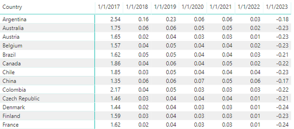
I have a Year Over Year percent calculation which displayed below. I need to show the data employing the Radar chart by Microsoft. This chart would use the Country as the Category. It requires a different measure for each column (year) that is displayed. What would be the best approach to slicing the data such that it can be displayed in the chart.
Best Regards,
Joe
1 REPLY 1
- Mark as New
- Bookmark
- Subscribe
- Mute
- Subscribe to RSS Feed
- Permalink
- Report Inappropriate Content
07-29-2019
06:30 PM
I guess there is no other way around but creating th measures per year, not very ellegant but should work
YoY 2018 = CALCULATE([YoY], YEAR(Calendar[Date]) = 2018)
Did I answer your question? Mark my post as a solution!
Proud to be a Datanaut!
Did I answer your question? Mark my post as a solution!
Thank you for the kudos 🙂
Thank you for the kudos 🙂
Helpful resources
Top Solution Authors
| User | Count |
|---|---|
| 16 | |
| 8 | |
| 7 | |
| 6 | |
| 5 |
Top Kudoed Authors
| User | Count |
|---|---|
| 25 | |
| 13 | |
| 12 | |
| 8 | |
| 8 |


