Join the #PBI10 DataViz contest
Power BI is turning 10, and we’re marking the occasion with a special community challenge. Use your creativity to tell a story, uncover trends, or highlight something unexpected.
Get started- Power BI forums
- Get Help with Power BI
- Desktop
- Service
- Report Server
- Power Query
- Mobile Apps
- Developer
- DAX Commands and Tips
- Custom Visuals Development Discussion
- Health and Life Sciences
- Power BI Spanish forums
- Translated Spanish Desktop
- Training and Consulting
- Instructor Led Training
- Dashboard in a Day for Women, by Women
- Galleries
- Webinars and Video Gallery
- Data Stories Gallery
- Themes Gallery
- Contests Gallery
- Quick Measures Gallery
- Notebook Gallery
- Translytical Task Flow Gallery
- R Script Showcase
- Ideas
- Custom Visuals Ideas (read-only)
- Issues
- Issues
- Events
- Upcoming Events
Join us for an expert-led overview of the tools and concepts you'll need to become a Certified Power BI Data Analyst and pass exam PL-300. Register now.
- Power BI forums
- Forums
- Get Help with Power BI
- DAX Commands and Tips
- Re: Dynamic Names axis based on selected filter.
- Subscribe to RSS Feed
- Mark Topic as New
- Mark Topic as Read
- Float this Topic for Current User
- Bookmark
- Subscribe
- Printer Friendly Page
- Mark as New
- Bookmark
- Subscribe
- Mute
- Subscribe to RSS Feed
- Permalink
- Report Inappropriate Content
Dynamic Names axis based on selected filter.
Hi All,
I've a question about a dynamic axis in charts. I have sales data from different countries. To put them all in a chart is a bit too much so I have sorted the countries into regions. So Americas, Europe, Africa and Asia. What I would like to show is that the chart shows the margins of all regions (coming from Dim_Countries[Region]) together, but when the user select a region in the filter the chart shows the country (coming from Dim_Countries[Country]) of the selected region.
I have something fimiliar with quantities and amounts with Selected value but then I need to do a calculation. now it has to choose between two fields with names (Dim_Countries[Region] or Dim_Countries[Country]). How can I set this?
I've tried this with parameters and that work but now the users need to switch from regions to countries manually. So they have to select a region and change the view to countries manually. How can I set this automatically when the users select a region?
Solved! Go to Solution.
- Mark as New
- Bookmark
- Subscribe
- Mute
- Subscribe to RSS Feed
- Permalink
- Report Inappropriate Content
Hey @RJV83,
This is possible by creating a table in which the regions are columns and the rows are countries. And then create a field parameter on it. I used the following sample data:
Dim_Countries:
CountryRegionSales
| 1 | A | 8 |
| 2 | A | 12 |
| 3 | A | 54 |
| 4 | B | 21 |
| 5 | B | 76 |
| 6 | B | 32 |
| 7 | B | 89 |
| 8 | B | 21 |
| 9 | C | 40 |
| 10 | C | 4 |
Dim_Region:
Region
| A |
| B |
| C |
Dim_Country_Region (combination table in which you indicate per country to which region it belongs. You could create this table dynamically in M by pivoting the region column in the countries table):
CountryABC
| 1 | 1 | ||
| 2 | 2 | ||
| 3 | 3 | ||
| 4 | 4 | ||
| 5 | 5 | ||
| 6 | 6 | ||
| 7 | 7 | ||
| 8 | 8 | ||
| 9 | 9 | ||
| 10 | 10 |
Field paramter (refer to the general region column and call it 'All'. And select all the region columns from the combination table underneath):
Parameter = {
    ("All", NAMEOF('Dim_Region'[Region]), 0),
    ("A", NAMEOF('Dim_Country_Region'[A]), 1),
    ("B", NAMEOF('Dim_Country_Region'[B]), 2),
    ("C", NAMEOF('Dim_Country_Region'[C]), 3)
}
This is how the models looks:
Use the field parameter as a slicer. And also place the field parameter on the x axis of a visual.
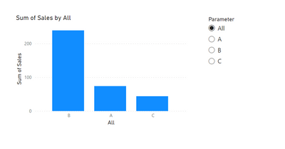
'All' selected:
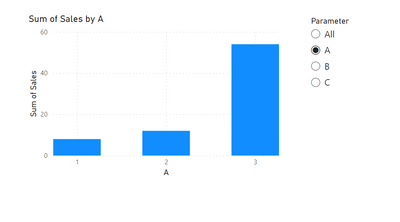
When you select one region:
- Mark as New
- Bookmark
- Subscribe
- Mute
- Subscribe to RSS Feed
- Permalink
- Report Inappropriate Content
Hi @RJV83
You can create field paramater and put the paramater to the axis, you can refer to the following link:
Solved: Re: How to dynamically calculate the percentage fo... - Microsoft Power BI Community
Let report readers use field parameters to change visuals (preview) - Power BI | Microsoft Learn
Best Regards,
Yolo Zhu
If this post helps, then please consider Accept it as the solution to help the other members find it more quickly.
- Mark as New
- Bookmark
- Subscribe
- Mute
- Subscribe to RSS Feed
- Permalink
- Report Inappropriate Content
Hey @RJV83,
This is possible by creating a table in which the regions are columns and the rows are countries. And then create a field parameter on it. I used the following sample data:
Dim_Countries:
CountryRegionSales
| 1 | A | 8 |
| 2 | A | 12 |
| 3 | A | 54 |
| 4 | B | 21 |
| 5 | B | 76 |
| 6 | B | 32 |
| 7 | B | 89 |
| 8 | B | 21 |
| 9 | C | 40 |
| 10 | C | 4 |
Dim_Region:
Region
| A |
| B |
| C |
Dim_Country_Region (combination table in which you indicate per country to which region it belongs. You could create this table dynamically in M by pivoting the region column in the countries table):
CountryABC
| 1 | 1 | ||
| 2 | 2 | ||
| 3 | 3 | ||
| 4 | 4 | ||
| 5 | 5 | ||
| 6 | 6 | ||
| 7 | 7 | ||
| 8 | 8 | ||
| 9 | 9 | ||
| 10 | 10 |
Field paramter (refer to the general region column and call it 'All'. And select all the region columns from the combination table underneath):
Parameter = {
    ("All", NAMEOF('Dim_Region'[Region]), 0),
    ("A", NAMEOF('Dim_Country_Region'[A]), 1),
    ("B", NAMEOF('Dim_Country_Region'[B]), 2),
    ("C", NAMEOF('Dim_Country_Region'[C]), 3)
}
This is how the models looks:
Use the field parameter as a slicer. And also place the field parameter on the x axis of a visual.
'All' selected:
When you select one region:
- Mark as New
- Bookmark
- Subscribe
- Mute
- Subscribe to RSS Feed
- Permalink
- Report Inappropriate Content
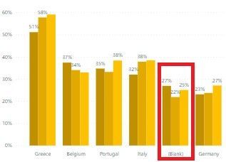
Oh thanks a lot this works. I only have one issue with this method. I now see the others as blank in my chart.
So the total is always the same (total of the entire world).
I think this has to do with the Dim_Country_Region where country 4 belongs to region B but not to region A or C. if A is selected he shows the figures of 1, 2, 3 and blank (which is 4 till 10). In the table these fields (4 till 10) are 'null' for region A. But I have no idea how to get rid of the 'others' in the chart.
- Mark as New
- Bookmark
- Subscribe
- Mute
- Subscribe to RSS Feed
- Permalink
- Report Inappropriate Content
Hey @RJV83,
Yeah you are right. I think the easiest way to fix this is to filter the visual, where 'country' is not equal to 'Blank'. You can do this in the filter panel once you've selected the visal.
- Mark as New
- Bookmark
- Subscribe
- Mute
- Subscribe to RSS Feed
- Permalink
- Report Inappropriate Content
Hey @Barthel ,
The problem with this is that the (Blank) is depended for the region. So in the 'country' field there is no blank, only in the Region fields. But then when I select Americas and is not equal to blank the other regions will only show the total of americas as blank. So I can't take the Blank out of the visual by using the filter panel.
BUT I've found a solution with DAX.....I love DAX
What I did for the blanks is to create a "If(Selectedvalue(" and then for each 'Order' in the parameter a calculation measure where I filter out the blank for that region.
So: IF(SELECTEDVALUE('Parameter'[Parameter order])=1, CALCULATE([Margin], FILTER(Dim_Country_Region,Dim_Country_Region[A]<>BLANK())),
IF(SELECTEDVALUE('Parameter' [Parameter Order])=2, CALCULATE([Margin], FILTER(Dim_Country_Region,Dim_Country_Region[B]<>BLANK())),
IF(SELECTEDVALUE('Parameter' [Parameter Order])=3, CALCULATE([Margin], FILTER(Dim_Country_Region,Dim_Country_Region[C]<>BLANK())),
[Margin]))))
(hope this way, I made the DAX a bit readable/clear)
And that made the blanks disappear!
So thanks for the solution!
Helpful resources

Join our Fabric User Panel
This is your chance to engage directly with the engineering team behind Fabric and Power BI. Share your experiences and shape the future.

Power BI Monthly Update - June 2025
Check out the June 2025 Power BI update to learn about new features.

| User | Count |
|---|---|
| 10 | |
| 8 | |
| 8 | |
| 8 | |
| 6 |
| User | Count |
|---|---|
| 14 | |
| 12 | |
| 11 | |
| 10 | |
| 8 |


