FabCon is coming to Atlanta
Join us at FabCon Atlanta from March 16 - 20, 2026, for the ultimate Fabric, Power BI, AI and SQL community-led event. Save $200 with code FABCOMM.
Register now!- Power BI forums
- Get Help with Power BI
- Desktop
- Service
- Report Server
- Power Query
- Mobile Apps
- Developer
- DAX Commands and Tips
- Custom Visuals Development Discussion
- Health and Life Sciences
- Power BI Spanish forums
- Translated Spanish Desktop
- Training and Consulting
- Instructor Led Training
- Dashboard in a Day for Women, by Women
- Galleries
- Data Stories Gallery
- Themes Gallery
- Contests Gallery
- Quick Measures Gallery
- Visual Calculations Gallery
- Notebook Gallery
- Translytical Task Flow Gallery
- TMDL Gallery
- R Script Showcase
- Webinars and Video Gallery
- Ideas
- Custom Visuals Ideas (read-only)
- Issues
- Issues
- Events
- Upcoming Events
Calling all Data Engineers! Fabric Data Engineer (Exam DP-700) live sessions are back! Starting October 16th. Sign up.
- Power BI forums
- Forums
- Get Help with Power BI
- DAX Commands and Tips
- Dynamic Graph Title based on Keyword Search
- Subscribe to RSS Feed
- Mark Topic as New
- Mark Topic as Read
- Float this Topic for Current User
- Bookmark
- Subscribe
- Printer Friendly Page
- Mark as New
- Bookmark
- Subscribe
- Mute
- Subscribe to RSS Feed
- Permalink
- Report Inappropriate Content
Dynamic Graph Title based on Keyword Search
I have a keyword search on my dashboard (I am using the Text Filter custom visual). I have a line graph that is titled 'Documents by Year based on Keyword Search' but I would like the title to be dynamic based on the keyword that was entered.
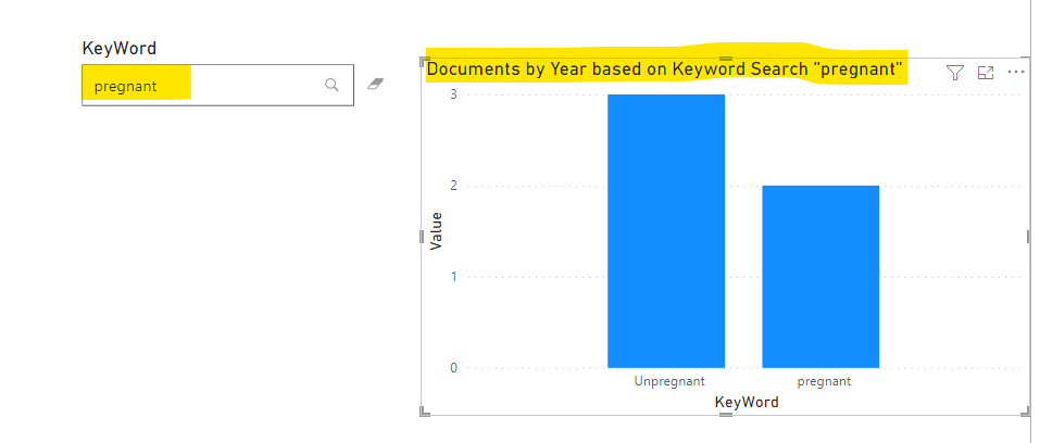
For example, if I type in 'pregnant' in the keyword search box, I would like the title to say: Documents by Year based on Keyword Search "pregnant"
Solved! Go to Solution.
- Mark as New
- Bookmark
- Subscribe
- Mute
- Subscribe to RSS Feed
- Permalink
- Report Inappropriate Content
Hi,
According to your description, I can clearly understand your requirement, I think you can create a measure to act as the dynamic title of the chart you created to achieve your needs, like this:
This is the test data I created based on your description:
You can create a measure like this:
Name =

var _selectedvalue=MINX(ALLSELECTED('Table'),'Table'[KeyWord])

return

"Documents by Year based on Keyword Search """&_selectedvalue&""""
Then you can click on the chart you want to set to set like this:
And you can get what you want, like this:
You can download my test pbix file below
If this result is not what you want, you can post some sample data(without sensitive data) and your expected result.
How to Get Your Question Answered Quickly
Thank you very much!
Best Regards,
Community Support Team _Robert Qin
If this post helps, then please consider Accept it as the solution to help the other members find it more quickly.
- Mark as New
- Bookmark
- Subscribe
- Mute
- Subscribe to RSS Feed
- Permalink
- Report Inappropriate Content
Helpful resources

FabCon Global Hackathon
Join the Fabric FabCon Global Hackathon—running virtually through Nov 3. Open to all skill levels. $10,000 in prizes!

Power BI Monthly Update - October 2025
Check out the October 2025 Power BI update to learn about new features.

| User | Count |
|---|---|
| 13 | |
| 11 | |
| 9 | |
| 8 | |
| 8 |


