- Power BI forums
- Get Help with Power BI
- Desktop
- Service
- Report Server
- Power Query
- Mobile Apps
- Developer
- DAX Commands and Tips
- Custom Visuals Development Discussion
- Health and Life Sciences
- Power BI Spanish forums
- Translated Spanish Desktop
- Training and Consulting
- Instructor Led Training
- Dashboard in a Day for Women, by Women
- Galleries
- Data Stories Gallery
- Themes Gallery
- Contests Gallery
- QuickViz Gallery
- Quick Measures Gallery
- Visual Calculations Gallery
- Notebook Gallery
- Translytical Task Flow Gallery
- TMDL Gallery
- R Script Showcase
- Webinars and Video Gallery
- Ideas
- Custom Visuals Ideas (read-only)
- Issues
- Issues
- Events
- Upcoming Events
We've captured the moments from FabCon & SQLCon that everyone is talking about, and we are bringing them to the community, live and on-demand. Starts on April 14th. Register now
- Power BI forums
- Forums
- Get Help with Power BI
- DAX Commands and Tips
- Re: Data Visualization with Rule Based Color in Co...
- Subscribe to RSS Feed
- Mark Topic as New
- Mark Topic as Read
- Float this Topic for Current User
- Bookmark
- Subscribe
- Printer Friendly Page
- Mark as New
- Bookmark
- Subscribe
- Mute
- Subscribe to RSS Feed
- Permalink
- Report Inappropriate Content
Data Visualization with Rule Based Color in Column Graph
Hi Everyone,
I have a summarised Dataset where the Fields are like this.
Category -- Budget -- Consumed
A -- 1000 -- 500
B -- 4000 -- 4500
Now I want to Generate a Bar Graph with Budget vs Consumption. I want my Consumption bars to become red when it will cross the Budget Field and it will remain Green when it is below the Budget line.
Any DAX Formula or suggestion how to achieve this please?
Solved! Go to Solution.
- Mark as New
- Bookmark
- Subscribe
- Mute
- Subscribe to RSS Feed
- Permalink
- Report Inappropriate Content
@arafmustavi please find a link to a file with a solution:
Data Visualization with Rule Based Color in Column Graph 2022-07-24.pbix
- Mark as New
- Bookmark
- Subscribe
- Mute
- Subscribe to RSS Feed
- Permalink
- Report Inappropriate Content
Hi @arafmustavi ,
1. IF you want the whole consumed bar to become green or red:
As @SpartaBI mentioned before, you can use conditional formatting to change the color. However if you want to generate a Bar Graph with Budget vs Consumption, you will not be able to use conditional formatting. You can use line and clustered column chart to achieve this goal.
Please try:
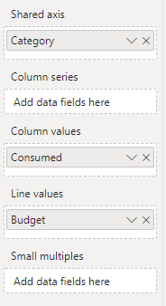
First add values to the field like this:
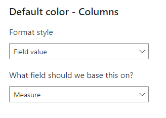
Then create a measure for conditional formatting :
Measure = IF(MAX('Table'[Consumed])>MAX('Table'[Budget]),"Red","Green")Apply it to the columns
Turn on the Data labels:
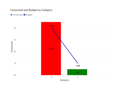
Final output:
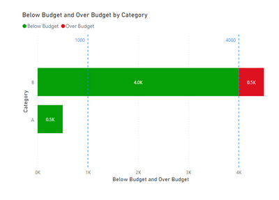
2. If you want the part of the bar that below the budget line become green and the over part become red:
Please try:
Create these measure:
Below Budget = IF(MAX('Table'[Consumed])>MAX('Table'[Budget]),MAX('Table'[Budget]),MAX('Table'[Consumed]))

Over Budget = IF(MAX('Table'[Consumed])>MAX('Table'[Budget]),MAX('Table'[Consumed])-MAX('Table'[Budget]),0)
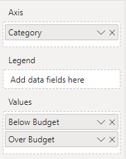
Then apply it to stacked bar chart:
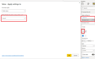
Use these measure to create constant line:
Line A = MAXX(FILTER('Table',[Category]="A"),[Budget])

Line B = MAXX(FILTER('Table',[Category]="B"),[Budget])
Final output:
Best Regards,
Jianbo Li
If this post helps, then please consider Accept it as the solution to help the other members find it more quickly.
- Mark as New
- Bookmark
- Subscribe
- Mute
- Subscribe to RSS Feed
- Permalink
- Report Inappropriate Content
@arafmustavi please find a link to a file with a solution:
Data Visualization with Rule Based Color in Column Graph 2022-07-24.pbix
- Mark as New
- Bookmark
- Subscribe
- Mute
- Subscribe to RSS Feed
- Permalink
- Report Inappropriate Content
@arafmustavi I created this measure:
Color =
SWITCH(
    TRUE(),
    SUM('Table'[Consumed]) > SUM('Table'[Budget]), "Red",
    "Green"
)
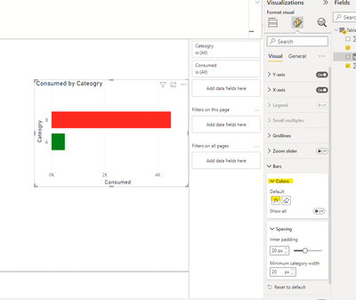
In the visual settings on the Bars colors I used the conditional formatting (Fx) option:
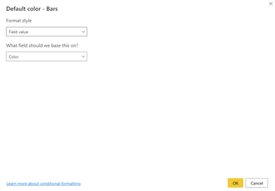
Then set it to this:
Helpful resources

New to Fabric Survey
If you have recently started exploring Fabric, we'd love to hear how it's going. Your feedback can help with product improvements.

Power BI DataViz World Championships - June 2026
A new Power BI DataViz World Championship is coming this June! Don't miss out on submitting your entry.

Join our Fabric User Panel
Share feedback directly with Fabric product managers, participate in targeted research studies and influence the Fabric roadmap.

| User | Count |
|---|---|
| 12 | |
| 10 | |
| 10 | |
| 6 | |
| 5 |


