Huge last-minute discounts for FabCon Vienna from September 15-18, 2025
Supplies are limited. Contact info@espc.tech right away to save your spot before the conference sells out.
Get your discount- Power BI forums
- Get Help with Power BI
- Desktop
- Service
- Report Server
- Power Query
- Mobile Apps
- Developer
- DAX Commands and Tips
- Custom Visuals Development Discussion
- Health and Life Sciences
- Power BI Spanish forums
- Translated Spanish Desktop
- Training and Consulting
- Instructor Led Training
- Dashboard in a Day for Women, by Women
- Galleries
- Data Stories Gallery
- Themes Gallery
- Contests Gallery
- Quick Measures Gallery
- Notebook Gallery
- Translytical Task Flow Gallery
- TMDL Gallery
- R Script Showcase
- Webinars and Video Gallery
- Ideas
- Custom Visuals Ideas (read-only)
- Issues
- Issues
- Events
- Upcoming Events
Score big with last-minute savings on the final tickets to FabCon Vienna. Secure your discount
- Power BI forums
- Forums
- Get Help with Power BI
- DAX Commands and Tips
- Re: Customizable trend analysis for both point-in-...
- Subscribe to RSS Feed
- Mark Topic as New
- Mark Topic as Read
- Float this Topic for Current User
- Bookmark
- Subscribe
- Printer Friendly Page
- Mark as New
- Bookmark
- Subscribe
- Mute
- Subscribe to RSS Feed
- Permalink
- Report Inappropriate Content
Customizable trend analysis for both point-in-time and cumulative data elements (pbix included)
Link to pbix download:
In this sample dashboard, I included 3 sample data elements:
- # new referrals (cumulative)
- # clients currently waiting for service (point in time)
- average # days in service for active clients (point in time)
I need to create a trand analysis visual for each of these data elements (plan to use line graph for cumulative and bar graph for point in time). The end users would like the following features:
- Customized date range and responsive point-in-time visuals: when users enter a start and end date (using a date slider slicer?), for example, if they enter 2021-04-01 to today, the "# clients currently waiting for service" visual will show number of clients that were waiting on 2021-04-01, 2021-05-01, 2021-06-01... etc. When a client is waiting on 2021-04-01, their referral date must be before or on 2021-04-01, and their start date must be after 2021-04-01.
- Customized date range and responsive cumulative visuals: when users enter 2021-04-01 to today, the "# referrals" visual will show number of cumulative referrals since 2021-04-01, this should be a trendline that always goes up
- If possible, have the option to switch between different time intervals (monthly, quaterly, yearly) for all the visuals. I think this could be achieved using date hierarchy and drill-down, but my end users tend to get confused by that and they want big buttons to click on. So another solution would be create separate visuals, and show/hide them using bookmarked buttons. Is there any other solution?
- The users want to be able to set the start date as any day of the month/quarter/year, and have the intervals fall on the same day. For example, if the interval is set to quarterly, and the user select "2021-03-02" as start date, the graph will show 2021-03-02, 2021-06-02, 2021-09-02, etc... if this is not possible, setting the dates to first day of the month/quarter/year within the selected time range is fine as well.
Thanks so much! I look forward to discussing this with everyone 🙂
- Mark as New
- Bookmark
- Subscribe
- Mute
- Subscribe to RSS Feed
- Permalink
- Report Inappropriate Content
Hi @Anonymous
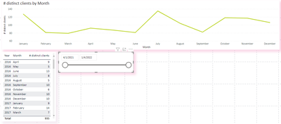
(1)For your first question ,the status of the calculated column [# clients waiting] you created has fixed “waiting”, in your data , when the status is waiting , the value of start date is null , so you cannot realize the scenario “When a client is waiting on 2021-04-01, their referral date must be before or on 2021-04-01, and their start date must be after 2021-04-01.” You can see the difference when I select date in Start Date slicer .
(2) For your second question, from referral date 2021-04-01 , the number of cumulative referrals shows ups and downs, not always goes up .
(3)For your third question , you can try the bookmark button in Desktop , I have searched an operational documentation for you , you can refer to it .
https://www.c-sharpcorner.com/article/how-to-add-button-using-bookmarks-in-power-bi/
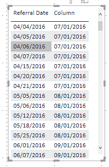
(4)For your forth question , you can use EOMONTH() to return the first day of different month .For example :
Column = EOMONTH(services_breakdown[Referral Date],2)+1I have attached my pbix file , you can refer to it .
Best Regard
Community Support Team _ Ailsa Tao
If this post helps, then please consider Accept it as the solution to help the other members find it more quickly.
Helpful resources
| User | Count |
|---|---|
| 12 | |
| 11 | |
| 8 | |
| 6 | |
| 6 |
| User | Count |
|---|---|
| 24 | |
| 19 | |
| 14 | |
| 10 | |
| 7 |


