Join the #PBI10 DataViz contest
Power BI is turning 10, and we’re marking the occasion with a special community challenge. Use your creativity to tell a story, uncover trends, or highlight something unexpected.
Get started- Power BI forums
- Get Help with Power BI
- Desktop
- Service
- Report Server
- Power Query
- Mobile Apps
- Developer
- DAX Commands and Tips
- Custom Visuals Development Discussion
- Health and Life Sciences
- Power BI Spanish forums
- Translated Spanish Desktop
- Training and Consulting
- Instructor Led Training
- Dashboard in a Day for Women, by Women
- Galleries
- Webinars and Video Gallery
- Data Stories Gallery
- Themes Gallery
- Contests Gallery
- Quick Measures Gallery
- Notebook Gallery
- Translytical Task Flow Gallery
- R Script Showcase
- Ideas
- Custom Visuals Ideas (read-only)
- Issues
- Issues
- Events
- Upcoming Events
Join us for an expert-led overview of the tools and concepts you'll need to become a Certified Power BI Data Analyst and pass exam PL-300. Register now.
- Power BI forums
- Forums
- Get Help with Power BI
- DAX Commands and Tips
- Re: Adding upper and lower Limt lines in a line ch...
- Subscribe to RSS Feed
- Mark Topic as New
- Mark Topic as Read
- Float this Topic for Current User
- Bookmark
- Subscribe
- Printer Friendly Page
- Mark as New
- Bookmark
- Subscribe
- Mute
- Subscribe to RSS Feed
- Permalink
- Report Inappropriate Content
Adding upper and lower Limt lines in a line chart based on Average value +/- 1 standard deviation
Hi all,
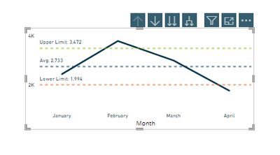
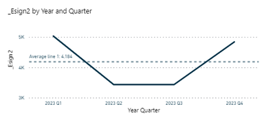
So I am trying to create something like a process control chart. I have been able to do this , but my upper and lower limit lines work fine when x axis is month, but when I drill to Day level, it does not work as expected. I want it to behave as the buil in avg line behaves. so when I am at month level, the avg line shows month's average but when I am at day level it gives daily average.
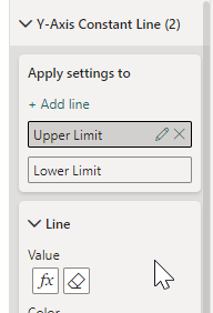
I understand it is happening because if the way I have built measures- which is as following-
I do understand, that because I am summarizing by month, it is behaving like this but how do I modify it to behave as expected for month/day or whatever calendar hierarchy is there.
Thank you in advance
- Mark as New
- Bookmark
- Subscribe
- Mute
- Subscribe to RSS Feed
- Permalink
- Report Inappropriate Content
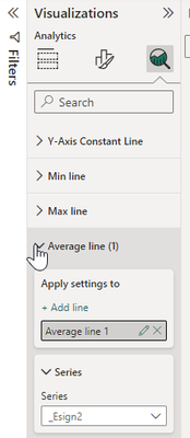
@Anonymous Thank you. but I cannot train my users to do that.
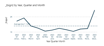
I want to achieve the same functionality as the built in average line.
ex
The average value recalculates. I want to achieve similar results for upper control line and lower control line. Any help/guidance is appreciated.
- Mark as New
- Bookmark
- Subscribe
- Mute
- Subscribe to RSS Feed
- Permalink
- Report Inappropriate Content
Hi, @_Regina
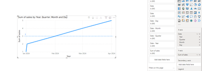
Based on your description, I tried it using the following chart:
Here's my DAX expression:
_Avg line Signups =
AVERAGEX(
    ADDCOLUMNS(
        SUMMARIZE(ALLSELECTED('Calender'),'Calender'[Date]),
        "avg",[Sum of price]
    ),
    [avg])
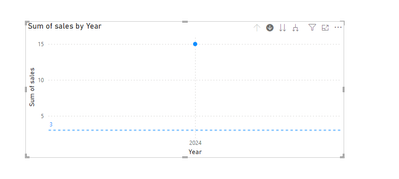
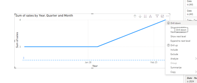
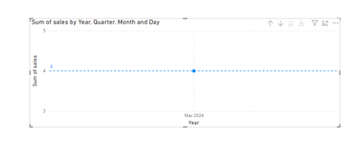
When I use the arrow in the top right corner to get to the next level, the constant line doesn't change:
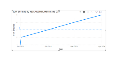
When I use the drill down function of the right-click menu, it is recalculated:
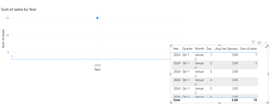
To make it easier to explain the problem with this constant line, I've tried to create a table visual:
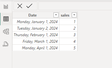
This is my data:
In the diagram below, we find that _Avg line Signups is always 3, which is calculated as 15/5=3. The dependency is on the total of sales rather than the context of the hierarchy currently entered by the arrows.
So that's why when you go to the level of date through the arrow in the top right corner, your constant line doesn't do a recalculation. You can proceed to the next level by right-clicking on the drill down function, and your constant line will be recalculated.
I provide the PBIX file used this time below.
How to Get Your Question Answered Quickly
If it does not help, please provide more details with your desired output and pbix file without privacy information (or some sample data) .
Best Regards
Jianpeng Li
If this post helps, then please consider Accept it as the solution to help the other members find it more quickly.
Helpful resources

Join our Fabric User Panel
This is your chance to engage directly with the engineering team behind Fabric and Power BI. Share your experiences and shape the future.

Power BI Monthly Update - June 2025
Check out the June 2025 Power BI update to learn about new features.

| User | Count |
|---|---|
| 10 | |
| 9 | |
| 8 | |
| 8 | |
| 8 |
| User | Count |
|---|---|
| 13 | |
| 12 | |
| 11 | |
| 10 | |
| 8 |
