Fabric Data Days starts November 4th!
Advance your Data & AI career with 50 days of live learning, dataviz contests, hands-on challenges, study groups & certifications and more!
Get registered- Power BI forums
- Get Help with Power BI
- Desktop
- Service
- Report Server
- Power Query
- Mobile Apps
- Developer
- DAX Commands and Tips
- Custom Visuals Development Discussion
- Health and Life Sciences
- Power BI Spanish forums
- Translated Spanish Desktop
- Training and Consulting
- Instructor Led Training
- Dashboard in a Day for Women, by Women
- Galleries
- Data Stories Gallery
- Themes Gallery
- Contests Gallery
- Quick Measures Gallery
- Visual Calculations Gallery
- Notebook Gallery
- Translytical Task Flow Gallery
- TMDL Gallery
- R Script Showcase
- Webinars and Video Gallery
- Ideas
- Custom Visuals Ideas (read-only)
- Issues
- Issues
- Events
- Upcoming Events
Join us at FabCon Atlanta from March 16 - 20, 2026, for the ultimate Fabric, Power BI, AI and SQL community-led event. Save $200 with code FABCOMM. Register now.
- Power BI forums
- Forums
- Get Help with Power BI
- DAX Commands and Tips
- 100% stacked bar chart - sort of text column by in...
- Subscribe to RSS Feed
- Mark Topic as New
- Mark Topic as Read
- Float this Topic for Current User
- Bookmark
- Subscribe
- Printer Friendly Page
- Mark as New
- Bookmark
- Subscribe
- Mute
- Subscribe to RSS Feed
- Permalink
- Report Inappropriate Content
100% stacked bar chart - sort of text column by index with same colors in legend
Hi,
I want to create a 100 % stacked bar chart which has data like below
| Ticket | Created | Time spent | state | Index |
| id 1 | 10/24/2023 16:49 | 1 | P4 | 1 |
| id 1 | 10/24/2023 17:23 | 0 | P4 | 1 |
| id 1 | 10/24/2023 17:40 | 1 | P2 | 2 |
| id 1 | 10/24/2023 18:02 | 0 | P2 | 2 |
| id 1 | 10/24/2023 18:07 | 0 | P2 | 2 |
| id 1 | 10/24/2023 18:10 | 0 | P2 | 2 |
| id 1 | 10/24/2023 18:38 | 0 | P2 | 2 |
| id 1 | 10/24/2023 18:49 | 0 | P3 | 3 |
| id 1 | 10/24/2023 18:50 | 13 | P3 | 3 |
| id 1 | 10/25/2023 7:13 | 0 | P3 | 3 |
| id 1 | 10/25/2023 7:18 | 0 | P3 | 3 |
| id 1 | 10/25/2023 7:21 | 1 | P3 | 3 |
| id 1 | 10/25/2023 8:20 | 0 | P3 | 3 |
| id 2 | 10/24/2023 16:49 | 1 | P4 | 1 |
| id 2 | 10/24/2023 17:23 | 0 | P4 | 1 |
| id 2 | 10/24/2023 17:40 | 1 | P2 | 2 |
| id 2 | 10/24/2023 18:02 | 0 | P2 | 2 |
| id 2 | 10/24/2023 18:07 | 0 | P2 | 2 |
| id 2 | 10/24/2023 18:10 | 0 | P2 | 2 |
| id 2 | 10/24/2023 18:38 | 0 | P2 | 2 |
| id 2 | 10/24/2023 18:49 | 0 | P3 | 3 |
| id 2 | 10/24/2023 18:50 | 13 | P3 | 3 |
| id 2 | 10/25/2023 7:13 | 0 | P3 | 3 |
| id 2 | 10/25/2023 7:18 | 0 | P3 | 3 |
| id 2 | 10/25/2023 7:21 | 1 | P3 | 3 |
| id 2 | 10/25/2023 8:20 | 0 | P3 | 3 |
in y-axis=Ticket, x-axis=Time spent, legend=Index, but this legend does not give the same colors for all state in a id. Also, tried sorting column state using Sort by column index which gives an error such as"there can't be more than one value in index for the same state". Would really be helpfull if there's a way to sort state by index and it should have same colors for all ticket id.
Please Note: The legend has to be sorted by index+it should same colors for every state in each id as well well over all other id's.
Thanks for your help in advance
- Mark as New
- Bookmark
- Subscribe
- Mute
- Subscribe to RSS Feed
- Permalink
- Report Inappropriate Content
@ValtteriN , if you turn off legend and switch on custom label and put state there, you can observe that color for each state is different because of the sequence/index. Thus i want the sequence+same colors, is this possible in dax to have it sorted and assign colors same colors to states and put this as a legend?
- Mark as New
- Bookmark
- Subscribe
- Mute
- Subscribe to RSS Feed
- Permalink
- Report Inappropriate Content
Hi,
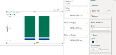
Could you add an image of the issue? Generally speaking the color should be the same between the columns since you can adjust it on series level:
Did I answer your question? Mark my post as a solution!
Proud to be a Super User!
Helpful resources

FabCon Global Hackathon
Join the Fabric FabCon Global Hackathon—running virtually through Nov 3. Open to all skill levels. $10,000 in prizes!

Power BI Monthly Update - October 2025
Check out the October 2025 Power BI update to learn about new features.


