Huge last-minute discounts for FabCon Vienna from September 15-18, 2025
Supplies are limited. Contact info@espc.tech right away to save your spot before the conference sells out.
Get your discount- Power BI forums
- Get Help with Power BI
- Desktop
- Service
- Report Server
- Power Query
- Mobile Apps
- Developer
- DAX Commands and Tips
- Custom Visuals Development Discussion
- Health and Life Sciences
- Power BI Spanish forums
- Translated Spanish Desktop
- Training and Consulting
- Instructor Led Training
- Dashboard in a Day for Women, by Women
- Galleries
- Data Stories Gallery
- Themes Gallery
- Contests Gallery
- Quick Measures Gallery
- Notebook Gallery
- Translytical Task Flow Gallery
- TMDL Gallery
- R Script Showcase
- Webinars and Video Gallery
- Ideas
- Custom Visuals Ideas (read-only)
- Issues
- Issues
- Events
- Upcoming Events
Score big with last-minute savings on the final tickets to FabCon Vienna. Secure your discount
- Power BI forums
- Forums
- Get Help with Power BI
- Custom Visuals Development Discussion
- Re: Visual Similar to Gantt Chart
- Subscribe to RSS Feed
- Mark Topic as New
- Mark Topic as Read
- Float this Topic for Current User
- Bookmark
- Subscribe
- Printer Friendly Page
- Mark as New
- Bookmark
- Subscribe
- Mute
- Subscribe to RSS Feed
- Permalink
- Report Inappropriate Content
Visual Similar to Gantt Chart
Hello-
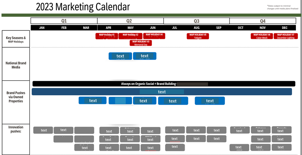
I am looking for a visual that can allow me to automate this view in Power BI:
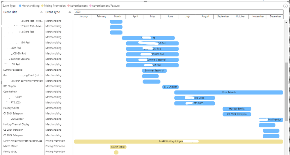
Currently, the raw data is in row format with Start Date, End Date, Event Type, Event Name, and more columns. I would like the calendar year view on one screen with Event Type on the y axis and the Event Name in the chart. I have come close by trying a Gantt Chart. Below is the result of using PowerGantt Chart:
However, the Gantt Chart lacks the following:
- Grouping: I would like Event Type to be the only Y axis with Event Title in the chart.
- Side by Side: Events side by side if they are under the same grouping
- PowerGantt Chart is the best option so far but it requires a paid license; the Microsoft Gantt Chart is not as strong (Rolls up to Day view max, not month)/Axis cannot be expanded
That being said, is there a visual that mimicks the view of a Gantt Chart while fulfilling these needs?
Thanks!
- Mark as New
- Bookmark
- Subscribe
- Mute
- Subscribe to RSS Feed
- Permalink
- Report Inappropriate Content
Custom Visuals in Appsource :
Traqplan Timeline and Roadmaps Pro
and
ADWISE RoadMap
Did I answer your question? Mark my post as a solution!
Proud to be a Super User!
- Mark as New
- Bookmark
- Subscribe
- Mute
- Subscribe to RSS Feed
- Permalink
- Report Inappropriate Content
Although there is some learning curve, you could likely create that with the Deneb visual. See video for an example Gantt.
Deneb Demo Build - Gantt Edition - YouTube
Pat
- Mark as New
- Bookmark
- Subscribe
- Mute
- Subscribe to RSS Feed
- Permalink
- Report Inappropriate Content
You can always create your own time series and use a standard matrix visual to achieve the hierarchy.


