FabCon is coming to Atlanta
Join us at FabCon Atlanta from March 16 - 20, 2026, for the ultimate Fabric, Power BI, AI and SQL community-led event. Save $200 with code FABCOMM.
Register now!- Power BI forums
- Get Help with Power BI
- Desktop
- Service
- Report Server
- Power Query
- Mobile Apps
- Developer
- DAX Commands and Tips
- Custom Visuals Development Discussion
- Health and Life Sciences
- Power BI Spanish forums
- Translated Spanish Desktop
- Training and Consulting
- Instructor Led Training
- Dashboard in a Day for Women, by Women
- Galleries
- Data Stories Gallery
- Themes Gallery
- Contests Gallery
- QuickViz Gallery
- Quick Measures Gallery
- Visual Calculations Gallery
- Notebook Gallery
- Translytical Task Flow Gallery
- TMDL Gallery
- R Script Showcase
- Webinars and Video Gallery
- Ideas
- Custom Visuals Ideas (read-only)
- Issues
- Issues
- Events
- Upcoming Events
The Power BI Data Visualization World Championships is back! Get ahead of the game and start preparing now! Learn more
- Power BI forums
- Forums
- Get Help with Power BI
- Custom Visuals Development Discussion
- Re: Visual Similar to Gantt Chart
- Subscribe to RSS Feed
- Mark Topic as New
- Mark Topic as Read
- Float this Topic for Current User
- Bookmark
- Subscribe
- Printer Friendly Page
- Mark as New
- Bookmark
- Subscribe
- Mute
- Subscribe to RSS Feed
- Permalink
- Report Inappropriate Content
Visual Similar to Gantt Chart
Hello-
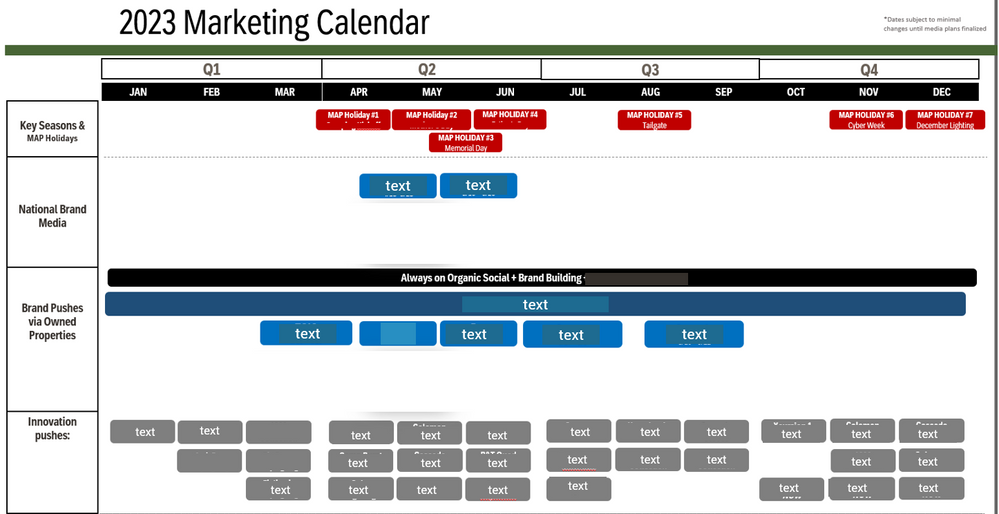
I am looking for a visual that can allow me to automate this view in Power BI:
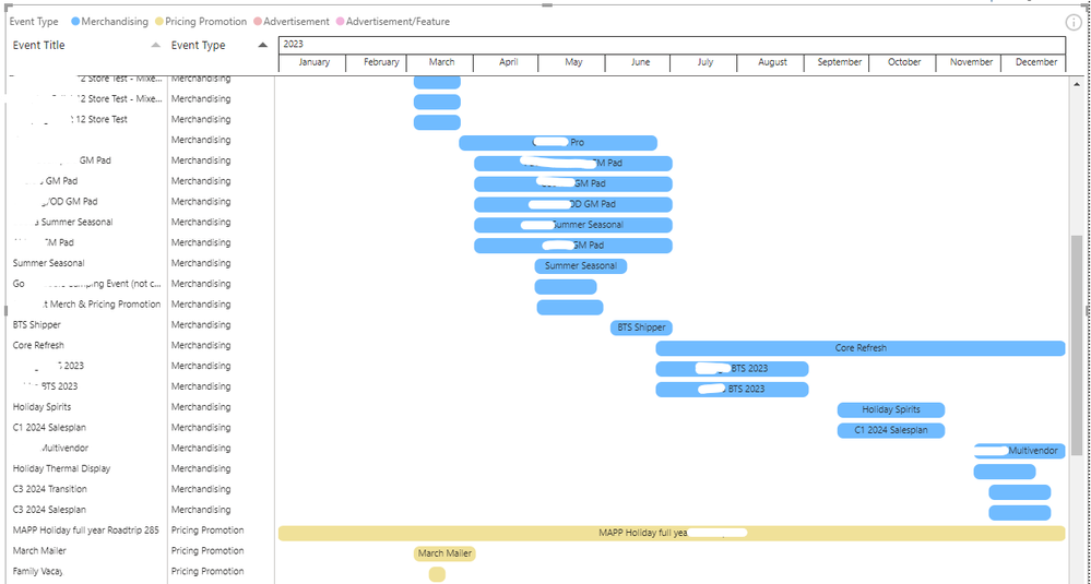
Currently, the raw data is in row format with Start Date, End Date, Event Type, Event Name, and more columns. I would like the calendar year view on one screen with Event Type on the y axis and the Event Name in the chart. I have come close by trying a Gantt Chart. Below is the result of using PowerGantt Chart:
However, the Gantt Chart lacks the following:
- Grouping: I would like Event Type to be the only Y axis with Event Title in the chart.
- Side by Side: Events side by side if they are under the same grouping
- PowerGantt Chart is the best option so far but it requires a paid license; the Microsoft Gantt Chart is not as strong (Rolls up to Day view max, not month)/Axis cannot be expanded
That being said, is there a visual that mimicks the view of a Gantt Chart while fulfilling these needs?
Thanks!
- Mark as New
- Bookmark
- Subscribe
- Mute
- Subscribe to RSS Feed
- Permalink
- Report Inappropriate Content
Custom Visuals in Appsource :
Traqplan Timeline and Roadmaps Pro
and
ADWISE RoadMap
Did I answer your question? Mark my post as a solution!
Proud to be a Super User!
- Mark as New
- Bookmark
- Subscribe
- Mute
- Subscribe to RSS Feed
- Permalink
- Report Inappropriate Content
Although there is some learning curve, you could likely create that with the Deneb visual. See video for an example Gantt.
Deneb Demo Build - Gantt Edition - YouTube
Pat
- Mark as New
- Bookmark
- Subscribe
- Mute
- Subscribe to RSS Feed
- Permalink
- Report Inappropriate Content
You can always create your own time series and use a standard matrix visual to achieve the hierarchy.
Helpful resources

Power BI Dataviz World Championships
The Power BI Data Visualization World Championships is back! Get ahead of the game and start preparing now!

| User | Count |
|---|---|
| 1 | |
| 1 | |
| 1 | |
| 1 | |
| 1 |


