- Power BI forums
- Get Help with Power BI
- Desktop
- Service
- Report Server
- Power Query
- Mobile Apps
- Developer
- DAX Commands and Tips
- Custom Visuals Development Discussion
- Health and Life Sciences
- Power BI Spanish forums
- Translated Spanish Desktop
- Training and Consulting
- Instructor Led Training
- Dashboard in a Day for Women, by Women
- Galleries
- Data Stories Gallery
- Themes Gallery
- Contests Gallery
- QuickViz Gallery
- Quick Measures Gallery
- Visual Calculations Gallery
- Notebook Gallery
- Translytical Task Flow Gallery
- TMDL Gallery
- R Script Showcase
- Webinars and Video Gallery
- Ideas
- Custom Visuals Ideas (read-only)
- Issues
- Issues
- Events
- Upcoming Events
Learn from the best! Meet the four finalists headed to the FINALS of the Power BI Dataviz World Championships! Register now
- Power BI forums
- Forums
- Get Help with Power BI
- Custom Visuals Development Discussion
- Re: Visual Issue (Combination Whole Number/Percent...
- Subscribe to RSS Feed
- Mark Topic as New
- Mark Topic as Read
- Float this Topic for Current User
- Bookmark
- Subscribe
- Printer Friendly Page
- Mark as New
- Bookmark
- Subscribe
- Mute
- Subscribe to RSS Feed
- Permalink
- Report Inappropriate Content
Visual Issue (Combination Whole Number/Percentage)
Hi Power Bi users,
i come with a question and I hope someone could help me:
I have 2 measures % and whole number and I wanted to create a graph where those two measures are combine but the graphs that I use is not perfect for it:
Here are the tables:
Act
| Name | 31.10.2020 | 30.11.2020 | 31.12.2020 | 31.01.2021 | 28.02.2021 | 31.03.2021 | 30.04.2021 | 31.05.2021 | 30.06.2021 |
| A | 200 | 500 | 600 | 800 | 400 | 300 | 200 | 250 | 450 |
| B | 300 | 600 | 800 | 100 | 400 | 300 | 500 | 350 | 500 |
BDG
| Name | 31.10.2020 | 30.11.2020 | 31.12.2020 | 31.01.2021 | 28.02.2021 | 31.03.2021 | 30.04.2021 | 31.05.2021 | 30.06.2021 | 31.07.2021 | 31.08.2021 | 30.09.2021 |
| A | 400 | 300 | 250 | 750 | 350 | 500 | 500 | 250 | 450 | 500 | 250 | 200 |
| B | 500 | 600 | 750 | 200 | 500 | 400 | 350 | 100 | 500 | 450 | 350 | 250 |
ACT GR (%)
| Name | 31.10.2020 | 30.11.2020 | 31.12.2020 | 31.01.2021 | 28.02.2021 | 31.03.2021 | 30.04.2021 | 31.05.2021 | 30.06.2021 |
| A | 0,8 | 0,7 | 1 | 0,5 | 1 | 1 | 1 | 1 | 1 |
| B | 0 | 0 | 0,5 | 1 | 1 | 1 | 1 | 1 | 0,75 |
BDG GR (%)
| Name | 31.10.2020 | 30.11.2020 | 31.12.2020 | 31.01.2021 | 28.02.2021 | 31.03.2021 | 30.04.2021 | 31.05.2021 | 30.06.2021 | 31.07.2021 | 31.08.2021 | 30.09.2021 |
| A | 1 | 1 | 1 | 1 | 1 | 1 | 1 | 1 | 1 | 1 | 1 | 1 |
| B | 1 | 1 | 1 | 1 | 1 | 1 | 1 | 1 | 1 | 1 | 1 | 1 |
Here my Graph with the Percentage issue:
As you can see in the Line Value I have 3 measures and one of them is whole Numbers. But I need to have the BDG also in the Line Value. But then it comes to the problem that the other two measure in % is showing it wrong in the graph. There is a solution for it?
Thanks in Advance for any solution 🙂
- Mark as New
- Bookmark
- Subscribe
- Mute
- Subscribe to RSS Feed
- Permalink
- Report Inappropriate Content
Hello @RY2019
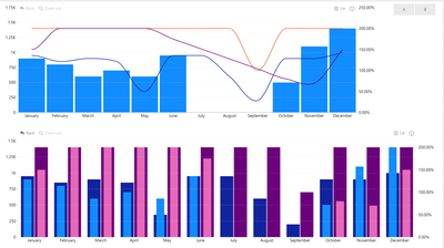
Don`t think it`s possible with the native visual, since series that are in Column Value are assigned to Primary Y-Axis and the series that are in the Line Value are automatically assigned to Secondary Y-Axis. You don`t have further control over which series from line values are assigned to what Y-Axis.
However, this is something you can achieve through 3-rd party visuals. for example this one https://appsource.microsoft.com/en-us/product/power-bi-visuals/WA104381944
It allows you to asign any of the series to any of the axis.
I have attached a simple example with the data you had.
https://failiem.lv/u/yaqqk7yfd
Here are 2 different variations from the same visual
Did I answer your question? Mark my post as a solution 🙂 If I gave you an idea on how to solve this otherwise give my post some Kudos 😄
Helpful resources

Power BI DataViz World Championships - June 2026
A new Power BI DataViz World Championship is coming this June! Don't miss out on submitting your entry.

Join our Fabric User Panel
Share feedback directly with Fabric product managers, participate in targeted research studies and influence the Fabric roadmap.

| User | Count |
|---|---|
| 5 | |
| 4 | |
| 2 | |
| 2 | |
| 2 |


