- Power BI forums
- Get Help with Power BI
- Desktop
- Service
- Report Server
- Power Query
- Mobile Apps
- Developer
- DAX Commands and Tips
- Custom Visuals Development Discussion
- Health and Life Sciences
- Power BI Spanish forums
- Translated Spanish Desktop
- Training and Consulting
- Instructor Led Training
- Dashboard in a Day for Women, by Women
- Galleries
- Data Stories Gallery
- Themes Gallery
- Contests Gallery
- QuickViz Gallery
- Quick Measures Gallery
- Visual Calculations Gallery
- Notebook Gallery
- Translytical Task Flow Gallery
- TMDL Gallery
- R Script Showcase
- Webinars and Video Gallery
- Ideas
- Custom Visuals Ideas (read-only)
- Issues
- Issues
- Events
- Upcoming Events
Learn from the best! Meet the four finalists headed to the FINALS of the Power BI Dataviz World Championships! Register now
- Power BI forums
- Forums
- Get Help with Power BI
- Custom Visuals Development Discussion
- Published Power BI R Visual Missing Category Names
- Subscribe to RSS Feed
- Mark Topic as New
- Mark Topic as Read
- Float this Topic for Current User
- Bookmark
- Subscribe
- Printer Friendly Page
- Mark as New
- Bookmark
- Subscribe
- Mute
- Subscribe to RSS Feed
- Permalink
- Report Inappropriate Content
Published Power BI R Visual Missing Category Names
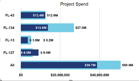
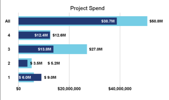
I've created a few visuals using R in Power BI. I can't get the names of the different projects to show up when I publish the visual though. It just replaces the names with 1, 2, 3, and 4. I've included a screen shot of what the visual looks like in Power BI desktop and when I publish it on the service. I've also included my code below. Is there a way I can fix this?

# The following code to create a dataframe and remove duplicated rows is always executed and acts as a preamble for your script:
# dataset <- data.frame(Project, Spend, MAmountPostive)
# dataset <- unique(dataset)
# Paste or type your script code here:
library(ggplot2)
library(gridExtra)
library(scales)
color1 = "#75CDE5"
color2 = "#223974"
s = 3500000
All1 <- sum(dataset$Spend)
All2 <- sum(dataset$MAmountPostive)
categorical = append("All",dataset$Project)
actual = append(All2,dataset$MAmountPostive)
target = append(All1,dataset$Spend)
data <- data.frame(categorical, actual, target)
ggplot(data, aes(categorical, target)) +
geom_col(fill = color1, width = 0.7) +
geom_col(aes(categorical, actual), fill = color2, width = 0.5) +
labs(title = "Project Spend", x = "", y = "") +
geom_text(aes(label = paste0("$",format(round(actual/1e6, 1)),"M"),
y = ifelse(actual < 2*s, ifelse(actual < target, actual + s, actual + 2.5*s), ifelse(actual < target, actual - s, actual + s))),
color = ifelse(actual < 2*s, ifelse(actual < target, "black", "black"), ifelse(actual < target, "white", "black")), fontface = "bold", size = 5) +
geom_text(aes(label = paste0("$",format(round(target/1e6, 1)),"M"),
y = ifelse(actual < 2*s, ifelse(target - actual < s, ifelse(actual < target, target + 2.5*s, target),ifelse(actual < target, target + s, target + s)), ifelse(actual < target, target+ s, target - s))),
color = ifelse(actual < 2*s, ifelse(target - actual < s, ifelse(actual < target, "black", "white"),ifelse(actual < target, "black", "black")), ifelse(actual < target, "black", "white")), fontface = "bold", size = 5) +
theme(panel.grid.major.y = element_blank(),
panel.grid.minor.y = element_blank(),
panel.grid.major.x = element_line("grey"),
panel.grid.minor.x = element_blank(),
panel.background = element_blank(),
plot.title = element_text(hjust = 0.5, size = 20),
axis.text = element_text(size = 15, face = "bold", color = "black"),
axis.text.y = element_text(hjust = 1),
axis.ticks.y = element_blank(),
plot.margin = margin(t = 10, r = 35, b = 0, l = 0)) +
scale_y_continuous(labels = dollar) +
coord_flip()
Helpful resources

Power BI DataViz World Championships - June 2026
A new Power BI DataViz World Championship is coming this June! Don't miss out on submitting your entry.

Join our Fabric User Panel
Share feedback directly with Fabric product managers, participate in targeted research studies and influence the Fabric roadmap.

| User | Count |
|---|---|
| 5 | |
| 4 | |
| 2 | |
| 2 | |
| 2 |
