I've created a few visuals using R in Power BI. I can't get the names of the different projects to show up when I publish the visual though. It just replaces the names with 1, 2, 3, and 4. I've included a screen shot of what the visual looks like in Power BI desktop and when I publish it on the service. I've also included my code below. Is there a way I can fix this?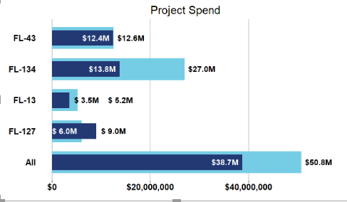 Desktop Visual
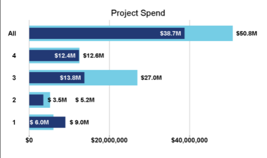 Service Visual
# The following code to create a dataframe and remove duplicated rows is always executed and acts as a preamble for your script:
# dataset <- data.frame(Project, Spend, MAmountPostive)
# dataset <- unique(dataset)
# Paste or type your script code here:
All1 <- sum(dataset$Spend)
All2 <- sum(dataset$MAmountPostive)
categorical = append("All",dataset$Project)
actual = append(All2,dataset$MAmountPostive)
target = append(All1,dataset$Spend)
data <- data.frame(categorical, actual, target)
ggplot(data, aes(categorical, target)) +
geom_col(fill = color1, width = 0.7) +
geom_col(aes(categorical, actual), fill = color2, width = 0.5) +
labs(title = "Project Spend", x = "", y = "") +
geom_text(aes(label = paste0("$",format(round(actual/1e6, 1)),"M"),
y = ifelse(actual < 2*s, ifelse(actual < target, actual + s, actual + 2.5*s), ifelse(actual < target, actual - s, actual + s))),
color = ifelse(actual < 2*s, ifelse(actual < target, "black", "black"), ifelse(actual < target, "white", "black")), fontface = "bold", size = 5) +
geom_text(aes(label = paste0("$",format(round(target/1e6, 1)),"M"),
y = ifelse(actual < 2*s, ifelse(target - actual < s, ifelse(actual < target, target + 2.5*s, target),ifelse(actual < target, target + s, target + s)), ifelse(actual < target, target+ s, target - s))),
color = ifelse(actual < 2*s, ifelse(target - actual < s, ifelse(actual < target, "black", "white"),ifelse(actual < target, "black", "black")), ifelse(actual < target, "black", "white")), fontface = "bold", size = 5) +
theme(panel.grid.major.y = element_blank(),
panel.grid.minor.y = element_blank(),
panel.grid.major.x = element_line("grey"),
panel.grid.minor.x = element_blank(),
panel.background = element_blank(),
plot.title = element_text(hjust = 0.5, size = 20),
axis.text = element_text(size = 15, face = "bold", color = "black"),
axis.text.y = element_text(hjust = 1),
axis.ticks.y = element_blank(),
plot.margin = margin(t = 10, r = 35, b = 0, l = 0)) +
scale_y_continuous(labels = dollar) +


