This time we’re going bigger than ever. Fabric, Power BI, SQL, AI and more. We're covering it all. You won't want to miss it.
Learn moreLevel up your Power BI skills this month - build one visual each week and tell better stories with data! Get started
Hello ,
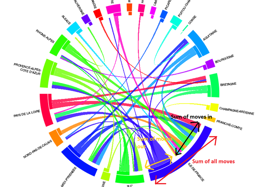
There is a graph "chord graph" to show the movement between 2 class or clusters. It's this graph : https://github.com/microsoft/powerbi-visuals-chord .
I Think that is very interesting to add an additional elements of information like this :
Red arrow : show the sum of movement
Yellow : only the part of out flow
Black : only the part of in flow
It's to compare the in VS out VS sum and the importance of the "flow". If it's a " little " or "big" flow , in case of migration for example.
With the current "chord graph" it's impossible to divide the "package" of in and of out. There is an only group.
Thanks for your help.
Solved! Go to Solution.
Hello,
We considered your feature request and concluded that it is reasonable so, we added it into the visual backlog.
Thanks a lot!
Kind Regards,
Evgenii Elkin,
Software Engineer
Microsoft Power BI Custom Visuals
pbicvsupport@microsoft.com
Hello,
We considered your feature request and concluded that it is reasonable so, we added it into the visual backlog.
Thanks a lot!
Kind Regards,
Evgenii Elkin,
Software Engineer
Microsoft Power BI Custom Visuals
pbicvsupport@microsoft.com
Hello / Good morning @v-evelk
Thanks for the consideration to process this idea . I follow your evolution with interest.
Check out the April 2026 Power BI update to learn about new features.
Sign up to receive a private message when registration opens and key events begin.
If you have recently started exploring Fabric, we'd love to hear how it's going. Your feedback can help with product improvements.