Join us at FabCon Vienna from September 15-18, 2025
The ultimate Fabric, Power BI, SQL, and AI community-led learning event. Save €200 with code FABCOMM.
Get registered- Power BI forums
- Get Help with Power BI
- Desktop
- Service
- Report Server
- Power Query
- Mobile Apps
- Developer
- DAX Commands and Tips
- Custom Visuals Development Discussion
- Health and Life Sciences
- Power BI Spanish forums
- Translated Spanish Desktop
- Training and Consulting
- Instructor Led Training
- Dashboard in a Day for Women, by Women
- Galleries
- Data Stories Gallery
- Themes Gallery
- Contests Gallery
- Quick Measures Gallery
- Notebook Gallery
- Translytical Task Flow Gallery
- TMDL Gallery
- R Script Showcase
- Webinars and Video Gallery
- Ideas
- Custom Visuals Ideas (read-only)
- Issues
- Issues
- Events
- Upcoming Events
Enhance your career with this limited time 50% discount on Fabric and Power BI exams. Ends September 15. Request your voucher.
- Power BI forums
- Forums
- Get Help with Power BI
- Custom Visuals Development Discussion
- Scatter Plot With Line Connecting Plot Points to X...
- Subscribe to RSS Feed
- Mark Topic as New
- Mark Topic as Read
- Float this Topic for Current User
- Bookmark
- Subscribe
- Printer Friendly Page
- Mark as New
- Bookmark
- Subscribe
- Mute
- Subscribe to RSS Feed
- Permalink
- Report Inappropriate Content
Scatter Plot With Line Connecting Plot Points to X-Axis
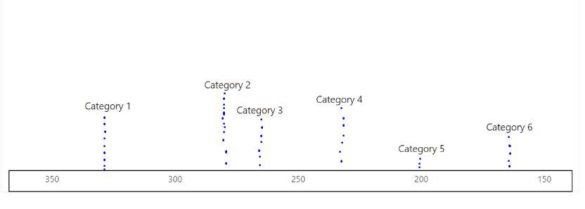
I have an X axis from 0 - 350. I am plotting where different categories fall on that axis based on their values.
What I am looking to do is have the plot points show the category label but I need a line, solid or dashed, to go from the plot point to the X-axis. I've tried lollipop charts, annotated bar charts, scatter plots, and some custom downloadable visuals and I have been unable to achieve this visual. It seems rather simple but I am unable to find a solution. Any ideas?
Below is an example of what I want to achieve. Thank you for your help.
Solved! Go to Solution.
- Mark as New
- Bookmark
- Subscribe
- Mute
- Subscribe to RSS Feed
- Permalink
- Report Inappropriate Content
With lots of googling and youtubing I was able to figure it out. Got exactly what I needed.
I used a basic bar chart and set the X axis to the max of my measure and the min to 0 and used the measure as the axis itself. On the Y axis I used the categories but of course they only did a count of 1. So I made a calculation group item that used the category name as the output string and placed that on the visual as a filter. Voila. Categories on top of each bar and each bar is plotted along the continuum.
- Mark as New
- Bookmark
- Subscribe
- Mute
- Subscribe to RSS Feed
- Permalink
- Report Inappropriate Content
Would you like to engage in some List.Generate() or GENERATESERIES() trickery? If yes then please provide sample data.
- Mark as New
- Bookmark
- Subscribe
- Mute
- Subscribe to RSS Feed
- Permalink
- Report Inappropriate Content
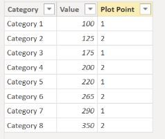
It's fairly straightforward. I have categories, and then values for each category. I've tried bar charts, line charts, matrices, custom visual downloads, you name it. I think if anything, a basic bar chart would be fine. I just need the x-axis to be made up of the values on the table with a bar or line extending up to the category label as in my example. I thought if anything, I could do a Y-Axis of say 1 and 2, so if any two category values are close to one another, they wouldn't overlap.
Unforuntately I am unable to attach a file here. It isn't in my options. But if you can create a basic input data table with one column being the categories, and the second column being the values, that would be the data sample I'm working with.
- Mark as New
- Bookmark
- Subscribe
- Mute
- Subscribe to RSS Feed
- Permalink
- Report Inappropriate Content
Please provide sanitized sample data that fully covers your issue. I cannot help you without meaningful sample data.
Please paste the data into a table in your post or use one of the file services like OneDrive or Google Drive. I cannot use screenshots of your source data.
- Mark as New
- Bookmark
- Subscribe
- Mute
- Subscribe to RSS Feed
- Permalink
- Report Inappropriate Content
- Mark as New
- Bookmark
- Subscribe
- Mute
- Subscribe to RSS Feed
- Permalink
- Report Inappropriate Content
Missing the plot point for each category.
- Mark as New
- Bookmark
- Subscribe
- Mute
- Subscribe to RSS Feed
- Permalink
- Report Inappropriate Content
Sorry for the double post. Not sure why it posted twice. The plot points will just be alternated to assure the category labels on each column don't overlap. Thank you for your time with this.
- Mark as New
- Bookmark
- Subscribe
- Mute
- Subscribe to RSS Feed
- Permalink
- Report Inappropriate Content
I'm not getting the desired outcome. Looks like the series label is not available for clom chart or scatter plot. If this is important to you please consider raising it at https://ideas.powerbi.com
See attached for both attempts.
- Mark as New
- Bookmark
- Subscribe
- Mute
- Subscribe to RSS Feed
- Permalink
- Report Inappropriate Content
With lots of googling and youtubing I was able to figure it out. Got exactly what I needed.
I used a basic bar chart and set the X axis to the max of my measure and the min to 0 and used the measure as the axis itself. On the Y axis I used the categories but of course they only did a count of 1. So I made a calculation group item that used the category name as the output string and placed that on the visual as a filter. Voila. Categories on top of each bar and each bar is plotted along the continuum.
- Mark as New
- Bookmark
- Subscribe
- Mute
- Subscribe to RSS Feed
- Permalink
- Report Inappropriate Content
Realize this is old, but I stubbled on it when looking how to recreate something I had done in the past. In case others, or myself in the future, are looking for this I thought I'd add an alternative I've used (and remember now but likely won't later!).
I used a X-Y scatter chart. With the + in the upper right of the chart you can add an error bar. It seems to pick horizontal automatically, but you want vertical. You can change this in the upper area of the menu that will pop out on the right of the screen after you add an error bar. The option to select a vertical (Y error bar) is hidden under a light blue chevron pointed down. Once you have the vertical error bar, choose to exend it down only (minus) and set the option for "Percentage" and set the percentage value to 100. This will extend an error bar down (minus) to the X-axis (100%). In the paint bucket I also set color to match the dot on the graph, the transparency to 75% and the width to 2.5, but you can customize this to how you see fit.
Cheers!
- Mark as New
- Bookmark
- Subscribe
- Mute
- Subscribe to RSS Feed
- Permalink
- Report Inappropriate Content


