Get Fabric certified for FREE!
Don't miss your chance to take the Fabric Data Engineer (DP-600) exam for FREE! Find out how by watching the DP-600 session on-demand now through April 28th.
Learn more- Power BI forums
- Get Help with Power BI
- Desktop
- Service
- Report Server
- Power Query
- Mobile Apps
- Developer
- DAX Commands and Tips
- Custom Visuals Development Discussion
- Health and Life Sciences
- Power BI Spanish forums
- Translated Spanish Desktop
- Training and Consulting
- Instructor Led Training
- Dashboard in a Day for Women, by Women
- Galleries
- Data Stories Gallery
- Themes Gallery
- Contests Gallery
- QuickViz Gallery
- Quick Measures Gallery
- Visual Calculations Gallery
- Notebook Gallery
- Translytical Task Flow Gallery
- TMDL Gallery
- R Script Showcase
- Webinars and Video Gallery
- Ideas
- Custom Visuals Ideas (read-only)
- Issues
- Issues
- Events
- Upcoming Events
Join the FabCon + SQLCon recap series. Up next: Power BI, Real-Time Intelligence, IQ and AI, and Data Factory take center stage. All sessions are available on-demand after the live show. Register now
- Power BI forums
- Forums
- Get Help with Power BI
- Custom Visuals Development Discussion
- Re: Power BI Custom Visuals' Community
- Subscribe to RSS Feed
- Mark Topic as New
- Mark Topic as Read
- Float this Topic for Current User
- Bookmark
- Subscribe
- Printer Friendly Page
- Mark as New
- Bookmark
- Subscribe
- Mute
- Subscribe to RSS Feed
- Permalink
- Report Inappropriate Content
Power BI Custom Visuals' Community
Welcome to Power BI Custom Visuals Community!
Power BI custom visuals is all about community. We are very excited to announce that custom visuals now have a special place in the Power BI community site, to share knowledge, ideas and news!
- Custom visuals development discussion – Ask questions and share knowledge about developing custom visuals.
- Custom visuals ideas – Share your ideas, ask for features, propose new custom visuals.
- Custom visuals community blog – Community news and announcements for new custom visuals available, new APIs released, tips & tricks from developers and users.
Power BI custom visuals useful links for developers
- Developer documents - find here all documents you need
- Step-by-step tutorial
- Looking for advanced tutorial? Find it here
- Visit also our github
- Find here Power BI visuals' Samples
- Custom visual's webinar
- For technichal questions and help please reach out pbicvsupport@microsoft.com
- Mark as New
- Bookmark
- Subscribe
- Mute
- Subscribe to RSS Feed
- Permalink
- Report Inappropriate Content
Hello,
Also for me some visual are completely blank on powerBi desktop after 2.131.1203.0 update. Any feedback?
- Mark as New
- Bookmark
- Subscribe
- Mute
- Subscribe to RSS Feed
- Permalink
- Report Inappropriate Content
I have the same problem with Text Filter Microsoft Corporation
Please advice. Best regards
- Mark as New
- Bookmark
- Subscribe
- Mute
- Subscribe to RSS Feed
- Permalink
- Report Inappropriate Content
Today working!
same version 2.131.1203.0 64-bit (July 2024)
- Mark as New
- Bookmark
- Subscribe
- Mute
- Subscribe to RSS Feed
- Permalink
- Report Inappropriate Content
Hi, did you re-update powerBi? My visuals are still blank.
- Mark as New
- Bookmark
- Subscribe
- Mute
- Subscribe to RSS Feed
- Permalink
- Report Inappropriate Content
Hello I am using Gantt 3.0.12.0 and I am encountering aproblem with the resources bucket. Most of my resource names are displaying, but anytime the field would say "Client" or a non-Employee Group, nothing displays. It will only display employee names as category labels, and no amount of changing relationships seems to fix this
- Mark as New
- Bookmark
- Subscribe
- Mute
- Subscribe to RSS Feed
- Permalink
- Report Inappropriate Content
Custom power bi chart is not refreshing to visualize a streaming data
I have been developing custom power bi chart for visualizing azure streamed data & for that created azure streaming job with an event hub data streaming input that pushs data to power bi dataset but it is not refreshing the chart to visualize a streaming data automatically, i have to refresh it manually to see the changes, can you please help me what i missing?
- Mark as New
- Bookmark
- Subscribe
- Mute
- Subscribe to RSS Feed
- Permalink
- Report Inappropriate Content
Hello,
Is there a way to filter the Sankey visual so we can see individual levels and how the are connected to other level.
- Mark as New
- Bookmark
- Subscribe
- Mute
- Subscribe to RSS Feed
- Permalink
- Report Inappropriate Content
Hi,
Data format might make it difficult. There is a custom Sankey Diagram by ChartExpo with different and easy data format. You can try filter on this tabular data format.
Thanks
- Mark as New
- Bookmark
- Subscribe
- Mute
- Subscribe to RSS Feed
- Permalink
- Report Inappropriate Content
Having issues witrh the Timeline Slicer as had set the fiscal year for June 1st with Sunday being the 1st day of the week though now the week numbers are not correct as of this month.
Example, week 52 is correct as the date range is from Sunday 19th of May to the Saturday 25th of May. Week 53 however is Sunday 26th of May to Friday 31st instead of Saturday 1st of July (I understand the issue here) and then it has week 1 as the single day of Saturday July 1st and week 2 starts on the 2nd of June.
To compensate, I have changed the fiscal date to June 2nd though for 2025, this may cause grief as 1st of June will be the Sunday. Not sure if there may be an easy fix to this.
- Mark as New
- Bookmark
- Subscribe
- Mute
- Subscribe to RSS Feed
- Permalink
- Report Inappropriate Content
If you add a 'Clear all slicers' button, it does not clear the text in the 'Text Filter'. Does anyone have experience in this?
- Mark as New
- Bookmark
- Subscribe
- Mute
- Subscribe to RSS Feed
- Permalink
- Report Inappropriate Content
Yes, the clear button does not work for custom visuals, at least not for the ones I use.
In order to implement a Clear filters button while having custom visuals, I used the bookmarks feature.
Harder to maintain, but unfortunately I think it is the only option.
- Mark as New
- Bookmark
- Subscribe
- Mute
- Subscribe to RSS Feed
- Permalink
- Report Inappropriate Content
Slicer not working since April 2024 update, gives error when published "To see this custom visual, add to this report first. Timeline144991079100. Any suggestions welcome!
- Mark as New
- Bookmark
- Subscribe
- Mute
- Subscribe to RSS Feed
- Permalink
- Report Inappropriate Content
The chicklet slicer is not able to access through embedding events after report embedded to a web portal
- Mark as New
- Bookmark
- Subscribe
- Mute
- Subscribe to RSS Feed
- Permalink
- Report Inappropriate Content
I'm trying to use the new dynamic formatting for measures with Power KPI Matrix 3.1.1. Is this not supported? The visual seems to use the custom column format set in the visual. It would be ideal if that could be left blank and the visual would default to using the default format of the measure, which in my case would be dynamic.
- Mark as New
- Bookmark
- Subscribe
- Mute
- Subscribe to RSS Feed
- Permalink
- Report Inappropriate Content
Hello, I am desiring to create a pretty simple radial column chart in PowerBI. Charticular seems like a plausible way to do this, but I have had no luck so far. My dataset contains rows representing people and columns with pre-scaled metrics about them. I would like each metric to be a column on the chart. What is the best way to achieve this? Thank you.
- Mark as New
- Bookmark
- Subscribe
- Mute
- Subscribe to RSS Feed
- Permalink
- Report Inappropriate Content
I am using Power KPI 2.0.0 (see attached image).
How can I invert my Y-axes in with this visual?
Thank you.
- Mark as New
- Bookmark
- Subscribe
- Mute
- Subscribe to RSS Feed
- Permalink
- Report Inappropriate Content
Update: Issue has been resolved. We found an issue with the Chrome browser version being used in the company.
We are using the ChicletSlicer in several reports. We started recieving reports that it was not working in the online versions. They click on a chiclet to make a selection but nothing happens other than the the colors of the chiclet changing. It does work properly in the desktop version.
- Mark as New
- Bookmark
- Subscribe
- Mute
- Subscribe to RSS Feed
- Permalink
- Report Inappropriate Content
PowerBI with app (add-in) Power KPI (2.0.0.0, last updated 7/10/2023) from Microsoft Corporation has a bug with vertical axis. When all values of variable are identical in time axis, plot gives horizontal line on the bottom, while it should be in the middle according to the vertical axis values. See example below.
How to reproduce a bug:
- Select "Power KPI" visual
- Set "Axis" to some valid variable
- Set "Values" to a variable which has identical values (calculated measure or count) accross all time points
- Result is horizontal line at the bottom of a graph, but according to vertical axis line should be in the middle
- Count of country = 3, vertical axis from 2.4 to 3.5, line is at wrong ~2.4 level
- Value popup shows correct value, but bubble point is on the line which is at wrong level (cross-hair of horizontal and vertical line)
IMO, axis values are correct, popup values are correct, but line is plotted at wrong height for some reason. When variable has different values, then ploted line and axis values seem to match correctly.
This bug needs to be fixed.
- Mark as New
- Bookmark
- Subscribe
- Mute
- Subscribe to RSS Feed
- Permalink
- Report Inappropriate Content
Is it possible to extract witch a right click on a point some data ?
- Mark as New
- Bookmark
- Subscribe
- Mute
- Subscribe to RSS Feed
- Permalink
- Report Inappropriate Content
There is the way to exceed the limit of data points in visual from AppSource?
- Mark as New
- Bookmark
- Subscribe
- Mute
- Subscribe to RSS Feed
- Permalink
- Report Inappropriate Content
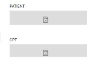
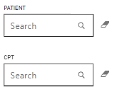
I am having this issue for 2 of our users. This search filter is working fine for other users, but not for some.
This is the working filter.
Any solution to this? We have tried clearing caches and re login to power bi service for those users too.
Helpful resources

Power BI Monthly Update - April 2026
Check out the April 2026 Power BI update to learn about new features.

New to Fabric Survey
If you have recently started exploring Fabric, we'd love to hear how it's going. Your feedback can help with product improvements.

Power BI DataViz World Championships - June 2026
A new Power BI DataViz World Championship is coming this June! Don't miss out on submitting your entry.


