A new Data Days event is coming soon!
This time we’re going bigger than ever. Fabric, Power BI, SQL, AI and more. We're covering it all. You won't want to miss it.
Learn more- Power BI forums
- Get Help with Power BI
- Desktop
- Service
- Report Server
- Power Query
- Mobile Apps
- Developer
- DAX Commands and Tips
- Custom Visuals Development Discussion
- Health and Life Sciences
- Power BI Spanish forums
- Translated Spanish Desktop
- Training and Consulting
- Instructor Led Training
- Dashboard in a Day for Women, by Women
- Galleries
- Data Stories Gallery
- Themes Gallery
- Contests Gallery
- QuickViz Gallery
- Quick Measures Gallery
- Visual Calculations Gallery
- Notebook Gallery
- Translytical Task Flow Gallery
- TMDL Gallery
- R Script Showcase
- Webinars and Video Gallery
- Ideas
- Custom Visuals Ideas (read-only)
- Issues
- Issues
- Events
- Upcoming Events
Did you hear? There's a new SQL AI Developer certification (DP-800). Start preparing now and be one of the first to get certified. Register now
- Power BI forums
- Forums
- Get Help with Power BI
- Custom Visuals Development Discussion
- Re: Power BI Custom Visuals' Community
- Subscribe to RSS Feed
- Mark Topic as New
- Mark Topic as Read
- Float this Topic for Current User
- Bookmark
- Subscribe
- Printer Friendly Page
- Mark as New
- Bookmark
- Subscribe
- Mute
- Subscribe to RSS Feed
- Permalink
- Report Inappropriate Content
Power BI Custom Visuals' Community
Welcome to Power BI Custom Visuals Community!
Power BI custom visuals is all about community. We are very excited to announce that custom visuals now have a special place in the Power BI community site, to share knowledge, ideas and news!
- Custom visuals development discussion – Ask questions and share knowledge about developing custom visuals.
- Custom visuals ideas – Share your ideas, ask for features, propose new custom visuals.
- Custom visuals community blog – Community news and announcements for new custom visuals available, new APIs released, tips & tricks from developers and users.
Power BI custom visuals useful links for developers
- Developer documents - find here all documents you need
- Step-by-step tutorial
- Looking for advanced tutorial? Find it here
- Visit also our github
- Find here Power BI visuals' Samples
- Custom visual's webinar
- For technichal questions and help please reach out pbicvsupport@microsoft.com
- Mark as New
- Bookmark
- Subscribe
- Mute
- Subscribe to RSS Feed
- Permalink
- Report Inappropriate Content
There is the way to exceed the limit of data points in visual from AppSource?
- Mark as New
- Bookmark
- Subscribe
- Mute
- Subscribe to RSS Feed
- Permalink
- Report Inappropriate Content
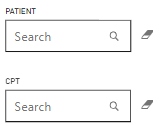
I am having this issue for 2 of our users. This search filter is working fine for other users, but not for some.
This is the working filter.
Any solution to this? We have tried clearing caches and re login to power bi service for those users too.
- Mark as New
- Bookmark
- Subscribe
- Mute
- Subscribe to RSS Feed
- Permalink
- Report Inappropriate Content
Hi, could you please help me with this visualization? After refreshing our Power BI Server up to September 2023 Chiclet Slicer does not mark color for selected chiclet.
- Mark as New
- Bookmark
- Subscribe
- Mute
- Subscribe to RSS Feed
- Permalink
- Report Inappropriate Content
After 15.0.1113.169 refreshing the issue was resolved
- Mark as New
- Bookmark
- Subscribe
- Mute
- Subscribe to RSS Feed
- Permalink
- Report Inappropriate Content
Hi,
I'm using the Power KPI custom visual and love the functionality that this provides. However, I noticed that the chart automatically defaults all values as whole/decimal numbers instead of using the formatting that the user defines for a given value/meausure, such as percentage or currency. I feel like this is an easy fix. Is this the right place to request such a change?
Thanks,
Dillon
- Mark as New
- Bookmark
- Subscribe
- Mute
- Subscribe to RSS Feed
- Permalink
- Report Inappropriate Content
Hi, I have previously published a report using the pdfviewer visual to display a one-page PDF file. It works fine and I really appreciate the zoom in and out feature that can't be done using other image viewer custom visual. However, the recent update of the PDFviewer has changed all my PDFs to be stretched vertically and all the texts on it become unreadable. It also has the default export document feature turned on at the nav bar by default with no option to hide. However, clicking on it just brings you to the licensing page. May I know how do I go about this? Is there a way to downgrade or settings to deal with the stretched image?
- Mark as New
- Bookmark
- Subscribe
- Mute
- Subscribe to RSS Feed
- Permalink
- Report Inappropriate Content
Hi
we've just updated our Power BI Report Server to the September 2023 and have now an issue with the Chiclet slicers not showing the selection. They still filter the report page in the published version but the selection doesn't keep the coloured highlight to show which value was selected. In desktop it's still keeping the selected value highlighted, so not sure why this disappears when saved to the report server. Can anyone help with this?
- Mark as New
- Bookmark
- Subscribe
- Mute
- Subscribe to RSS Feed
- Permalink
- Report Inappropriate Content
After 15.0.1113.169 refreshing issue was resolved
- Mark as New
- Bookmark
- Subscribe
- Mute
- Subscribe to RSS Feed
- Permalink
- Report Inappropriate Content
I have the same situation
- Mark as New
- Bookmark
- Subscribe
- Mute
- Subscribe to RSS Feed
- Permalink
- Report Inappropriate Content
Even I also have.
- Mark as New
- Bookmark
- Subscribe
- Mute
- Subscribe to RSS Feed
- Permalink
- Report Inappropriate Content
Hi,
I am using Chicklet Slicer in my report. I have almost every element accessible using the keyboard, but I cannot get inside the chicklet slicer by pressing the Enter key. I have updated its code such that the Keypress selects the next option available and it works when I click on the visual (get inside of it). When I use the TAB key to roam around the report it only selects the visual. Need help figuring out how can I get inside of the visual using the Enter key so that I can get my Keypress function working.
- Mark as New
- Bookmark
- Subscribe
- Mute
- Subscribe to RSS Feed
- Permalink
- Report Inappropriate Content
Hi
Did you see the article: https://learn.microsoft.com/en-us/power-bi/developer/visuals/supportskeyboardfocus-feature
Thanks
Ranin
- Mark as New
- Bookmark
- Subscribe
- Mute
- Subscribe to RSS Feed
- Permalink
- Report Inappropriate Content
Hi,
I am using the "Timeline Slicer" visual and on 04/09 it does not show me data. There is a way to force them to show. (Understanding that this date is a holiday in the US)
- Mark as New
- Bookmark
- Subscribe
- Mute
- Subscribe to RSS Feed
- Permalink
- Report Inappropriate Content
Hi,
I've built a solution to show the actual and the target. These numbers are in %. Then, the visual calculates the KPI status comparasion doing the percentage between both values but not the differente.
For example:
Value: 80%
Target: 90%
Expected comparision value: 80%-90%=-10%
Here how the dashboard does the calculation: (80-90) / 90 = -11%
Do you know if the calculation method can be changed?
Thanks
- Mark as New
- Bookmark
- Subscribe
- Mute
- Subscribe to RSS Feed
- Permalink
- Report Inappropriate Content
Hi everybody,
I've recently created a custom visual that displays revenue produced over a 5 year period segregated by a certain company's assets.
The visual shows the variance year over year as well as the overall trend of revenue.
- Mark as New
- Bookmark
- Subscribe
- Mute
- Subscribe to RSS Feed
- Permalink
- Report Inappropriate Content
I'm using Drilldown Choropleth Custom map visual by Microsoft. I'm adding state value in it but it's not showing anything, even in format section of visual I'm getting only General section. Can anyone help in this?
- Mark as New
- Bookmark
- Subscribe
- Mute
- Subscribe to RSS Feed
- Permalink
- Report Inappropriate Content
Hi everyone,
i just started my carrier as junior developer.
Having doubts in powerbi visual development. i am developing the dhtmlx gantt chart as powerbi visual.
can anyone help me on this?
- Mark as New
- Bookmark
- Subscribe
- Mute
- Subscribe to RSS Feed
- Permalink
- Report Inappropriate Content
Hi,
I created a dashboard that utilizes the chiclet slicer v1.6.3. I have it deployed on a PBI Service environment and I just noticed that when I hover over the slicers it now shows a tooltip? However I don't see any way to actually configure a tooltip in the visual settings. Am I missing something here?
Thanks
- Mark as New
- Bookmark
- Subscribe
- Mute
- Subscribe to RSS Feed
- Permalink
- Report Inappropriate Content
Seems to be resolved now as I no longer see the tooltip 🙂
- Mark as New
- Bookmark
- Subscribe
- Mute
- Subscribe to RSS Feed
- Permalink
- Report Inappropriate Content
I am working on a power BI project that requires the network navigator visual, I have about 3000 nodes and whenever I reach the 1000 mark the dashboard stops updating. I updated the Max nodes in the layout accordingly and I can also see the hard limit set in the github repo has been increased to 30000. I was wondering if I could get some help on this. Is it possible that the visual on the microsoft store has not been updated to accept the new value of 30000. Thanks
- Mark as New
- Bookmark
- Subscribe
- Mute
- Subscribe to RSS Feed
- Permalink
- Report Inappropriate Content
Hi Community / @Anonymous ,
Lately we encounter issues with the Text Filter Visual from Microsoft. You need to type in twice the text you are searching for before it actually works. Is this a known bug that is being looked at?
Helpful resources

Power BI Monthly Update - April 2026
Check out the April 2026 Power BI update to learn about new features.

Data Days 2026 coming soon!
Sign up to receive a private message when registration opens and key events begin.

New to Fabric Survey
If you have recently started exploring Fabric, we'd love to hear how it's going. Your feedback can help with product improvements.


