
This is best Fabric, Power BI, SQL and AI community event. How do we know? The last event sold out! Save €200 with code FABCMTY200.
Register nowA new Data Days event is coming soon! This time we’re going bigger than ever. Fabric, Power BI, SQL, AI and more. Don't miss out.
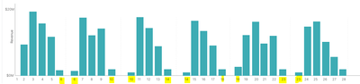
Hello Everyone. Below I am attaching a visual, which is a prototype that has to be created accordingly. In the below visual, we are seeing data according to "week". Here in the prototype we can see week's data from 1 to 6th week and again from 6th to 10th week and 10th to 14th week and like wise. I am not able to achieve this in my report(i.e; the repetive order of 6,10,14 etc).
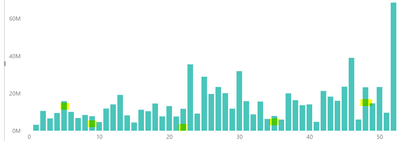
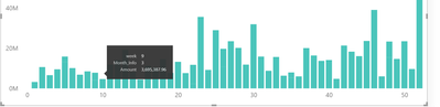
In my report, next month's repetetive week's data is getting merged in a single pile with a white color dash like this:
How can i achieve the 1st visual as per the prototype? Any help would be much appreciated. Thanks in Advance!
Please provide sample data that covers your issue or question completely, in a usable format (not as a screenshot).
https://community.powerbi.com/t5/Community-Blog/How-to-provide-sample-data-in-the-Power-BI-Forum/ba-...
Please indicate the criteria by which the values in week 6 etc are divided up.
Check out the May 2026 Power BI update to learn about new features.
Sign up to receive a private message when registration opens and key events begin.
If you have recently started exploring Fabric, we'd love to hear how it's going. Your feedback can help with product improvements.