FabCon is coming to Atlanta
Join us at FabCon Atlanta from March 16 - 20, 2026, for the ultimate Fabric, Power BI, AI and SQL community-led event. Save $200 with code FABCOMM.
Register now!- Power BI forums
- Get Help with Power BI
- Desktop
- Service
- Report Server
- Power Query
- Mobile Apps
- Developer
- DAX Commands and Tips
- Custom Visuals Development Discussion
- Health and Life Sciences
- Power BI Spanish forums
- Translated Spanish Desktop
- Training and Consulting
- Instructor Led Training
- Dashboard in a Day for Women, by Women
- Galleries
- Data Stories Gallery
- Themes Gallery
- Contests Gallery
- QuickViz Gallery
- Quick Measures Gallery
- Visual Calculations Gallery
- Notebook Gallery
- Translytical Task Flow Gallery
- TMDL Gallery
- R Script Showcase
- Webinars and Video Gallery
- Ideas
- Custom Visuals Ideas (read-only)
- Issues
- Issues
- Events
- Upcoming Events
The Power BI Data Visualization World Championships is back! Get ahead of the game and start preparing now! Learn more
- Power BI forums
- Forums
- Get Help with Power BI
- Custom Visuals Development Discussion
- Football/Soccer-pitch and player visual
- Subscribe to RSS Feed
- Mark Topic as New
- Mark Topic as Read
- Float this Topic for Current User
- Bookmark
- Subscribe
- Printer Friendly Page
- Mark as New
- Bookmark
- Subscribe
- Mute
- Subscribe to RSS Feed
- Permalink
- Report Inappropriate Content
Football/Soccer-pitch and player visual
Hi
I'm looking for a custom visual that can visualise player data from Soccer/football games.
I both have data about the players movement on the pitch (X and Y coordinates), but also line-ups an posisiotns. First of all I need inspiration on haow to visualise the following data:
- Player name
- Player no.
- Player position (GK, CD, CM, LM, RW CF etc.)
- Position koordinates (x and y)
- Role (Goalkeeper, Defence, Midfield, forward)
- In start line-up (true/false)
Do any of you have an idea to how I best visualise these data? Is a scatter chart the way to go? Can I download a custom visiual that can help me?
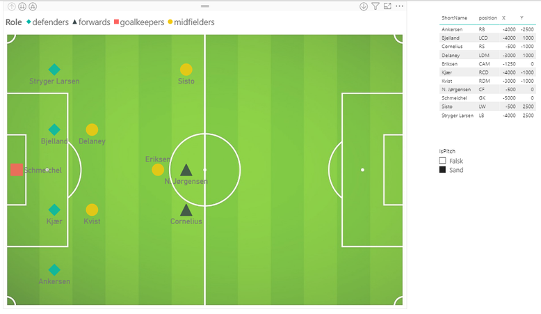
I have attached a picture that illustrates the data I have available and how I have tried to visualise it.
I hope to get inspiration so I can move forward in my dashboard.
Tanks
Nikolaj
- Mark as New
- Bookmark
- Subscribe
- Mute
- Subscribe to RSS Feed
- Permalink
- Report Inappropriate Content
- Mark as New
- Bookmark
- Subscribe
- Mute
- Subscribe to RSS Feed
- Permalink
- Report Inappropriate Content
I haven't had time to work that much on it. However i managed to build a visualisation using the standard scatterplot.
Are you looking for insparation, or do you have ideas to make it better?
/Nikolaj
- Mark as New
- Bookmark
- Subscribe
- Mute
- Subscribe to RSS Feed
- Permalink
- Report Inappropriate Content
Hello Nikolaj,
We would propose you to try to use the following visuals:
- Core Scatter Chart that is build into Power BI
- Enhanced Scatter
- Synoptic Panel by OKViz
Ignat Vilesov,
Software Engineer
Microsoft Power BI Custom Visuals
Helpful resources

Power BI Dataviz World Championships
The Power BI Data Visualization World Championships is back! Get ahead of the game and start preparing now!

| User | Count |
|---|---|
| 1 | |
| 1 | |
| 1 | |
| 1 | |
| 1 |


