FabCon is coming to Atlanta
Join us at FabCon Atlanta from March 16 - 20, 2026, for the ultimate Fabric, Power BI, AI and SQL community-led event. Save $200 with code FABCOMM.
Register now!- Power BI forums
- Get Help with Power BI
- Desktop
- Service
- Report Server
- Power Query
- Mobile Apps
- Developer
- DAX Commands and Tips
- Custom Visuals Development Discussion
- Health and Life Sciences
- Power BI Spanish forums
- Translated Spanish Desktop
- Training and Consulting
- Instructor Led Training
- Dashboard in a Day for Women, by Women
- Galleries
- Data Stories Gallery
- Themes Gallery
- Contests Gallery
- QuickViz Gallery
- Quick Measures Gallery
- Visual Calculations Gallery
- Notebook Gallery
- Translytical Task Flow Gallery
- TMDL Gallery
- R Script Showcase
- Webinars and Video Gallery
- Ideas
- Custom Visuals Ideas (read-only)
- Issues
- Issues
- Events
- Upcoming Events
The Power BI Data Visualization World Championships is back! Get ahead of the game and start preparing now! Learn more
- Power BI forums
- Forums
- Get Help with Power BI
- Custom Visuals Development Discussion
- Re: Football/Soccer-pitch and player visual
- Subscribe to RSS Feed
- Mark Topic as New
- Mark Topic as Read
- Float this Topic for Current User
- Bookmark
- Subscribe
- Printer Friendly Page
- Mark as New
- Bookmark
- Subscribe
- Mute
- Subscribe to RSS Feed
- Permalink
- Report Inappropriate Content
Football/Soccer-pitch and player visual
Hi
I'm looking for a custom visual that can visualise player data from Soccer/football games.
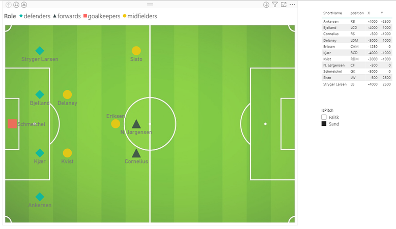
I both have data about the players movement on the pitch (X and Y coordinates), but also line-ups an posisiotns. First of all I need inspiration on haow to visualise the following data:
- Player name
- Player no.
- Player position (GK, CD, CM, LM, RW CF etc.)
- Position koordinates (x and y)
- Role (Goalkeeper, Defence, Midfield, forward)
- In start line-up (true/false)
Do any of you have an idea to how I best visualise these data? Is a scatter chart the way to go? Can I download a custom visiual that can help me?
I have attached a picture that illustrates the data I have available and how I have tried to visualise it.
I hope to get inspiration so I can move forward in my dashboard.
Tanks
Nikolaj
- Mark as New
- Bookmark
- Subscribe
- Mute
- Subscribe to RSS Feed
- Permalink
- Report Inappropriate Content
- Mark as New
- Bookmark
- Subscribe
- Mute
- Subscribe to RSS Feed
- Permalink
- Report Inappropriate Content
I haven't had time to work that much on it. However i managed to build a visualisation using the standard scatterplot.
Are you looking for insparation, or do you have ideas to make it better?
/Nikolaj
- Mark as New
- Bookmark
- Subscribe
- Mute
- Subscribe to RSS Feed
- Permalink
- Report Inappropriate Content
Hello Nikolaj,
We would propose you to try to use the following visuals:
- Core Scatter Chart that is build into Power BI
- Enhanced Scatter
- Synoptic Panel by OKViz
Ignat Vilesov,
Software Engineer
Microsoft Power BI Custom Visuals
Helpful resources

Power BI Monthly Update - November 2025
Check out the November 2025 Power BI update to learn about new features.

Fabric Data Days
Advance your Data & AI career with 50 days of live learning, contests, hands-on challenges, study groups & certifications and more!


