Get Fabric certified for FREE!
Don't miss your chance to take the Fabric Data Engineer (DP-600) exam for FREE! Find out how by watching the DP-600 session on-demand now through April 28th.
Learn more- Power BI forums
- Get Help with Power BI
- Desktop
- Service
- Report Server
- Power Query
- Mobile Apps
- Developer
- DAX Commands and Tips
- Custom Visuals Development Discussion
- Health and Life Sciences
- Power BI Spanish forums
- Translated Spanish Desktop
- Training and Consulting
- Instructor Led Training
- Dashboard in a Day for Women, by Women
- Galleries
- Data Stories Gallery
- Themes Gallery
- Contests Gallery
- QuickViz Gallery
- Quick Measures Gallery
- Visual Calculations Gallery
- Notebook Gallery
- Translytical Task Flow Gallery
- TMDL Gallery
- R Script Showcase
- Webinars and Video Gallery
- Ideas
- Custom Visuals Ideas (read-only)
- Issues
- Issues
- Events
- Upcoming Events
Join the FabCon + SQLCon recap series. Up next: Power BI, Real-Time Intelligence, IQ and AI, and Data Factory take center stage. All sessions are available on-demand after the live show. Register now
- Power BI forums
- Forums
- Get Help with Power BI
- Custom Visuals Development Discussion
- Display Cumulative Percentage Over Time - Line Cha...
- Subscribe to RSS Feed
- Mark Topic as New
- Mark Topic as Read
- Float this Topic for Current User
- Bookmark
- Subscribe
- Printer Friendly Page
- Mark as New
- Bookmark
- Subscribe
- Mute
- Subscribe to RSS Feed
- Permalink
- Report Inappropriate Content
Display Cumulative Percentage Over Time - Line Chart
I have a list of SAP Notifications.
Each Notification eventually gets a Work Order assigned to it as the job is planned.
And I have a date column for when the Work Order is created
Eventually every Notification will have a Work Order.
I want to show a Line Chart that tracks WO creation over time. With time as the X-Axis and Percent Complete (Count of Work Orders/Count of Notifications) as the Y-Axis
So I can track the cumulative progress of WO creation from 0% to 100% over time
I haven't been able to incorporate time into any of the measures that I have tried
Any help would be appreciated

Solved! Go to Solution.
- Mark as New
- Bookmark
- Subscribe
- Mute
- Subscribe to RSS Feed
- Permalink
- Report Inappropriate Content
@bgierwi2 OK, well, this is going to depend a bit on what date you use for your x-axis and whether you want to count all Notifications every time or just those that were created prior to the specific date on the axis. Making some simplifying assumptions and using the only date in your sample data it should look something like this:
Measure =
  VAR __Date = MAX('Table'[Date Work Order Created])
  VAR __AllCount = COUNTROWS(ALL('Table'))
  VAR __CurrentCount = COUNTROWS(FILTER(ALL('Table'),[Date Work Order Created] <> BLANK() && [Date Work Order Created] <= __Date))
RETURN
  DIVIDE(__CurrentCount, __AllCount, 0)
Follow on LinkedIn
@ me in replies or I'll lose your thread!!!
Instead of a Kudo, please vote for this idea
Become an expert!: Enterprise DNA
External Tools: MSHGQM
YouTube Channel!: Microsoft Hates Greg
Latest book!: DAX For Humans
DAX is easy, CALCULATE makes DAX hard...
- Mark as New
- Bookmark
- Subscribe
- Mute
- Subscribe to RSS Feed
- Permalink
- Report Inappropriate Content
@bgierwi2 Maybe this?
Take a look at these two Quick Measures as I think you want something like them.
https://community.powerbi.com/t5/Quick-Measures-Gallery/Open-Tickets/m-p/409364
https://community.powerbi.com/t5/Quick-Measures-Gallery/Periodic-Billing/m-p/409365
If not, Sorry, having trouble following, can you post sample data as text and expected output?
Not really enough information to go on, please first check if your issue is a common issue listed here: https://community.powerbi.com/t5/Community-Blog/Before-You-Post-Read-This/ba-p/1116882
Also, please see this post regarding How to Get Your Question Answered Quickly: https://community.powerbi.com/t5/Community-Blog/How-to-Get-Your-Question-Answered-Quickly/ba-p/38490
The most important parts are:
1. Sample data as text, use the table tool in the editing bar
2. Expected output from sample data
3. Explanation in words of how to get from 1. to 2.
Follow on LinkedIn
@ me in replies or I'll lose your thread!!!
Instead of a Kudo, please vote for this idea
Become an expert!: Enterprise DNA
External Tools: MSHGQM
YouTube Channel!: Microsoft Hates Greg
Latest book!: DAX For Humans
DAX is easy, CALCULATE makes DAX hard...
- Mark as New
- Bookmark
- Subscribe
- Mute
- Subscribe to RSS Feed
- Permalink
- Report Inappropriate Content
@Greg_Deckler - Thank your for the response:
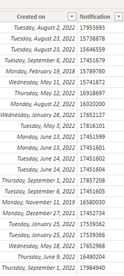
Here is some sample data
All of the notifications are already generated, and planners are creating WOs as they plan the work.
As a Work Order is created, another column shows the date the Work Order is created
This is in progress, eventually every notifiication will have a Work Order, and the progress will be 100%
| Notification | Work Order | Date Work Order Created |
| 17460816 | 90696104 | 9/9/2022 |
| 17452563 | ||
| 17452566 | 93072762 | 9/1/2022 |
| 17452680 | ||
| 17452682 | 95113238 | 8/15/2022 |
| 17452566 | ||
| 17451599 | 95115572 | 8/14/2022 |
| 17451601 | ||
| 17451602 | ||
| 17451604 | 99351374 | 8/1/2022 |
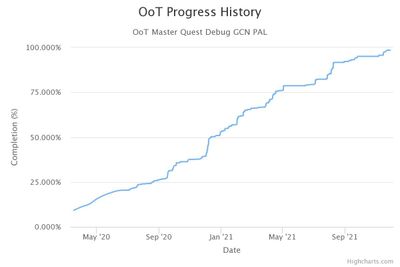
I would like to have a line chart:
X-Axis showing Date
Y-Axis Showing Count (Work Orders) / Count (Notifications)
That will track the progress of generating Work Orders from 0% to 100%
With this sample data, the progress should start at 0% and end at 50% (5 Work Orders generated out of 10 Notifications), between 8/1/2022 and 9/9/2022
I would like it to look something like what is below
- Mark as New
- Bookmark
- Subscribe
- Mute
- Subscribe to RSS Feed
- Permalink
- Report Inappropriate Content
@bgierwi2 OK, well, this is going to depend a bit on what date you use for your x-axis and whether you want to count all Notifications every time or just those that were created prior to the specific date on the axis. Making some simplifying assumptions and using the only date in your sample data it should look something like this:
Measure =
  VAR __Date = MAX('Table'[Date Work Order Created])
  VAR __AllCount = COUNTROWS(ALL('Table'))
  VAR __CurrentCount = COUNTROWS(FILTER(ALL('Table'),[Date Work Order Created] <> BLANK() && [Date Work Order Created] <= __Date))
RETURN
  DIVIDE(__CurrentCount, __AllCount, 0)
Follow on LinkedIn
@ me in replies or I'll lose your thread!!!
Instead of a Kudo, please vote for this idea
Become an expert!: Enterprise DNA
External Tools: MSHGQM
YouTube Channel!: Microsoft Hates Greg
Latest book!: DAX For Humans
DAX is easy, CALCULATE makes DAX hard...
- Mark as New
- Bookmark
- Subscribe
- Mute
- Subscribe to RSS Feed
- Permalink
- Report Inappropriate Content
It worked!
Thank you so much!
I never would have come up with that on my own, this is exactly what I was looking for
Helpful resources

Power BI Monthly Update - April 2026
Check out the April 2026 Power BI update to learn about new features.

New to Fabric Survey
If you have recently started exploring Fabric, we'd love to hear how it's going. Your feedback can help with product improvements.

Power BI DataViz World Championships - June 2026
A new Power BI DataViz World Championship is coming this June! Don't miss out on submitting your entry.


