FabCon is coming to Atlanta
Join us at FabCon Atlanta from March 16 - 20, 2026, for the ultimate Fabric, Power BI, AI and SQL community-led event. Save $200 with code FABCOMM.
Register now!- Power BI forums
- Get Help with Power BI
- Desktop
- Service
- Report Server
- Power Query
- Mobile Apps
- Developer
- DAX Commands and Tips
- Custom Visuals Development Discussion
- Health and Life Sciences
- Power BI Spanish forums
- Translated Spanish Desktop
- Training and Consulting
- Instructor Led Training
- Dashboard in a Day for Women, by Women
- Galleries
- Data Stories Gallery
- Themes Gallery
- Contests Gallery
- QuickViz Gallery
- Quick Measures Gallery
- Visual Calculations Gallery
- Notebook Gallery
- Translytical Task Flow Gallery
- TMDL Gallery
- R Script Showcase
- Webinars and Video Gallery
- Ideas
- Custom Visuals Ideas (read-only)
- Issues
- Issues
- Events
- Upcoming Events
The Power BI Data Visualization World Championships is back! Get ahead of the game and start preparing now! Learn more
- Power BI forums
- Forums
- Get Help with Power BI
- Custom Visuals Development Discussion
- Re: Compare same month with last year's month
- Subscribe to RSS Feed
- Mark Topic as New
- Mark Topic as Read
- Float this Topic for Current User
- Bookmark
- Subscribe
- Printer Friendly Page
- Mark as New
- Bookmark
- Subscribe
- Mute
- Subscribe to RSS Feed
- Permalink
- Report Inappropriate Content
Compare same month with last year's month
Hi,
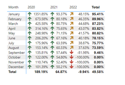
Can anyone please, help me with my visualization? some of my coullegues have said that its confusing to understand the graph percentage change? i don't know where to apply the conditional formatting here.
Is there any sugeestion to make it more readble and better looking? Specially if i want to highlight the +/- changges?
Also, what if i try to show the total per month within same month
the problem i have growing data, and it gets very crowded when i try to do that?
this is the dax i used to create the month% change:

- Mark as New
- Bookmark
- Subscribe
- Mute
- Subscribe to RSS Feed
- Permalink
- Report Inappropriate Content
Thank you again for your help.
One last thing, When i created a coloumn chart, when the percentage is very low, the value is not apprering in the vistuialization. I tried to resize it, but did not know how to show all the values in the graph e.g Apr 2022. How i can make sure all my figures apprears even for small totals,margins e.g, 00.76%
Also, for the conditional formating of the table, what if i simply want to show up/down positive/negetive arrow only (red,green)? means when it has (negitive sign) it means red a drop,, when it's not negetive it means green (I'm comparing same month over the years)
- Mark as New
- Bookmark
- Subscribe
- Mute
- Subscribe to RSS Feed
- Permalink
- Report Inappropriate Content
You have a couple of options. You can create a "Month over Month To Date" measure that compares same time intervals. Another option is to use 100% stacking.
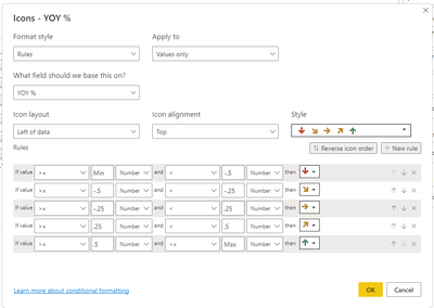
You can choose to show only the icons and hide the values.
- Mark as New
- Bookmark
- Subscribe
- Mute
- Subscribe to RSS Feed
- Permalink
- Report Inappropriate Content
What i mean for the stacked colomn chart, not values are showing becuase for example April 2022 value is 43.07% (please refer to the sampe PBX) is there any way to make sure i have all the numbers appreasing like resizing the bar chart or sth?
Also, i'm stuck with +/- formatting, how can i show any number with negetive sign as red, and anything else green?
Sorry for the inconvinience, im very new to Power BI
- Mark as New
- Bookmark
- Subscribe
- Mute
- Subscribe to RSS Feed
- Permalink
- Report Inappropriate Content
There is a "100% Stacked Column" visual - you can try that.
Do you have a general idea of what your expected result should look like? Can you show a mockup?
- Mark as New
- Bookmark
- Subscribe
- Mute
- Subscribe to RSS Feed
- Permalink
- Report Inappropriate Content
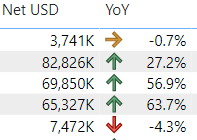
Keep experimenting with different visuals. Oftentimes for YoY comparisons a table or matrix visual with icons (up/down/sideways arrow for example) is more appropriate.
- Mark as New
- Bookmark
- Subscribe
- Mute
- Subscribe to RSS Feed
- Permalink
- Report Inappropriate Content
Can we add icons arrows for this kind of visuals? If yes I will appreciate if you can explain it to me?
where I can find arrows and present this in more appropriate way?
- Mark as New
- Bookmark
- Subscribe
- Mute
- Subscribe to RSS Feed
- Permalink
- Report Inappropriate Content
Here is an example
If you like more help please provide sample data.
- Mark as New
- Bookmark
- Subscribe
- Mute
- Subscribe to RSS Feed
- Permalink
- Report Inappropriate Content
I've placed the PBX file in drop box as i can not yet upload any file directly
- Mark as New
- Bookmark
- Subscribe
- Mute
- Subscribe to RSS Feed
- Permalink
- Report Inappropriate Content
- Mark as New
- Bookmark
- Subscribe
- Mute
- Subscribe to RSS Feed
- Permalink
- Report Inappropriate Content
Thank you very much for your response!!
much appreciated.
may I ask one last thing, will the up/down arrow will show if i converted this to bar or visual graph ?
- Mark as New
- Bookmark
- Subscribe
- Mute
- Subscribe to RSS Feed
- Permalink
- Report Inappropriate Content
The availability of icons for conditional formatting varies between visuals. It may not be available for the standard Column chart (bar chars are horizontal) but there might be custom visuals that allow that.
Instead of the icons you can also use column color ( for example) for the visual indication of the trend.
Helpful resources

Power BI Dataviz World Championships
The Power BI Data Visualization World Championships is back! Get ahead of the game and start preparing now!

| User | Count |
|---|---|
| 1 | |
| 1 | |
| 1 | |
| 1 | |
| 1 |


