

This is best Fabric, Power BI, SQL and AI community event. How do we know? The last event sold out! Save €200 with code FABCMTY200.
Register nowJuly 28 - August 9 | Final Round of the Power BI Dataviz World Championships. This is your chance. Learn more
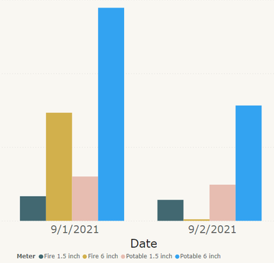
I have two sets of related datasets. They are Fire water supply usage and Potable Water Usage. Each of these datasets have have 2 pipe sizes. What do you think would be the best color scheme to show this data on a column chart.
Below is an example of the data for a couple of days.
I think that the related datasets should show without looking at the legend that they are related.
You may want to ask an accessibility expert to help you choose color blind safe colors. Different hues of blue should be ok though.
You say these data points are related. How so? Are they using the same infrastructure (pumps etc)?
If you want to show progression of a value over time you usually choose a line chart, not a column chart.
They are water meters, that have a 1.5" meter and a 6" Meter in parallel.
Thank you for forcing me to read up on Coriolis!
your welcome.
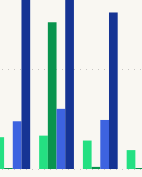
Here is what I am using now, until someone requests a different color scheme. Green colors for fire main and Blue for potable.
Join us in Barcelona for FabCon and SQLCon, the Fabric, Power BI, SQL, and AI community event. Save €200 with code FABCMTY200.
If you love stickers, then you will definitely want to check out our community sticker challenge, Barcelona edition!
Check out the July 2026 Power BI update to learn about new features.