

This is best Fabric, Power BI, SQL and AI community event. How do we know? The last event sold out! Save €200 with code FABCMTY200.
Register nowA new Data Days event is coming soon! This time we’re going bigger than ever. Fabric, Power BI, SQL, AI and more. Don't miss out.
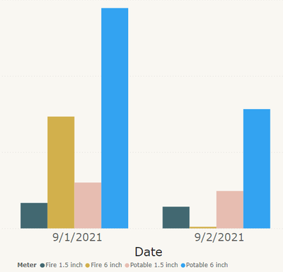
I have two sets of related datasets. They are Fire water supply usage and Potable Water Usage. Each of these datasets have have 2 pipe sizes. What do you think would be the best color scheme to show this data on a column chart.
Below is an example of the data for a couple of days.
I think that the related datasets should show without looking at the legend that they are related.
You may want to ask an accessibility expert to help you choose color blind safe colors. Different hues of blue should be ok though.
You say these data points are related. How so? Are they using the same infrastructure (pumps etc)?
If you want to show progression of a value over time you usually choose a line chart, not a column chart.
They are water meters, that have a 1.5" meter and a 6" Meter in parallel.
Thank you for forcing me to read up on Coriolis!
your welcome.
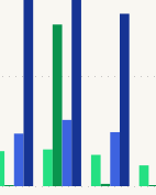
Here is what I am using now, until someone requests a different color scheme. Green colors for fire main and Blue for potable.
Check out the May 2026 Power BI update to learn about new features.
Sign up to receive a private message when registration opens and key events begin.
If you have recently started exploring Fabric, we'd love to hear how it's going. Your feedback can help with product improvements.